
Whats New in Minitab 14 - PowerPoint PPT Presentation
1 / 23
Title: Whats New in Minitab 14
1
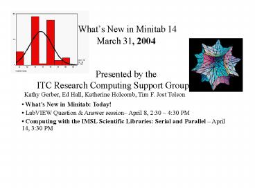
Whats New in Minitab 14
March 31, 2004Presented by
theITC Research Computing Support Group
Kathy Gerber, Ed Hall, Katherine
Holcomb, Tim F. Jost Tolson
- Whats New in Minitab Today!
- LabVIEW Question Answer session April 8, 230
430 PM - Computing with the IMSL Scientific Libraries
Serial and Parallel April 14, 330 PM
2
Whats New in Minitab 14
- Getting started
- Graphing data
- Using data getting results
- Statistical process control
- Partial Least Squares Regression
- Design of Experiments
3
Getting Started
- Help Resources
- Meet MINITAB
- MINITAB Help
- MINITAB StatGuide
- Tutorials
- Help-to-Go http//www.minitab.com/support/docs/rel
14/14helpfiles/default.aspx
4
Graph Features in MINITAB
- A pictorial gallery from which to choose a graph
type - Flexibility in customizing graphs, from
subsetting of data to specifying titles and
footnotes - Ability to change most graph elements, such as
fonts, symbols, lines, placement of tick marks,
and data display, after the graph is created - Ability to automatically update graphs
5
Enhancements to Specific Graphs
- Multiple levels of categorical variables.
- Contour plots use color ramps and label contour
lines. - Use summarized data in making a bar chart.
- Quartile, hinge, or percentile methods for
boxplot. - Fit regression lines and distributions to
selected graphs.
6
Empirical CDF
- You can use Empirical CDF (empirical cumulative
distribution function) graphs to evaluate the fit
of a distribution to your data or to compare
different sample distributions.
7
Individual Value Plot
- View the distribution of individual values,
with optional grouping by categorical variables.
8
Area Graph
- Use to evaluate trends in multiple time
series as well as each series' contribution to
the sum. Minitab can generate calendar values,
clock values, or index values for the time scale,
or you can use your own column of stamp values.
9
Residual fourpack
Display a layout of all four residual plots
instead of producing them separately.
10
Data Limits and Details
- A worksheet can contain up to 4000 columns, 1000
constants, and up to 10,000,000 rows depending on
how much memory your computer has. - Three stored constants have default values (you
can change them if you wish) - K998 (missing), K999 2.71828 (e), and
K1000 3.14159 (pi)
11
ReportPad
- The ReportPad acts as a simple text editor
(like Notepad), from which you can quickly
print or save in RTF (rich text) or HTML (Web)
format. - In ReportPad, you can
- Store MINITAB results and graphs in a single
document - Add comments and headings
- Rearrange your output
- Change font sizes
- Print entire output from an analysis
- Create Web-ready reports
12
Session Window
- Enabling the Command Line At the menu select
Editor, Enable Commands - Use in conjunction with History in the Project
Management window
13
Statistical Process Control
14
Multivariate Control Charts
- Multivariate control charting has several
advantages over creating multiple univariate
charts - The actual control region of the related
variables is represented (elliptical for
bivariate case). - You can maintain a specific Type I error.
- A single control limit determines whether the
process is in control. - However, multivariate charts are more difficult
to interpret than classic Shewhart control
charts.
15
Example of T2 chart
- You are a hospital manager interested in
monitoring patient satisfaction ratings through
the month of January. You randomly ask 5 patients
each day to complete a short questionnaire about
their stay at the hospital before they check out.
Because satisfaction and length of stay are
correlated, you create a T2 chart to
simultaneously monitor satisfactions ratings (on
scale of 1-7) and length of stay (in days).
16
Example of T2 chart (cont.)
- 1 Open the worksheet HOSPITAL.MTW.
- 2 Choose Stat gt Control Charts gt Multivariate
Charts gt Tsquared. - 3 In Variables, enter Stay Satisfaction.
- 4 In Subgroup sizes, enter a number or a
column of subscripts, then click OK.
17
Additional New Multivariate Control Charts
- Generalized variance control chart
- Multivariate exponentially weighted moving
average chart - Tsquared-generalized variance control chart
18
Partial Least Squares Regression
- Use partial least squares (PLS) to perform
biased, non-least squares regression with one or
more responses. PLS is particularly useful when
your predictors are highly collinear or you have
more predictors than observations and ordinary
least squares regression either fails or produces
coefficients with high standard errors. PLS
reduces the number of predictors to a set of
uncorrelated components and performs least
squares regression on these components. - PLS fits multiple response variables in a
single model. Because PLS models the responses in
a multivariate way, the results may differ
significantly from those calculated for the
responses individually. Model multiple responses
together only if they are correlated.
19
Example of Partial Least Squares Regression
- You are a wine producer who wants to know how
the chemical composition of your wine relates to
sensory evaluations. You have 37 Pinot Noir wine
samples, each described by 17 elemental
concentrations (Cd, Mo, Mn, Ni, Cu, Al, Ba, Cr,
Sr, Pb, B, Mg, Si, Na, Ca, P, K) and a score on
the wine's aroma from a panel of judges. You want
to predict the aroma score from the 17 elements
and determine that PLS is an appropriate
technique because the ratio of samples to
predictors is low.
20
Example of Partial Least Squares Regression
(cont.)
- 1 Open the worksheet WINEAROMA.MTW.
- 2 Choose Stat gt Regression gt Partial Least
Squares. - 3 In Responses, enter Aroma.
- 4 In Predictors, enter Cd-K.
- 5 In Maximum number of components, type 17.
- 6 Click Validation, then choose Leave-one-out.
Click OK. - 7 Click Graphs, then check Model selection
plot, Response plot, Std Coefficient plot,
Distance plot, Residual versus leverage plot, and
Loading plot. Uncheck Coefficient plot. Click OK
in each dialog box.
21
Example of Partial Least Squares Regression
(cont.)
- Session Commands
- WOPEN "winearoma.mtw"
- PLS 'aroma' 'Cd'-'K'
- NComponents 17
- XValidation 1
- GSelectionPlot
- GFit
- GCCoefficient
- GDistance
- GLeverage
- GLoading
- RSelection.
22
Interpreting Results
- Predicted Residual Sum of Squares
- Example details provide interpretation of both
the Session Window and the Graph Window outputs - See Minitab Help for the PLS example
23
Upcoming Talks
- Talks are online at www.itc.virginia.edu/research/
talks - Computing with the IMSL Scientific Libraries.
Wednesday, April 14
Recommended
CrystalGraphics Presentations


