
FBM Tools SPC Screenshot Demo PowerPoint PPT Presentation
Title: FBM Tools SPC Screenshot Demo
1
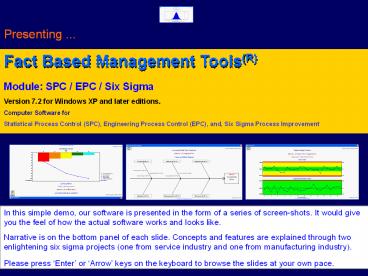
Presenting ...
Fact Based Management Tools(R) Module SPC / EPC
/ Six Sigma Version 7.2 for Windows XP and later
editions. Computer Software for Statistical
Process Control (SPC), Engineering Process
Control (EPC), and, Six Sigma Process Improvement
In this simple demo, our software is presented in
the form of a series of screen-shots. It would
give you the feel of how the actual software
works and looks like. Narrative is on the bottom
panel of each slide. Concepts and features are
explained through two enlightening six sigma
projects (one from service industry and one from
manufacturing industry). Please press Enter or
Arrow keys on the keyboard to browse the slides
at your own pace.
2
Process Improvement using SPC / EPC / Six Sigma
Tools There is a pressing need for the continual
improvement of manufacturing and service
processes in todays competitive business
environment. You may follow the time-tested Six
Sigma DMAIC approach (Define, Measure, Analyse,
Improve, and, Control) in any improvement
initiative. For this, you need to 1. Identify
the areas for improvement 2. Identify the key
input output variables (KIVs KOVs) that are
critical to quality/schedule/cost 3. Collect the
relevant data and analyse them using the SPC
tools such as CE Diagram, Pareto, Histogram,
Scatter Plot, Control Chart, etc. 4. Take
corrective and preventive actions to improve the
process, and 5. Install an on-going control
scheme (such as SPC or EPC chart) to sustain the
improvement.
3
What is SPC ? Statistical Process control (SPC)
is a scientific and inexpensive way to prevent
defects. It is an effective check against
assignable causes of process variation. You would
require SPC tools for every Six Sigma
project. When to use EPC ? Once a process is
brought to stable condition using SPC charts,
Engineering Process Control (EPC) helps in
predicting the process performance and pro-active
adjustments, thereby reducing process
variability. It adds extra power to your process
control schemes. Both SPC and EPC are very
essential for achieving the PPM (parts per
million) defect levels expected of your Six Sigma
initiatives. In this context, it is very
important to provide a statistical software to
your personnel for error-free data analysis and
charting on regular basis. Our FBM Tools
SPC/EPC/Six Sigma module is a Windows-based
computer program designed specifically for
improvement projects, by seasoned
Engineer-Statistician experts (alumni of the
Indian Statistical Institute). Before getting
into the details of the software, let us look at
one example project from service industry and one
from manufacturing industry, to learn how to put
SPC/EPC/Six Sigma tools to use. Please see the
software screens and read the narrative at the
bottom panel.
4
Example Project (Service Industry) In a certain
company, there were chronic data entry problems
in the Accounts Department. As part of its Six
Sigma initiatives, the companys management has
decided to study the data entry errors by
collecting the data for one month and analysing
it. The company has designated its Manager, Mr.
Stanley John as the Project Leader. Mr. John has
created a project record by going to the menu
item File ? Manage My Projects
5
Example Project (Service Industry) Then he
created a new data file by going to the menu item
File ? New Data File. After that, he entered
the data collected in August 2011 and saved the
file.
6
Example Project (Service Industry) Looking at
the data, he decided to first carry out a Pareto
Analysis. For this he went to the menu item
File ? Manage My Workbooks / Start Data Analysis
? Pareto Analysis and created a workbook record.
7
Example Project (Service Industry) When he
clicked on the START ANALYSIS NOW button, the
software has displayed the Pareto Diagram.
8
Example Project (Service Industry) And, when he
clicked on the View Table button, the Pareto
Table was shown as above. He has decided to
present this Pareto output along with a Cause
Effect Diagram to the concerned data entry
operators for further brainstorming and
improvement.
9
Example Project (Service Industry) He has also
decided to group the errors under six categories
(variation of Six Ms) such as People, Method,
Equipment, Resources, Measurements, and,
Materials. He went to the menu item File ?
Manage My Workbooks / Start Data Analysis ? Cause
and Effect Diagram and created a workbook record.
10
Example Project (Service Industry) When he
clicked on the START ANALYSIS NOW button, the
software has displayed the Cause Effect
Diagram.
11
Example Project (Service Industry) Also, the
project leader wanted to get an estimate of the
current levels of Six Sigma Metrics of the data
entry process. For this, he has decided to open a
control chart workbook and use the u-chart. To
setup u-chart, the project leader has gone to the
menu item File ? Manage My Workbooks / Start Data
Analysis ? Control Chart and Histogram and
created a workbook record.
12
Example Project (Service Industry) When he
clicked on the START ANALYSIS NOW button, the
software has displayed the above message. To
view the control chart, he has gone to the menu
item Graphics ? Control Charts and clicked open
the menu.
13
Example Project (Service Industry) The following
control chart (u-chart) was displayed. As the
sample sizes were varying, the chart was drawn
with varying control limits (not as straight
lines). Areas within control limits shown in
green colour, and areas outside limits in red
colour.
14
Example Project (Service Industry) To view the
Six Sigma metrics, he has gone to the menu item
Reports ? Control Chart Data Summary and clicked
open the menu as above. After checking the
required sections in the report, he hit the
View/Print button to view the report.
15
Example Project (Service Industry) Having done
the preliminary data analysis, it is now time for
brainstorming and improvement.
16
Example Project (Service Industry) Brain
Storming Improvement Looking at the Pareto
Analysis, Cause Effect Diagram, and the Control
Chart, the data entry operators as well as the
project leader agreed that the root causes of the
problem were 1. People (Human errors
spelling mistakes and wrong postings), and 2.
Method (Procedural flaws in communicating cheque
details) It was decided - to impart
training to all data entry operators on
accounting concepts (correct posting) - to
enable automatic spell-check facility of the
accounting software, and also to keep dictionary
CDs at data entry work stations - to re-write
the integrated management system (IMS) work
instructions in such a way that cheque details
would never be lost in the communication process,
and - to continue with the u-chart for
monitoring the day-to-day error levels. Lets
see what was the result of implementing the
corrective actions
17
Example Project (Service Industry) See the
freshly collected data for September 2011.
18
Example Project (Service Industry) See the
(modified) workbook entries for u-chart.
19
Example Project (Service Industry) See the
u-chart for September 2011.
20
Example Project (Service Industry) See the
improved Six Sigma Metrics for September 2011.
Prior to Six Sigma initiatives, these
were Defects per Million (DPM) 8186.15 Sigma
Quality Level 3.90 Yield ()
99.18
21
Hope that you liked the sample project from
service industry. Now, lets see one example
project from manufacturing industry.
22
Example Project (Manufacturing Industry) The
following tools are covered in this example -
Control Chart (Variable Data) - Scatter Plot
Regression - Engineering Process Control
(EPC) Project Description In a certain
pharmaceutical company that manufactures tablets,
there was frequent rejection of final product due
to off-the-spec tablet weight. As part of its Six
Sigma initiatives, the companys management
decided to study the tablet weight variations by
collecting some data from the plant and analysing
it. The company has designated its Manager, Mr.
Stanley John as the Project Leader and the
Laboratory Technician Ms. Ratna Raj as team
member. Now, lets see how this very interesting
project was executed.
23
Example Project (Manufacturing Industry) As the
first step, the project leader has created a
project record by going to the menu item File ?
Manage My Project Records
24
Example Project (Manufacturing Industry) Then,
he entered the team information by clicking on
the View / Edit the List of Team Members
button.
25
Example Project (Manufacturing Industry) After
that, he entered the key input and output
variables by clicking on the View / Edit the
List of Key Input and Output Variables (KIVs and
KOVs) button.
26
Example Project (Manufacturing Industry) Then he
created a data file and entered the data that was
collected with the help of team member.
27
Example Project (Manufacturing Industry) After
that he has created a workbook record for control
chart.
28
Example Project (Manufacturing Industry) He has
then added details under Specifications tab.
29
Example Project (Manufacturing Industry) He has
then looked at SPC Parameters tab and just made
one entry (Target 1.00) and kept all others at
default values. As the basic chart selected was
Xbar-S and chart type selected was
Conventional, these parameters were not
required. Regarding EPC Parameters tab, he
decided to enter the details at a later stage
(after analysing the data using Scatter Plot and
Regression tool).
30
Example Project (Manufacturing Industry) He then
clicked on the START ANALYSIS NOW button, and
received the above message. Now, he decided to
see the graphs first.
31
Example Project (Manufacturing Industry) Histogra
m, depicting the data distribution (spread)
viz-a-viz tolerance band (technical
specifications).
32
Example Project (Manufacturing Industry) Frequenc
y Table (optional add-on to Histogram), showing
data distribution in tabular form.
33
Example Project (Manufacturing Industry) Normal
Probability Plot (NPP) is a very important visual
aid for checking the normality of data (i.e., to
examine whether the data comes from a population
with Normal Distribution). If the data follows
Normal Distribution, the plotted points would
form a straight line.
34
Example Project (Manufacturing Industry) Run
chart is a simple plot of sample averages, which
gives a visual understanding of patterns and
trends in control chart data.
35
Example Project (Manufacturing Industry) Traditio
nal SPC charts are not effective when the data is
highly auto-correlated (i.e., when consecutive
data points are correlated. If the bars on the
Auto-Correlation Chart are shorter, it indicates
less amount of auto-correlation. In case the data
is highly auto-correlated, use Un-weighted Batch
Mean (UBM) chart.
36
Example Project (Manufacturing Industry) Control
chart shows that the process is under statistical
control. That means, there is no sporadic
(assignable) cause present. The process is
stable.
37
Example Project (Manufacturing Industry) Six
Sigma Metrics Probability Distribution (Normal)
gives an idea about expected rejections. Though
none of the data analysed were beyond
specifications, the small red zone below the
lower specification limit (LSL) indicates
possibility of manufacturing out-of-spec
products. Also, the process is barely capable
(Cp lt 1.33) and not centered (Cpk lt 1).
38
Example Project (Manufacturing Industry) Now,
the reports were looked at. First, the data
summary.
39
Example Project (Manufacturing Industry) Data
summary, continues.
40
Example Project (Manufacturing Industry) Data
summary, report ends.
41
Example Project (Manufacturing Industry) Then he
looked at the Control Chart Run Analysis, but
couldnt see any significant cyclic variations.
Mr. John has concluded that the real problem is
in process setting. From his technical knowledge,
he knows that Tablet Weight can be adjusted by
controlling the Feed Rate (input variable). But,
he needed to establish the relation, i.e.,
Average Weight of Tablet (Y) Vs Feed Rate (X).
For this, he decided to use scatter plot linear
regression.
42
Example Project (Manufacturing Industry) Then he
created a Scatter Plot workbook.
43
Example Project (Manufacturing Industry) By
clicking on the START ANALYSIS NOW button, he
could se the scatter plot regression line. As
a rule of thumb, R-square value must be at least
0.70 for the regression line to be considered as
meaningful. Mr. John looked at the R-square
value. It was 0.9951 (very close to the perfect
value). So, he decided to use the equation.
44
Example Project (Manufacturing Industry) Setting
up an Engineering Process Control (EPC) chart for
the Tablet making process It involved the
following steps (and cues from the User Manual
accompanying the SPC software) 1. Selection of
feedback control model Selected Integral
model, for simplicity. 2. Setting the parameter
(g) for the selected model Overall Process
Gain, g 0.1092 3. Setting the Smoothing
Constant (?) for EWMA predictor ? 0.15 (best
fit from recent data) 4. Setting the Adjustment
Boundary Value (L) for EWMA predictor L
0.0041 5. Re-setting the process average at the
Target value (1.00 gram) Done by engineering
means. 6. Installing an EPC chart and monitoring
(and adjusting) the process For this, he went
back to the SPC software. Lets see what he
did there.
45
Example Project (Manufacturing Industry) Mr.
John has edited the original control chart
workbook (EPC Parameters tab), as above.
46
Example Project (Manufacturing Industry) After
process re-set, fresh data were taken from 2.00
PM onwards and entered in the same data file as
above.
47
Example Project (Manufacturing Industry) Then,
the work book entries were modified (such as
project phase changed to Control, etc) as
above.
48
Example Project (Manufacturing Industry) Then
hit the START ANALYSIS NOW button, and checked
the EPC chart (Graphics menu). The thin graph
in black colour is the sample mean. The thick
graph in blue colour is the EWMA predictor for
process average. The next point prediction
(predicted value for process average at 8.00 PM)
was 1.0005 and the advice was to leave the Feed
Rate (X) at its present level (i.e., 2.13).
49
We have discussed two practical projects so
far. What are you thinking now ? Never thought
that such things could be done in your
organisation also ! As they say, it is better
late than never. Our software could be a
helpful companion in your improvement
initiatives. This product is available in three
editions (Academic / Lite / Standard). Each
edition is designed to serve a particular user
category. Let us now talk about the software
features in detail.
50
This is the login screen. Select your User ID
from the list, enter the password, and select a
login option (User / Admin). Then press OK to
enter the software.
51
The major menu items are File, Reports,
Graphics, and, About. Under the File menu, users
can create six sigma project records, create /
edit data files in this softwares own format,
import data from MS-Access / Excel / Text files
(also export data to these file formats), create
workbook records, and, analyse data through these
menu items. System Administrator can access
various admin and set-up menu items.
52
Reports menu generates reports in text form,
which can be printed or saved as PDF
files. Project and workbook related queries can
be made here. There are many data filters which
helps in segregating only those records (related
to projects you are involved in and workbook
records created by you) that you wish to view
during your Six Sigma projects. Control chart
data summary and run analysis reports can also be
generated through this menu.
53
Graphics menu is the heart of this software. You
can view/print graphs, or save them as PDF
files. Cause Effect Diagram, Pareto Diagram,
and, Scatter Plot are very important tools
required for most of the Six Sigma projects. The
rest of the graphical output relates to SPC
control charts. Advanced users can generate EPC
prediction chart also.
54
About menu tells about the software edition,
product tracking number, contact address for
technical support, etc. Let us now look at more
details of this software.
55
Basic SPC Charts Supported Name of chart
Data
Typical areas of application X - Moving Range
1 data / sample Chemical
processes Xbar - Range 2 - 5
data / sample Turning operation Xbar -
SD 2 - 200 data / sample
Blanking process Fraction Defective (p)
sample size gt 1 Visual inspection
(good/bad) of lot items Nos. Defective (np)
sample size gt 1 Visual inspection
(good/bad) of lot items Defects / Item (c)
sample size 1 Visual
defects (count) of castings Defects / Unit (u)
sample size gt 0 Clerical
mistakes (count) in data entry
56
Advanced SPC Charts Supported Name of chart
Data
Typical areas of application Short run /
Standardized Same as basic charts
For job-shop (small lot production) Slopping /
Tool wear 2 - 200 data / sample
Where gradual process shift is inherent Six
Sigma Process 2 - 200 data /
sample For monitoring Six Sigma processes
Coefficient of variation (CV) 2 - 200 data /
sample Normally, in textile and jute
processing Moving Avg. - Moving Range 1 data
/ sample When data is slightly
auto-correlated Moving Avg. - Moving SD
1 data / sample When data is
slightly auto-correlated CuSum
1 - 200 data / sample To
detect small shifts in process mean EWMA
1 - 200 data /
sample To detect small shifts in process
mean UBM
1 data / sample When data is
highly auto-correlated
57
Other Tools Supported Name of Tool
Typical use Cause and
Effect Diagram Brainstorming
(cause-effect mapping) Pareto Diagram
Finding the vital few
defects / problems Scatter Plot and Linear
Regression To study x-y relation between
variables Histogram and Frequency Table
To visualize spread (variability) in data
Normal Probability Plot (NPP) To
check normality of data Auto-Correlation Chart
To check
auto-correlation in data Run Chart
To visualize
trends in process mean Normal Curve
To visualize
variability Vs specifications Poisson
Distribution To
visualize defect data distribution
58
- Statistical Analysis and Computations
- Summary statistics
- Run analysis (detection of cyclic variations)
- Process capability indices - Cp, Cpk, Cpm, Cpkm,
Cpc (for non-normal data) - Six Sigma metrics - Defects Per Million, Sigma
Quality Level, Yield - Engineering Process Control (EPC)
- Supports Integral, Proportional-Integral, and,
Proportional-Integral-Derivative (PID) control
models - Draws EPC prediction chart
- Performs process adjustment calculations
- Optional Control Chart Features
- Can draw control charts with lines or colour
zones - Can also draw charts with user-defined limits
(process monitoring mode) - Homogenizes data with user-selected cut-off
59
- General Features
- Can import data from Access / Excel / Text files
- Can export data to Access / Excel / Text files
- Supports workgroups project management
- Includes a detailed user manual (in pdf)
- Includes sample data files for every tool
- Provision for FREE / paid user training on
software operations (at our training facility in
Kerala) - Provision for SPC / EPC / Six Sigma training (in
Kerala) e-Consultancy at extra cost. - OS Recommended Minimum Hardware
- Operating System Windows XP or later editions
- Computer PC / Laptop
- CPU speed 1 GHz
- RAM 1 GB
- Hard Disk 2 GB free disk space
- Screen Color monitor with 1024 x 768
resolution or higher - Printer Color Inkjet / Laser printer
60
Edition-wise Comparison This software comes in
two forms, namely, LITE Edition (multi-user) and
STANDARD Edition (multi-user) to suit the varying
requirements of prospective buyers. We highly
recommend STANDARD edition for corporate users,
and, LITE edition for small businesses and
academic users (professors teaching SPC / Six
Sigma, executives preparing for Six Sigma Green
Belt / Black belt examination, etc.). Both
editions are economically priced, making them
very affordable to corporate bodies as well as
individuals. Particulars
Lite Edition Standard
Edition Target user segment
SMEs, Teachers, Students Large Companies Max.
records (rows) / analysis 100
10000 Max. No. of data columns
50 200
Max. No. of Users / Site License 5
Unlimited Product warranty
support 3 months
6 months User training in Kerala (India)
For nominal fee FREE for 1 person No.
of FREE upgrades 2
3 Migration to Standard
Edition Allowed Not
required
61
Best Value for Money
Thank you for the patience. Please see the CD
pricing.
STANDARD Edition (Product code S0003B) of this
software is priced US 199 (Indian Rupees 11400)
only per site license. Note One site license of
Standard edition allows unlimited number of users
at buyers one site (premises). This offer
includes product support for six (6) months,
8-hours of hands-on training for one user at our
training facility in Kerala (India), and THREE
major upgrades (i.e., version 7.xx to version
10.xx).
LITE Edition (Product Code S0002B) of this
software costs US 130 (Indian Rupees 7400) only
per site license. Note One site license of Lite
edition allows a maximum of five (5) users at
buyers one site (premises). This offer includes
product support for three (3) months and TWO
major upgrades (i.e., version 7.xx to version
9.xx). Lite edition is generally suitable for
academic purposes and/or small organizations.
You can migrate to Standard edition by paying
the price difference within 3 months of
purchasing the Lite edition.
SIRWILL SOFTWARE PRIVATE LIMITED 29 Bhanu Lane,
TC-5/674/1, Vattiyoorkavu Road Peroorkada,
Thiruvananthapuram, Kerala, India - 695005 24x7
Phone 91 9846110273 Email
gqv_consultant_at_yahoo.com Website / eShop
https//www.GlobalQualityVillage.com
To purchase this software just now, please visit
the secure eShop on our website or contact us at
this address
Recommended
