
Excel PowerPoint PPT Presentation
1 / 31
Title: Excel
1
Excel 2010
Lesson
2
Excel Spreadsheets
- Excel is software that lets you create tables,
and calculate and analyze data. This type of
software is called spreadsheet software. Excel
lets you create tables that automatically
calculate the totals of numerical values you
input, print out tables in neat layouts, and
create simple graphs.
3
Spreadsheets
- A Row is a group of cells that run horizontally.
Rows are numerically labeled - A Column is a group of cells that run vertically.
Columns are alphabetically labeled. - Cells are the intersection of a Row and Column
- Cells are identified by first stating the
intersecting column letter followed by the
intersecting Row number - For example, B2 is an example of a cell address
4
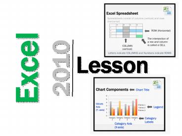
Excel Spreadsheet
- Spreadsheets consist of columns (vertical) and
rows (horizontal)
A B C D
1
2
3
4
ROW (Horizontal)
The intersection of a row and column is called a
CELL
COLUMN (vertical)
Letters indicate COLUMNS and Numbers indicate ROWS
5
Excel CHARTS
- Charts are used to present information so that it
can be quickly and easily understood - Bar and Column Charts
- Show values of data and allow comparison between
categories - Pie Charts
- Show values of data and allow comparison to the
whole - The area of each slice represents the fraction of
the whole - Line Charts
- Show the relationship between values
- They can be used to show the rate of change
6
Types of Charts
- Column or Bar Graph
Line Graph
Pie Graph
7
Chart Components
Chart Title
Values Axis (Yaxis)
- Legend
Category Labels
Category Axis (X-axis)
8
Bike Sales(Creating a chart)
Excel 2010 Mac version instructions. For Excel
2010 (Microsoft PC version) refer to next slide.
- Steps
- Enter this data into Excel
- Select all of the 8 cells
- Select the Charts Tab along the top toolbar
- Select Line Graph
- Excel will create the graph below
- Edit the title by clicking on it and type in Bike
Sales
Month Sales
June 150
July 76
August 43
9
Excel 2010 Microsoft PC version Instructions
- Highlight the 3 Numbers
- Select Insert Line
- Excel will create a Line (graph)
The next 3 slides will explore several features
in Chart Tools
10
Chart Tools - Design
Change Chart Type, Switch Row/Column and change
Styles
11
Chart Tools - Layout
Change/Add Chart Titles, Axis Titles, Legend and
Data Labels
12
Chart Tools - Format
Format Fill, Line and Text styles and colors on
the graph
13
Excel Tip 1
- If you need to graph data from 2 columns that are
not directly beside each other use this tip - Highlight the data in the first column
- Hold down the Ctrl button
- While holding down the Ctrl button, highlight the
data in the other column - Select Insert and choose the type of chart you
would like to create - Refer to the following slide to see a screen shot
using this tip
14
To select data from these 2 columns hold down
Ctrl
Excel Tip 1
15
Creating a Bar, Line and Pie Graph
BestBuy Sales
January February March
iPad 70 120 90
iPhone 130 90 60
Laptop Computer 15 22 28
Video Game 60 30 10
Cell phone 52 40 20
- Type the above information into Excel
- Make a Bar Graph of iPad Sales
- Make a Line Graph of Laptop Computer Sales
- Make a Pie Graph representing all devices sold in
March
16
BestBuy Sales Marking SchemeCreating Bar, Line
and Pie Graph
Category Marks
Accuracy of Information into Excel /5
Bar Graph of iPad Sales /5
Line Graph of Laptop Computer Sales /5
Pie Graph (add devices sold in March) /5
TOTAL /20
17
Adding up numbers in cells
- Steps
- Select the cells you want to add
- Select Formulas from the top toolbar
- Select AutoSum
- Select SUM
- Excel will add the numbers in the cells and
display the total in the appropriate cell - Note you can also choose Average, Max or Min
under AutoSum
Craves Candy Company
Monday Tuesday Wednesday
Truffles 4 6 3
Fudge 2 2 1
Candy 6 5 9
Chocolate Bars 9 8 9
Cookies 6 6 7
Task Type the above information into Excel and
practice adding up the total number of sales for
each day
18
SUM, AVG, MAX, MIN
SUM Adds all numbers in a range of cells
AVG Calculates the Average of all numbers in a range of cells
MAX Gives the Largest number in the range of cells
MIN Gives the Smallest number in the range of cells
19
Go to www.espn.com Click on NFL Click on
StandingFill in the Table BelowNote PF
Points For PA Points Against
WINS LOSSES PF PA
Baltimore
Buffalo
Chicago
Dallas
Green Bay
Miami
Pittsburgh
San Diego
Seattle
Tampa Bay
20
Graphing the NFL Data
- Step 1 - take the data from your table and type
it into a spreadsheet program such as Excel or
Quattro Pro. - Step 2 Make a Bar graph showing the wins for
each team. - Step 3 Make a Line graph showing PF (Points
For) for each team. - Step 4 Make a Pie Graph showing Green Bays
wins and losses.
21
Instructions for Adding Wins and Losses to Pie
Chart
- 1. Click on the Chart that you made of Green Bays
wins and losses2. Click Select Data (Chart
Tools/Design)3. In Horizontal Axis Labels,
highlight the "1"4. Click Edit5. Highlight the
2 cells that have Wins and Losses. (DON'T just
highlight Wins and try to change each one at a
time because it will delete the "2" and leave you
with just one entry)6. Click OK - Wins and
Losses should now appear instead of "1" and "2"
22
NFL Spreadsheet Marking SchemeCreating Bar,
Line and Pie Graph
Category Marks
Accuracy of Information in Excel /5
Bar Graph showing wins for each team /5
Line Graph showing PF each team /5
Pie Graph showing Green Bays Wins and Losses /5
TOTAL /20
23
Adding numbers in cells
Type this formula into cell C7 to add cells C4,
C5 and C6 sum(C4,C5,C6) then press the enter key
24
Finding MAX, MIN and AVERAGE
To find the max, min and average of cells C4, C5
and C6 use these formulas max(C4,C5,C6) min(C
4,C5,C6) avg(C4,C5,C6)
25
Finding MAX, MIN and AVERAGE
Task In cell C7 put the formula to find the
maximum number in the range of the 3 numbers In
cell C8 put the formula to find the minimum
number in the range of 3 numbers In cell C9 put
the formula to find the average of the 3 numbers.
26
Thanksgiving Meal
In Microsoft Excel, complete the following Step
1 Type your Full Name in cell A1 Step 2
Complete the following A. In B3 and C3 enter the
names of two people. (one per cell) (1 mark) B.
In cells A5, A6 and A7 list three items they ate
for Thanksgiving dinner. (2 marks) C. In the
appropriate cells, enter numbers for how many
helpings of each food each person ate.(2 marks)
Pretend they can eat a lot D. Make a Column
Graph to represent the helpings of each food the
1st person ate. Properly title and label this
graph. (3 marks) F. Make a Pie Graph
representing the helpings of each food the 2nd
person ate. Remember to properly title and label
this graph. (3 marks) G. In the appropriate
cells, use a formula to find the total number of
helpings for each person. (4 marks) Hint you
will be creating a formula for each person. Save
as Thanksgiving Excel yourname
27
Student Exemplar
28
Halloween Treats
In Microsoft Excel, complete the following A. In
B3 and C3 enter the names of two people. (one per
cell) (1 mark) B. In cells A5, A6 and A7 list
three types of treats that these people got
trick-or-treating. (2 marks) C. In the
appropriate cells, enter numbers for how many
treats each person received Halloween night.(2
marks) D. Make a Bar Graph to represent the
treats the 1st person received. Properly title
and label this graph. (3 marks) E. Make a Line
Graph comparing the number of each treat received
by each person. Remember to properly title and
label this graph. (3 marks) F. Make a Pie Graph
representing the treats the 2nd person received.
Remember to properly title and label this graph.
(3 marks) G. In the appropriate cells, use a
formula to find the total number of treats for
each person. (4 marks)
29
Halloween Treats Solution
30
Specializing in PowerPoint presentations that
share cutting edge technology and examine
revolutionary businesses
Link to store http//www.teacherspayteachers.com/S
tore/Gavin-Middleton
31
Thank you for downloading this PowerPoint
- I hope that you and your students enjoyed it!
- If you provide Positive Feedback and Follow Me, I
will send you a Free Lesson of your choice (4 or
less value). - E-mail me at gavin_at_eastdalebusiness.com to
receive your free PowerPoint. - Could you please let me know how you discovered
my store in your email - Teachers Pay Teachers Search
- Google Search
- Flyer Mailed To My School
- TPT Newsletter (December 2012)
- Other (please specify)
- To view or purchase more materials here is a link
to my store - http//www.teacherspayteachers.com/store/gavin-mid
dleton
Recommended
