
Understanding tables PowerPoint PPT Presentation
1 / 10
Title: Understanding tables
1
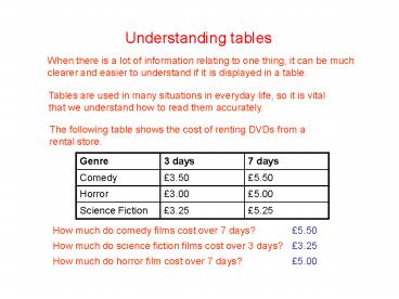
Understanding tables
When there is a lot of information relating to
one thing, it can be much clearer and easier to
understand if it is displayed in a table.
Tables are used in many situations in everyday
life, so it is vital that we understand how to
read them accurately.
The following table shows the cost of renting
DVDs from a rental store.
Genre 3 days 7 days
Comedy 3.50 5.50
Horror 3.00 5.00
Science Fiction 3.25 5.25
How much do comedy films cost over 7 days? 5.50
How much do science fiction films cost over 3
days? 3.25
How much do horror film cost over 7 days? 5.00
2
Understanding tables
Here is a copy of Gerrys school timetable.
English
What does Gerry have at 11.30 on Thursday?
How many periods of swimming does Gerry have?
2
What class is Gerry in at 12.30 on Friday?
RE
3
Understanding tables
The following table shows the cost of buying a
holiday from a travel agent.
Destination 7 Days 10 Days 14 Days
Ibiza 345 400 415
Majorca 360 410 430
Canary Islands 375 430 450
410
How much does 10 days in Majorca cost?
How much does 7 days in the Canary Islands cost?
375
Stephen spent 450 on his holiday. Where did he
go and for how long did he go for?
14 days in the Canary Islands
Now try questions 14 in your booklet.
4
Pictographs
It is also possible to show information by using
pictures in a pictograph.
Each pictograph has a key which lets you know
what the value of each picture is.
This pictograph shows the favourite sports of a
class in 4th year.
4
How many people like basketball?
7
How many people like football?
How many people like rugby and swimming in total?
5
5
Pictographs
This pictograph shows the number of customers per
week at the fruit and veg shop since it opened in
2007
Year Number of customers
2007
2008
2009
Key 100 people
200
How many people visited in 2007?
400
How many people visited in 2008?
How many people visited in 2009?
650
Now try questions 5 and 6 in your booklet.
6
Bar Graphs
A bar graph is another way of showing information
in a clear and tidy way. This one shows the
favourite TV shows of a group of students.
EastEnders
What is the most popular show?
How many more people prefer Family Guy to Lost?
5
How many fewer people prefer Lost to 24?
3
7
Bar Graphs
This bar graph shows the favourite types of fruit
among a group of students.
15
How many people like bananas?
How many more people like bananas than like
apples?
1
17
How many people like apples and oranges?
Now try questions 7 and 8 in your booklet.
8
Line graphs
Another way to display information in a clear way
is to use a line graph. This one shows the
maximum temperature in Glasgow over 1 week in
June.
Friday
What was the warmest day?
How much warmer was it on Friday than on
Wednesday?
5 degrees
What was the temperature on Sunday?
17 degrees
9
Scattergraphs
Scattergraphs are very useful when comparing two
sets of data. This scattergraph shows the scores
of a class in maths and English.
Now try questions 9 and 10 in your booklet.
Maths 50 English 40
What scores did Rab get?
Maths 80 English 90
What scores did Jon get?
How much higher was Jans maths score than her
English score?
30
10
Test yourself
You are now ready to tackle the end-of-topic test
in your booklet.
GOOD LUCK!!
Recommended
