
Bar Chart PowerPoint PPT Presentation
Title: Bar Chart
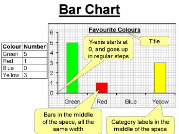
1
Bar Chart
Title
Y-axis starts at 0, and goes up in regular steps
Bars in the middle of the space, all the same
width
Category labels in the middle of the space
2
Pie Chart
Category labels with a key.
Title
Categories are in proportion
The angles must be worked out by dividing by the
total and multiplying by 360
3
Scattergraph
Title
Both axes start at 0, and go up in regular steps
Points marked with a x and a line of best fit
drawn
Axes both labelled
Axes both labelled
Numbers on the lines
4
Line Graph
Points joined up with straight lines
Continuous scale (usually time)
5
Bar, Pie or Line?
Best at comparing categories to the whole.
Best at comparing categories to each other.
Best at demonstrating trends over time.
6
Bar, Pie or Line?
Profits made by different branches of Tesco
Achievement in school during Key Stage 3
Favourite flavour of milkshake
7
Types of Graph
- Pie Chart Compares the size of each category
with the total. - Bar Chart Compares categories with each other.
- Frequency Diagram Like a bar chart, but for
continuous data. - Line Graph Plots data over time to display an
ongoing trend. - Scatter Graph Uses bivariate data (two pieces
of linked data) to determine any correlation.
Recommended
