
Stem and Leaf Diagram PowerPoint PPT Presentation
1 / 37
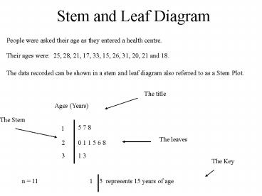
Title: Stem and Leaf Diagram
1
Stem and Leaf Diagram
People were asked their age as they entered a
health centre.
Their ages were 25, 28, 21, 17, 33, 15, 26, 31,
20, 21 and 18.
The data recorded can be shown in a stem and leaf
diagram also referred to as a Stem Plot.
The title
Ages (Years)
The Stem
5 7 8
1
The leaves
2
0 1 1 5 6 8
3
1 3
The Key
n 11
1 5 represents 15 years of age
2
- The figures on the left of the line form the
stem. - Each figure on the right is called a leaf.
- The leaves increase in value outwards from the
stem. - Each row is called a level.
- A title is needed at the top.
- A key is needed at the bottom.
A stem and leaf diagram is easier to produce if
you order the data first.
3
Exercise GS1 on page G3.
4
Back to back stem and leaf diagram
Sometimes you want to compare one set of figures
with another.
A back to back stem and leaf diagram is useful
The 2 level can be read as last week there was
an opening when 23 books were borrowed and this
week there were openings with 20 and 21 books
borrowed. The library opens 10 times a week.
5
Exercise GS2 on page G5
6
Frequency Tables
The receptionist at a vets surgery notes the
types of animals as they are brought in.
Dog Cat Bird Fish Dog Dog Cat
Cat Cat Cat Dog Cat Bird Cat
Bird Cat Cat Dog Dog Cat Bird
Dog Dog Cat Cat Bird Fish Cat
Type Tally Frequency
DOG IIII III 8
CAT IIII IIII III 13
BIRD IIII 5
FISH II 2
This kind of table is referred to as a frequency
table.
She decides to sort the data onto a table.
7
Exercise GS3 Page G6
8
Constructing A Pie Chart
Geologists carry out a survey on rocks. Here are
their results.
9
1200
1800
10
Limestone
Granite
Sandstone
11
Exercise CS1 Page C3
12
Cumulative Frequency
Age Frequency Cumulative Frequency
1 1 1
2 1 2
3 3 5
4 7 12
5 12 24
6 8 32
7 4 36
8 2 38
9 1 39
10 1 40
The cumulative frequency of age 5 is 24
This can be interpreted as 24 people in the
sample aged 5 or less.
13
Exercise CS2 on page C4
14
Cumulative Frequency Diagram
60 Patients are around 25 Years old
15
Exercise CS3 on page C6
16
Dotplots
It is sometimes useful to get a feel for the
location of a data set on a number line. One
way to do this is to construct a dotplot.
A group of athletes are timed in a 100m sprint.
Their times are 10.8, 10.9, 11.2, 11.5,
11.6, 11.6, 11.6, 11.9, 12.2, 12.2, 12.8.
17
Exercise CS4 on Page C8
18
The Five Figure Summary
When a list of numbers is put in order it can be
summarised by quoting five figures.
- The highest number (H)
- The lowest number (L)
- The Median (Q2). This number halves the list
and does not belong in either half.
- The upper quartile (Q3). The median of the upper
half.
- The lower quartile (Q1). The median of the lower
half.
19
Give a five figure summary of the following
data. 3 5 6 6 7 8 8 8 9 10 11
L
H
Q2
Q1
Q3
L 3 Q1 6 Q2 8 Q3 9 H 11
20
Give a five figure summary of the following
data. 3 5 6 6 7 8 8 9 10 11
L
H
Q2
Q1
Q3
L 3 Q1 6 Q2 ( 7 8 ) ? 2 7.5 Q3 9 H
11
21
Give a five figure summary of the following
data. 3 5 6 6 7 8 9 10 11
L
H
Q2
Q1
Q3
L 3 Q1 ( 5 6 ) ? 2 5.5 Q2 7 Q3 ( 9
10 ) ? 2 9.5 H 11
22
Exercise CS5 on page C10
23
Boxplots
The five figure summary can be illustrated using
a boxplot
A boxplot is drawn to a suitable scale and
displays the five figure summary as follows.
H
Q3
Q2
Q1
L
A suitable scale
24
Example. Lowest score 12 highest score 97
Q1 32, Q2 49, Q3 66. For an exam out of
100, the boxplot is
Note that 25 of the candidates got between 12
and 32 (lower Whisker) 50 of the candidates
got between 32 and 66 (in the box) 25 of the
candidates got between 66 and 97 (upper whisker)
25
Exercise CS6 on page C11
26
Comparing Distributions
When comparing distributions it is useful to
consider two things
- The typical score (the mean, the mode or the
median)
- The spread of the marks (the range can be useful,
but more often the interquartile range or
semi-interquartile range is used)
27
Boxplots can be used to help compare
distributions.
January
June
Comparison of exam results by the same class.
On average the June results are better since the
median is higher. But scores tended to be more
variable. (larger interquartile range)
Note that the longer the box, the greater the
interquartile range and hence the variability.
28
Exercise CS7 on page C13.
29
Calculating the Quartiles
To find the quartiles of an ordered list we
consider its length.
30
a) Where are the quartiles in a data list of 24
numbers.
24 numbers can be divided into 2 equal groups of
12 numbers.
The median will be between the 12th and 13th
numbers
The lower quartile will be between the 6th and
7th numbers
The upper quartile will be between the 18th and
19th numbers
31
b) Where are the quartiles in a data list of 25
numbers.
25 numbers can be divided into 2 equal groups of
12 numbers.
The median will be the 13th number
The lower quartile will be between the 6th and
7th numbers
The upper quartile will be between the 19th and
20th numbers
32
c) Where are the quartiles in a data list of 26
numbers.
26 numbers can be divided into 2 equal groups of
13 numbers.
The median will be between the 13th and 14th
numbers
The lower quartile will be the 7th number
The upper quartile will be the 20th number
33
d) Where are the quartiles in a data list of 27
numbers.
27 numbers can be divided into 2 equal groups of
13 numbers.
The median will be the 14th number
The lower quartile will be the 7th number
The upper quartile will be the 21st number
34
Exercise CS8 on page C14
35
Using a Cumulative Frequency Column
The frequency table shows the length of
commercial breaks in minutes, broadcast on a TV
channel one evening. Calculate the median and
the quartiles of these times.
Cumulative Frequency
1
5
10
18
22
Time (min) Frequency
1 1
2 4
3 5
4 8
5 4
Data list is 22 numbers long
By adding a cumulative frequency column we can
see the total data list
36
Time (min) Frequency
1 1
2 4
3 5
4 8
5 4
Cumulative Frequency
1
5
10
18
22
6th number is here
11th and 12th numbers are here
17th number is here
22 numbers can be split into two equal groups of
11
4 mins
4 mins
Q2
Q3
3 mins
Q1
37
Exercise CS9 on page C16
Recommended
