Responsive Design Solution PowerPoint PPT Presentation
Title: Responsive Design Solution
1
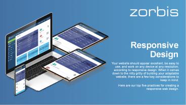
Responsive Design
- Your website should appear excellent, be easy to
use, and work on any device at any resolution,
according to responsive design. When it comes
down to the nitty gritty of building your
adaptable website, there are a few key
considerations to keep in mind. - Here are our top five practices for creating a
responsive web design.
2
Fluid vs. Responsive Layouts
- When it comes to mobile-first design, the terms
responsive design and fluid design are frequently
used interchangeably, although they are not
interchangeable. As previously said, responsive
design use fixed pixel units to specify the
breakpoints at which the UI's content adjusts to
scale upwards or downwards. Fluid design, on the
other hand, uses percentages to scale content
dependent on the size of the screen you're using. - We prefer responsive design over fluid design for
a design that adapts to the greatest user
experience possible or if you're creating for
many screens.
3
Include at Least Three Breakpoints in Your Design
- Breakpoints are points in a website's CSS that
change how information looks at various screen
resolutions. In responsive design, min-width and
max-width values relate to the minimum and
maximum width of pixels across a screen or for
elements, respectively. - Breakpoints are often divided down for mobile
devices, tablets, and desktop views, though you
can have more to cover all bases and increase
device flexibility.
4
Begin with Min- Width Breakpoints
- Each breakpoint in your responsive web design
will have a min-width and a max-width, as we
explained earlier. A solid rule of thumb when
designing with the mobile-first strategy, which
is encouraged, is to start creating from each
min-width of your three breakpoints. - This manner, you may build screens for smaller
devices first, and then add additional content
and UI features as the screens become larger.
Remember that scaling upwards is usually easier
than scaling downwards.
5
Make Content A Priority
- Responsive design is all about content. Assuming
you're following the recommended mobile-first
strategy, this implies you should prioritize
critical information for mobile and add more as
the screen size grows. - Hiding stuff and displaying it only when needed
can help to ensure a consistent user experience.
However, there are occasions when you only need a
particular amount of content on a website, so
employing collapsible and expandable menus can
help you out.
6
Pay Attention To Buttons
- When it comes to responsive design, button design
is crucial. On a desktop, a button may be simple
to click, especially with the aid of a mouse.
What about a tablet, though? Or how about a cell
phone? The finger lacks the fine precision of a
mouse. - This category also includes links and other
clickable sections. If the click area is too
small, your users may become frustrated.
According to Apple's Human Interface Guidelines,
the average finger tap is 4444 pixels. Allow
consumers to be accommodated by making sure your
buttons and clickable spaces are well suited for
this average for greater usability.
7
The Conclusion
- Responsive design is a very versatile design
technique. There are many different ways to show
content, and part of the joy of UX design is
figuring out how to convey that content in a way
that isn't discriminatory based on the device.
The limits may make you feel confined at first,
but responsive design is all about creating magic
within those constraints. - Zorbis is a professional web design company that
will create a flawless website based on your
specifications and provide critical functions.
Get in touch with us right away!
Dont get late now! Visit us today at
https//www.zorbis.com/

