
Beach Photo Analysis PowerPoint PPT Presentation
Title: Beach Photo Analysis
1
(No Transcript)
2
Photography Terms to Consider. . .
- Lighting
- Focus
- Macro shots
- Full body shots
- Negative and Positive Spacing
- Composition
- Rule of Thirds
- Rembrandt Photography
- Texture
- Curved Lines
- Vertical Lines
- Horizontal Lines
- Tones Darkest to Lightest
- Depth of Field
- Colour
- Framing
- Balance
- Contrast
- Line and Perspective
3
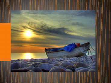
EXPLANATION
- The Rule of Thirds brings into focus the part of
the picture that is mostly important or vital.
For example in this photo, the boats edge and
part of the sky will be in the centre of the
division, the sky is the main backdrop of the
picture so it is important that it is in sync
with the boat. It helps to bring the subject into
focus. I would conclude that this was taken from
a low angle because the rocks are visible leading
up to the side of the boat, this picture is
expertly composed because it is slightly
difficult to say if positive or negative spacing
has been applied. I would deduce that both types
of spacing have been used. The sun and the clouds
have been included to fill out the endless space
of the sky, instead of just taking a plain part
of it, the ocean is reflecting the sun and I
think it unifies the sky and the sea in a way. - The irregular and rhythmic interruption of the
rocks provide a perfect layout for the white
boat, because the viewers eyes travel all over
the picture, taking in every angle and line.
Another thing I have picked up in this picture is
the angle of the boat it is slightly tilted
almost as if it was hastily dragged there. The
blue material leaning out looks like it has been
dropped there not necessarily arranged or kept.
It is a coherent arrangement because there are
different things leading to the fact that the
composition is not intended to be perfect. - I like the use of warm and cool colours yellow
and orange are sharp and attractive and it puts
the sun and the sea in the lightest tone range.
Automatically the positioning of the boat places
in the darker part of the picture and it pushes
it into an easy viewing range, rocks are hard and
cold and the way that they are excluded from the
suns rays helps to bring out how it must feel
like to hold one. Additionally this image is
framed in an L shape as it efficiently displays
different sides of the photo without partiality
to important details. In simpler words the
elements are framed centrally so it is not
difficult to take in.
4
What do you notice? ? ?
- The picture is L shaped and the golden section
brings more of the sky into focus. - The photo is taken from a long shot and it is low
angled.
Recommended
