
PowerPoint Etiquette PowerPoint PPT Presentation
1 / 67
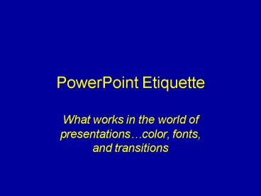
Title: PowerPoint Etiquette
1
PowerPoint Etiquette
- What works in the world of presentationscolor,
fonts, and transitions
2
Created by Kathy SchrockAdministrator for
TechnologyNauset Public SchoolsOrleans MA
- Based on research in
- the area of visual design
3
Introduction to color
4
Colors per slide
- No more than four colors per slide
- Too busy if use more
- Viewers dont know why you are using color
- The viewers dont know what is important and
highlighted if you use lots of colors
5
Colors per slide
- No more than four colors per slide
- Too busy if use more
- Viewers dont know why you are using color
- The viewers dont know what is important and
highlighted if you use lots of colors
6
Colors for type and background
7
Colors to use
- Light yellow on a blue background
- White on a black background
- Black on a light yellow background
- Black on a white background may be too bright
8
Colors to use
- Light yellow on a blue background
- White on a black background
- Black on a light yellow background
- Black on a white background may be
- too bright
9
Colors to use
- Light yellow on a blue background
- White on a black background
- Black on a light yellow background
- Black on a white background may be
- too bright
10
Colors to use
- Light yellow on a blue background
- White on a black background
- Black on a light yellow background
- Black on a white background may be
- too bright
11
Other color information
12
Other color information
- Dont use red for text
- It is hard to see and read
13
Other color information
- Avoid red on a green background
- Colorblind viewers will have difficulty
14
Other color information
- For gradients, think earth to sky
- Darker colors on bottom and lighter on top
15
Other color information
- Red backgrounds stimulate emotion
- Use burgundy instead
16
Other color information
- Red backgrounds stimulate emotion
- Use burgundy instead
17
Other color information
- Green backgrounds make the viewer feel
involvement with the topic
18
Other color information
- Gray backgrounds make the viewer feel that the
information shows a lack of commitment or
neutrality
19
Other color information
- Blue backgrounds indicate a calm, conservative
message
20
Other color information
- Yellow backgrounds indicate hope for the future
and cheerfulness
21
Other color information
- Purple backgrounds give the feeling of fantasy or
are perceived as child-like - Save purple for the lighter topics
22
Other color information
- Brown backgrounds are perceived as the
presentation of passive information - Viewers feel that information on brown
backgrounds is less stable
23
Other color information
- Black backgrounds indicate power and
sophistication - Ideal for presenting information that the
audience has no choice but to accept - fixed budget figures
- student enrollment
24
Information about fonts
25
Information about fonts
- Type can express moods and emotions
as well as images can - Type can be serious and business-like
- Type can be relaxed and open
- Dont let the typeface contradict your message
- No more than 3 fonts in no more than 4 sizes
during a presentation
26
Font details Serif fonts
- Serif fonts
- tiny horizontal or vertical lines at the ends
of longer line strokes - The serifs help the eye move across the text
- Good for large blocks of text
- Examples of serif fonts
- Bookman
- Garamond
- Times New Roman
27
Font details Sans-serif fonts
- Sans-serif fonts
- NO tiny horizontal or vertical lines at the
ends of longer line strokes - Simple strokes of equal weight and thickness
- Good for headlines but not lots of text
- Examples of serif fonts
- Arial
- Comic Sans
- Eras Medium
28
Fonts can express a mood
- Comic sans is a gentle font
- BettysHand is very relaxed
- Diner makes you think of the 1950s
- Tinkertoy is a good elementary font
- Schools often use the Kids font
- Century Schoolbook is a formal font
- Dont let the font become distracting!
29
Fonts can be congruent with the theme
30
How much text
- Use the general 6x6 rule
- No more than six words across
- No more than six bullet points
- Words are considered markers
- Text needs to include keywords only
31
HOW ABOUT CAPITAL LETTERS?
- Make limited use of all capital letters
- Our eyes need to capture the shapes of the
letters above and below the line - Words in all capital letters have nearly the same
visual shape - What does this say.
32
IUMRING TO GQNGIUSIOQNS
33
IUMRING TO GQNGIUSIOQNS
34
Information on transitions
35
Information about transitions
- Good transitions can
- Help tie your presentation together
- Make it flow smoothly between ideas
- Signal important ideas to get the audiences
attention
36
Technical aspects of transitions
- Transition effects can be used with images,
tables, charts, and graphs - Can add movement to
- slices of a pie chart
- bars in a bar chart
- rows in a table
- levels in an organization chart
37
Types of transitions
38
Blinds
- The new slide is unveiled in a series of
horizontal or vertical rows, similar to the
effect of opening the blinds of a window
39
Boxes
- The new slide "grows" from the middle of the
previous slide, or grows inward from the edges of
the screen
40
Checkerboards
- The new slide appears over the previous slide as
a series of boxes
41
Dissolves
- An advanced case of checkerboards, where the new
screen is unveiled in numerous small boxes or
other graphic elements
42
Wipes
- The new slide replaces the previous slide from
left to right, top to bottom, or diagonally
43
Flash bulb
- Slide title flashes to get the audiences
attention
44
Splits
- The new slide expands horizontally or vertically
from the center of the screen
45
Fade in and dim
- Points in a text chart are highlighted one point
at a time - This prevents your audience from reading ahead of
you - Focuses their attention on the point you're
discussing - Dims previously introduced points
46
Using a transition in a diagram
47
Choosing the right transition
- Should be based on
- your message
- your audience
- the computer hardware
- the length of the presentation
48
Tips for transitions
- Your transitions should reflect the basic feeling
of your presentation - Consider the formality of your presentation and
the expectations of your audience - Remember that it takes a more powerful computer
to use transitions
49
Tips for transitions
- It may be annoying when the same transitions are
used over and over - It may be annoying when too many different types
of transitions are used - Use transitions to chunk your information
50
The End
51
Background on transitions
52
Information about transitions
- Good transitions can
- Help tie your presentation together
- Make it flow smoothly between ideas
- Signal important ideas to get the audiences
attention
53
Technical aspects of transitions
- Transition effects can be used with images,
tables, charts, and graphs - Can add movement to
- slices of a pie chart
- bars in a bar chart
- rows in a table
- levels in an organization chart
54
Types of transitions
55
Blinds
- The new slide is unveiled in a series of
horizontal or vertical rows, similar to the
effect of opening the blinds of a window
56
Boxes
- The new slide "grows" from the middle of the
previous slide, or grows inward from the edges of
the screen
57
Checkerboards
- The new slide appears over the previous slide as
a series of boxes
58
Dissolves
- An advanced case of checkerboards, where the new
screen is unveiled in numerous small boxes or
other graphic elements
59
Wipes
- The new slide replaces the previous slide from
left to right, top to bottom, or diagonally
60
Flash bulb
- Slide title flashes to get the audiences
attention
61
Splits
- The new slide expands horizontally or vertically
from the center of the screen
62
Fade in and dim
- Points in a text chart are highlighted one point
at a time - This prevents your audience from reading ahead of
you - Focuses their attention on the point you're
discussing - Dims previously introduced points
63
Using a transition in a diagram
64
Choosing the right transition
- Should be based on
- your message
- your audience
- the computer hardware
- the length of the presentation
65
Tips for transitions
- Your transitions should reflect the basic feeling
of your presentation - Consider the formality of your presentation and
the expectations of your audience. - Remember that it takes a more powerful computer
to use transitions
66
Tips for transitions
- It may be annoying when the same transitions are
used over and over - It may be annoying when too many different types
of transitions are used - Use transitions to chunk your information
67
The End
Recommended
