
Professional Presentations Design Advice - PowerPoint PPT Presentation
1 / 21
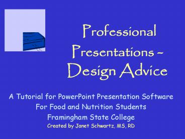
Title:
Professional Presentations Design Advice
Description:
Font Facts. Use no more than two fonts on a . Italics are ... Blues/greens are cool'; reds/oranges are hot' White is perceived as more cheerful than black ... – PowerPoint PPT presentation
Number of Views:94
Avg rating:3.0/5.0
Title: Professional Presentations Design Advice
1
Professional Presentations - Design Advice
- A Tutorial for PowerPoint Presentation Software
- For Food and Nutrition Students
- Framingham State College
- Created by Janet Schwartz, MS, RD
2
Learning Objectives of This Tutorial
You will learn
- basic design principles for presentations
- how to improve the readabilty of PowerPoint
presentations.
3
When creating slides, remember the five golden
rules
- Know thy audience
- Not everything you say in a presentation is
printed on the slide - A picture is worth a thousand words
- Let simple design elements reinforce your ideas.
- KISS Keep It Simple, Silly
4
Font Facts
- Use no more than two fonts on a slide
- Italics are more difficult to read
- Bolding helps at times and sometimes it makes the
font difficult to read. - Choose a clear sans serif font serif
serif - Arial, Berlin Sans, Comic are sans serif (without
tails) - ALL CAPITAL LETTERS ARE MORE DIFFICULT TO READ
5
How to Change Font Size
- To change the font size before you begin to type,
- pull down the font size number on the Formatting
Tool Bar - To change font size after you have typed the text
- highlight the material and then proceed as above.
6
Font Size
- Classroom gt200 seats
- Headings 42 point
- Main Text 36 point
- Classroom lt200 seats
- Headings 36 point
- Main Text 28 point
- Rooms lt50 seats
- Headings 32 point
- Main Text 24 point
- Fonts lt24 are not easily read
Size of the letters vary in different
fonts. Size 24 Comic Size 24 Arial Size 24
Berlin Sans FB
If you are presenting to older people, font size
lt 28 is not easily read on the screen
7
Color Considerations
- For Presentation Slides, dark background with
light letters - Which of these words is easiest to read?
- Color color color color color color
- For Overhead Transparencies, clear background
with vivid colors - Choose a simple color scheme and stay with it
- Colors will appear differently on your computer
and projected on a screen
8
Colors have psychological meaning
- Bright colors project energy pastel colors are
delicate - Blues/greens are cool reds/oranges are hot
- White is perceived as more cheerful than black
- Purple appeals to younger audiences
- Older audiences find neon colors distracting
- Colors have cultural meaning
- Red, white and blue are patriotic in US and
Puerto Rico - Red is a festive color for Asian audiences
- Orange, green, and black appeal to Black
audiences
9
You can set a standard color scheme for all of
your slides at the same time
- Format ? Slide Color Scheme ? Standard Color
Scheme ? Apply to All
10
Custom Color Schemes
- You to change the color of background, title,
text, shadows, accents and fills - View ? Master ? Slide Master ? Format ? Slide
Color Scheme ? Custom - By clicking Apply to All, your color scheme will
be used throughout your presentation unless you
change the colors for an individual slide.
11
Ways to give emphasis
- Magnify the correct way
- Use color for emphasis
- Bold it or underline it
- Draw an arrow and point to it
- Draw a circle around it
- Refrain from exclamation points !!
12
To improve readability
- The first way to improve readability is to
increase the size of the font - The second way to improve readability is to
increase the size of the space between
paragraphs or lines in a bulleted list - Click Text Box ? Format ? Line Spacing ?
Number Before Paragraph
13
Other PP Tips
- Save often
- Keep to one main color and two supporting colors
throughout your presentation - To move a text box or shape a little bit
- highlight the object, click on one of the lines
until you see a cross-hatched double arrow, use
the arrow keys on your keyboard to move the object
14
Center alignment is for titlesLists and text are
left justified
- Wash all fruit
- Peel fruits and vegetables
- Buy organic fruits and vegetables
- Buy domestic plant foods
- Wash all fruit
- Peel fruits and vegetables
- Buy organic fruits and vegetables
- Buy domestic plant foods
15
Titles belong in the text box, not outside
- Cancer-fighting ingredients in this recipe
- Red peppers
- Garlic
- Broccoli
- Walnuts
Cancer-fighting ingredients in this recipe
- Red peppers
- Garlic
- Broccoli
- Walnuts
Group concepts on one line
Framingham State College, Food and Nutrition
Framingham State College Food and Nutrition
16
Keep the message simple and clear Embellish the
ideas in your talk Not everything you say is on
the slide
17
Use boxes, pictures, and white space to balance
your slide
18
Pictures should enhance, not distract
- WIC Adds Life to Your Life
Babies inhale the smoke from your cigarettes
19
Tables help to organize informationwith borders
20
0r without bordersto create vertical columns
with even spacing
Foods Made From Soy
21
Final Words
- When you see a slide, color scheme, picture, or a
design concept you like, remember it, and use it
in your next presentation. - Be creative. Add your personal style to your
presentations.