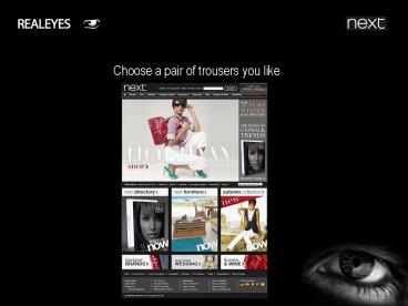
Choose a pair of trousers you like - PowerPoint PPT Presentation
1 / 26
Title:
Choose a pair of trousers you like
Description:
It reveals if attention is drawn to right elements or if people become lost and distracted. ... the participants were asked to rate it in terms of ease of use. ... – PowerPoint PPT presentation
Number of Views:34
Avg rating:3.0/5.0
Title: Choose a pair of trousers you like
1
Choose a pair of trousers you like
2
- TEST DESIGN
3
DEMOGRAPHICS
The demographics of the people who took part in
this study are shown above.
4
HEATMAP
This heatmap shows where the participants focused
most during the test sessions.
5
HEATMAP
Inverted heatmaps display the same information in
the opposite way. They illustrate what people
actually see and what is left out of their visual
focus.
6
SEGMENTED HEATMAP
FEMALE
MALE
This slide compares heatmaps for male and female
participants. The differences in visual
attention between target groups, guide you to
more efficient content allocation on the page.
7
SEGMENTED HEATMAP
UNDER 30
OVER 30
This slide compares heatmaps for older and
younger people. The differences in visual
attention between target groups, guide you to
more efficient content allocation on the page.
8
SEGMENTED HEATMAP
USES INTERNET LESS OFTEN
USES INTERNET MORE OFTEN
This slide compares heatmaps for people according
to their internet usage. The differences in
visual attention between target groups, guide you
to more efficient content allocation on the page.
9
HEATCAST over TIME
Click on text above to start animation
This animation shows in real time how peoples
attention moves across Your media It reveals if
attention is drawn to right elements or if people
become lost and distracted.
10
HEATCAST over INTENSITY
Click on image to start animation
This heatcast shows peoples interaction over
different levels of attention intensity. The
areas that become visible first received most
attention. Areas that remain dark received less
attention. Replay this animation focusing on
different areas to analyze its relative
performance.
11
EASE of USE
After performing the test the participants were
asked to rate it in terms of ease of use. This
graph shows the distribution of this rating.
12
EASE of USE
HARD TO USE
EASY TO USE
This slide compares heatmaps for people who found
the page easy or hard to use. It reveals the
areas causing user frustration (left) and shows
what people found easy to use (right).
13
VIEW to CLICK
Graph above describes the potential to increase
navigation efficiency. Green area shows how much
time it takes people to notice the area
potential to reposition call-to-action Blue bars
above the green area show how much time it takes
to make sense of the area potential to redesign
call-to-action
14
AREA ANALYSIS
The web page was divided into areas described
above. The following describe the performance of
those areas. Please refer back to this slide for
area definitions.
15
- CATCHINESS
- how attractive is an area
- ATTENTION PRODUCTIVITY
- how productive is an area
Catchiness describes how well area captures
attention, relative to its screen space Attention
productivity shows how well received attention
was transformed to mouse clicks
16
CATCHINESS
The blue bars in this graph show the catchiness
scores of these areas The most important
question is whether catchiness scores correspond
to the page business priorities. Are any areas
using up too much attention? Is something
important not performing?
17
ATTENTION PRODUCTIVITY
Attention productivity is shown by the green line
on the graph. The areas are displayed from right
to left in the order of interest/relevance for
the tested people.
18
CATCHINESS TABLE
Catchiness and Attention Productivity are here
displayed in a table format.
19
VISUAL VALUE
How visible is the area How fast people see the
area How long people look at the area How
engaged are people with the area
Visual value of area comprises of 4 key metrics
listed above. Following slides display results
for each metric in this study.
20
VISUAL VALUE
Blue bars on the graph show how quickly people
arrived to different areas. Green visibility line
displays how many participants actually saw the
particular area.
21
VISUAL VALUE
Observation length shows how many seconds users
looked at each area on average.
22
VISUAL VALUE
Average eye fixation length measures engagement
with the area. Longer duration of a single
fixation means more information from that area
was processed by the brain. Engagement can be
either positive (its interesting) or negative
(its hard to understand). Either way, it measures
with which areas people engage with the most
23
VISUAL VALUE
Key visual metrics are then combined into single
value score. The picture above shows how visual
value is distributed across the areas. These
percentages should correspond to the business
importance of the respective areas
24
VISUAL VALUE
This Table shows the key visual metrics are
combined into a single value score. These
percentages should correspond to the business
importance of the respective areas
25
VISUAL VALUE
Allocation of visual value across different
functions of the page is displayed above. This
distribution must be in line with business
priorities of Your media.
26
Thank you! PDF version of this study can be
accessed here All high resolution images can
be accessed here Flash version of this
presentation can be accessed here www.realeyes
.it info_at_realeyes.it


