
Ch4: Displaying Quantitative Data Dealing With a Lot of Numbers - PowerPoint PPT Presentation
1 / 28
Title:
Ch4: Displaying Quantitative Data Dealing With a Lot of Numbers
Description:
... dotplot to the right shows Kentucky Derby winning times, plotting each annual race with a dot. ... Kentucky Derby Winning. Times, 1875-2004. Slide 4- 9 ... – PowerPoint PPT presentation
Number of Views:69
Avg rating:3.0/5.0
Title: Ch4: Displaying Quantitative Data Dealing With a Lot of Numbers
1
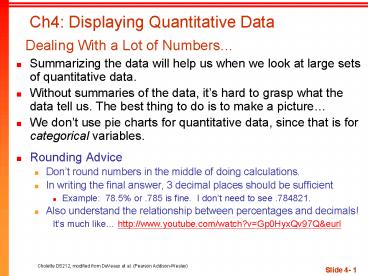
Ch4 Displaying Quantitative Data Dealing
With a Lot of Numbers
- Summarizing the data will help us when we look at
large sets of quantitative data. - Without summaries of the data, its hard to grasp
what the data tell us. The best thing to do is to
make a picture - We dont use pie charts for quantitative data,
since that is for categorical variables. - Rounding Advice
- Dont round numbers in the middle of doing
calculations. - In writing the final answer, 3 decimal places
should be sufficient - Example 78.5 or .785 is fine. I dont need to
see .784821. - Also understand the relationship between
percentages and decimals! - Its much like http//www.youtube.com/watch?vGp0
HyxQv97Qeurl
2
Histograms Displaying the Distribution
- The chapter example discusses the changes in
Enrons stock price from 1997 2001. - First, slice up the entire span of values covered
by the quantitative variable into equal-width
piles called bins. - The bins and the counts in each bin give the
distribution of the quantitative variable.
- Monthly Price Changes in Enron Stock
- A histogram plots the bin counts as the heights
of bars (It looks like a bar chart).
3
Histograms Displaying the Distributionof Price
Changes (cont.)
- A relative frequency histogram displays the
percentage of cases in each bin instead of the
count.
- Relative Frequency Histogram
- Monthly Price Changes in Enron Stock
4
Stem-and-Leaf Displays
- Stem-and-leaf displays show the distribution of a
quantitative variable, like histograms do, while
also preserving the individual values. - Stem-and-leaf displays contain all the
information found in a histogram and, when
carefully drawn, satisfy the area principle and
show the distribution.
5
Constructing a Stem-and-Leaf Display
- First, cut each data value into leading digits
(stems) and trailing digits (leaves). - Use the stems to label the bins.
- Use only one digit for each leafeither round or
truncate the data values to one decimal place
after the stem. - More detail can be obtained by breaking each stem
into 2 lines as has been done here for low and
high 60s, low and high 70s, etc. ( also see Book
Pr 18) - Its easy to learn by doing! (see example)
6
Example
- Construct a Stem and Leaf for the following data
- Using stems of 10K
- Using stems of 5K
- 30-34, 35-39, etc
7
Stem-and-Leaf vs. Histogram
- Compare the histogram and stem-and-leaf display
for the pulse rates of 24 women at a health
clinic. Which graphical display has more info?
Stem-and Leaf Plot Heart Rate for Women at
Health Clinic
8
Dotplots
Kentucky Derby Winning Times, 1875-2004
- A dotplot is a simple display. It just places a
dot along an axis for each case in the data. - The dotplot to the right shows Kentucky Derby
winning times, plotting each annual race with a
dot. - Dotplots can be displayed horizontally or
vertically. - What do you notice about the data in this dotplot?
9
What is the Shape of the Distribution?
Shape, Center, and Spread
- When describing a distribution, make sure to
always tell about three things shape, center,
and spread
- Does the histogram have a single, central hump or
several separated bumps? - Is the histogram symmetric?
- Do any unusual features stick out?
10
Humps and Bumps
- Does the histogram have a single, central hump or
several separated bumps? - Humps in a histogram are called modes.
- A histogram with one main peak is dubbed
unimodal histograms with two peaks are bimodal
histograms with three or more peaks are called
multimodal.
11
Humps and Bumps (cont.)
- A bimodal histogram has two apparent peaks
12
Humps and Bumps (cont.)
- A histogram that doesnt appear to have any mode
and in which all the bars are approximately the
same height is called uniform
13
Symmetry
- Is the histogram symmetric?
- If you can fold the histogram along a vertical
line through the middle and have the edges match
pretty closely, the histogram is symmetric.
14
Symmetry (cont.)
- The (usually) thinner ends of a distribution are
called the tails. If one tail stretches out
farther than the other, the histogram is said to
be skewed to the side of the longer tail. - the blue histogram below is said to be skewed
left, while the pink histogram is said to be
skewed right.
15
Anything Unusual?
- Do any unusual features stick out?
- Sometimes its the unusual features that tell us
something interesting or exciting about the data. - You should always mention any stragglers, or
outliers, that stand off away from the body of
the distribution. - Are there any gaps in the distribution? If so, we
might have data from more than one group.
16
Anything Unusual? (cont.)
- The following histogram has outliersthere are
three cities in the leftmost bar - What do you think is happening?
Histogram People per Housing Unit in Selected
Cities
17
Where is the Center of the Distribution?
- If you had to pick a single number to describe
all the data what would you pick? - Its easy to find the center when a histogram is
unimodal and symmetricits right in the middle. - On the other hand, its not so easy to find the
center of a skewed histogram or a histogram with
more than one mode. - For now, we will eyeball the center of the
distribution. In the next chapter we will find
the center numerically.
18
How Spread Out is the Distribution?
- Variation matters, and Statistics is about
variation. - Are the values of the distribution tightly
clustered around the center or more spread out? - In the next two chapters, we will talk about
spread
Stay Tuned
19
Comparing Distributions
- Often we would like to compare two or more
distributions instead of looking at one
distribution by itself. - When looking at two or more distributions, it is
very important that the histograms have been put
on the same scale. Otherwise, we cannot really
compare the two distributions. - When we compare distributions, we talk about the
shape, center, and spread of each distribution.
20
Comparing Distributions (cont.)
- Compare the following 2 Charts
- What do they have in common
- How do they differ?
- Title Distributions of Ages for Female and
Male Heart Attack Patients
21
Time-plots Order, Please!
- For some data sets, we are interested in how the
data behave over time. In these cases, we
construct time-plots of the data. - What do we notice about Enrons stock over time?
Changes in Price of Enron Stock, 1997-2002
22
Think Before You Draw, Again
- Remember the Make a picture rule?
- Now that we have options for data displays, you
need to Think carefully about which type of
display to make. - Before making a stem-and-leaf display, a
histogram, or a dotplot, check the - Quantitative Data Condition The data are values
of a quantitative variable whose units are known. - Does it make sense to make a histogram of
students in this class as broken down by the last
4 digits of their cel phone numbers? (Bin 1
(0000-0999), Bin2 (1000-1999)) What information
would that tell us?
23
What Can Go Wrong?
- Dont make a histogram of a categorical
variablebar charts or pie charts should be used
for categorical data. - Dont look for shape,
center, and spread
of
a bar chart. - Although they look
- alike, dont confuse
- Histograms
- with Bar Charts
24
What Can Go Wrong? (cont.)
- Dont use bars in every displaysave them for
histograms and bar charts. - Below is a badly drawn timeplot and the proper
histogram entitled Number of Eagles Sighted in a
Collection of Weeks - What does it look like the first graphic tells
us? - What would be the correct way to convey this
information?
25
What Can Go Wrong? (cont.)
- Avoid inconsistent scales, either within the
display or when comparing two displays. - Label clearly so a reader knows what the plot
displays. - Good intentions, bad plot
- At least it has a title
26
What Can Go Wrong? (cont.)
- Y-axis values need to be shown, or at the very
least, all items should be drawn to scale, as
this wonderfully bad USA Today Stats-shot fails
to do.
27
What have we learned?
- Weve learned how to make a picture for
quantitative data to help us see the story the
data have to Tell. - We can display the distribution of quantitative
data with a histogram, stem-and-leaf display, or
dot-plot. - Tell about a distribution (of quantitative data)
by talking about shape, center, spread, and any
unusual features. - We can compare two quantitative distributions by
looking at side-by-side displays (plotted on the
same scale). - Trends in a quantitative variable can be
displayed in a time-plot.
28
Examples
- Its a good idea to think about what a
distribution might look like before we collect
the data. What is your estimate of the
following? - Number of miles run by Saturday morning joggers
in Golden Gate Park? - Hours spent by all US adults watching football on
Thanksgiving Day? - Amount of winnings of all people who bought Lotto
tickets last week? - Ages of SFSU professors?
- Last digit of all SFSU campus extension phone
numbers