
106CR: Designing for Usability PowerPoint PPT Presentation
1 / 21
Title: 106CR: Designing for Usability
1
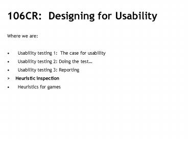
- 106CR Designing for Usability
- Where we are
- Usability testing 1 The case for usability
- Usability testing 2 Doing the test
- Usability testing 3 Reporting
- gt Heuristic inspection
- Heuristics for games
2
- Heuristic evaluation
- Benyon, Turner and Turner. Designing Interactive
Systems. Chapter 12. - ltRECAPgt
3
- Usability
- ISO 9241 (part 11) defines usability as
- The extent to which a product can be used by
specified users to achieve specified goals with
effectiveness, efficiency, and satisfaction in a
specified context of use - we could add learnability to this list.
4
- Effectiveness
- Can you actually do a specified task?
- Efficiency
- Can you do it quickly, without getting bored or
frustrated? - Satisfaction
- Is it fun, or at least pleasant to use?
- Learnability
- Can you use it without constantly reaching for
the manual or asking for help.
5
- heuristic evaluation
- Usability attributes tested effectiveness,
learnability. - Interface inspection and critique by an
interaction expert who has knowledge of the
essential principles and standards of usable
design. - not so good for satisfaction or efficiency)
- Originally proposed by Nielsen and Molich.
6
Heuristic Principles You can find heuristic
principles by Ben Schneiderman Designing the
User Interface Strategies for Effective
Human-Computer Interaction (Addisson-Wesley
1998) Nielsen, J., and Molich, R. Heuristic
evaluation of user interfaces, Proc. ACM CHI'90
Conf. (Seattle, WA, 1-5 April), 249-256. (1990).
Benyon, Turner and Turner. Designing
Interactive Systems. Chapter 12. Jenifer Fleming
Web Navigation Designing the User Experience,
1998
7
- Heuristic Evaluation Process
- usability criteria (heuristics) are chosen
- A design / interface is examined by an expert to
see if these criteria are violated - The expert reports to the designer the perceived
problems and their severity - Heuristic evaluation debugs design should be
used early in design and throughout the process.
It can be used to judge effectiveness of existing
systems.
8
How effective is this method? The number of
usability problems found by heuristic evaluation
is roughly the same as those found by user
testing. HOWEVER User testing is more effective
at finding errors which may severely affect user
performance. As Rolf Molich points out,
heuristics experts can often disagree about which
problems in any interface are significant. The
solution is to use multiple experts and aggregate
findings, Very expensive!!
9
- Schneidermans 8 Golden Rules
- 1. Strive for consistency
- 2. Enable frequent users to use shortcuts
- 3. Offer informative feedback
- 4. Design dialogues to yield closure
- 5. Offer error prevention and simple error
handling - 6. Permit easy reversal of actions
- 7. Support user control
- 8. Reduce short-term memory load
10
- 1 - Be consistent.
- This means not changing design on different pages
of your application or web site. - fonts,
- page layouts,
- action sequences
- terminology (return, enter, button with bendy
arrow!) - Consistent design will aid learnability,
guessability and user comfort. Inconsistent
navigation schemes will confuse users.
11
Consistency
12
Consistent navigation conventions Web pages are
not like books (1) - hyperlinks Hyperlinks are
the universal method of navigating the web. As
everybody has to use them the issue of
consistency is critical. Three of the commonest
methods blue underlined text rollover
graphics bullet style graphic buttons Avoid
these conventions at your peril!
13
- Consistent navigation conventions
- Web pages are not like pages in a book (2) .
- Fact 90 of web users arrive at a web page from
a search engine. They rarely arrive at the home
page. - Make sure pages are free-standing. On every
page you must provide your user with the answer
to two basic questions Where am I? Where do I
go from here? - Provide information on possible routes
- Provide a link to your home page
- Ensure navigation is always available
- Avoid user reliance on browsers back button
- Avoid relative terms like back or top
- Principal vehicle for this is the navigation
bar/panel which comprises a set of buttons
linking different pages of the site. It provides
a key element of visual consistency
14
- Guidelines for navigation panels
- Uses consistent typography
- Uses different colours /groupings to distinguish
one group of buttons from another (e.g. topics
from tools) - Uses rollover techniques and flying tips to
reinforce use and create a sense that the button
is active
15
- 2 - Enable frequent users to use shortcuts.
Provide advanced and shortcut ways for frequent
users to work most efficiently - these are often
called accelerators. - Search engines
- Site-maps
- Pull-down menus
- 7 - Support user control.
- Give experienced users the tools and shortcuts to
be in charge of the system. Make features,
functions, and aids easily available so that
users at all skill levels can find what they need
quickly and easily.
16
3 - Offer informative feedback. For every user
action, there should be system feedback. Keep the
user informed of their position in the sequence
of events and the status of the system. Use the
psychological concept of affordance - buttons
look like they should be pressed, knobs look like
they should be turned, doors look like they
should be opened. Interface objects that visibly
represent changes are highly effective indicators
!
17
4- Design interactions that yield closure
Provide informative feedback as a user moves
through a series of action steps, particularly at
the successful conclusion of an intended act.
18
- Example - the badly designed ATM
- Users goal - to get money
- System sequence
- insert card
- type PIN
- select withdraw cash
- set amount of cash
- take cash
- Goal achieved - walk away
- AAAAARGH I forgot to retrieve card !
- Solution
- Force the user to retrieve the card before
taking the money and achieving the goal.
19
- 5 - Provide error prevention and error
handlingDesign the system so that users cannot
make serious errors. - Dont allow users to come to a dead end - a
web page that has no way back to the last page
used or the home page. - Use JavaScript to validate data entries in web
forms, on the spot. - 6 - Permit easy reversal of actions
- Make provision for and give the user ample
instruction for undoing or retreating from the
error path. Knowing that actions are reversible
relieves anxiety and encourages exploration of
unfamiliar options. - Disabling the browser back button by launching
a link in a new window can be a big mistake!
20
- 8 - Minimise short-term memory load.
- The rule of thumb for memory load is "humans can
remember 7 2 chunks of information." To
accommodate this limitation, keep displays
simple, make options visually apparent, arrange
tasks to be completed in the fewest set of
actions. - Keep bullet lists short
21
Design rules and heuristics Design rules are
very useful in preventing you from making big
mistakes The problem with using design rules is
that they only provide general principles To
REALLY ensure that your web site is well designed
and usable you must Test it with REAL
users Next week Games Heuristics
Recommended
