
Speakers using visual aids: PowerPoint PPT Presentation
Title: Speakers using visual aids:
1
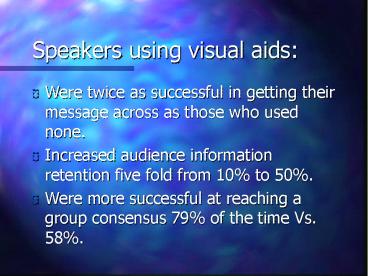
Speakers using visual aids
- Were twice as successful in getting their message
across as those who used none. - Increased audience information retention five
fold from 10 to 50. - Were more successful at reaching a group
consensus 79 of the time Vs. 58.
2
Good design
- Contributes to the effectiveness and usefulness
of the visual aid/document. - Makes the visual aid/document more visually
appealing and more readable. - Involves choosing the most appropriate design
elements. - Produces lively and interesting documents.
- Helps communicates the message.
3
Getting Started
- Ask Questions
- Establish Goals and Objectives
- Establish the Audience
- Purpose
4
Getting Started
- Purpose
- Persuade - press releases, business plans,
posters, flyers - Inform - reports, lab work, newsletters,
instruction - Identify - layout, certificates, labels
- Reference - directories, lists, schedules, event
calendars, lists of books
5
Getting Started
- Ask Questions
- Establish Goals and Objectives
- Establish the Audience
- Purpose
- Information Categories
6
Getting Started
- Information Categories
- Concept What is it?
- Procedures How do I do it?
- Process How is it done?
- Classification What kind / type is it?
- Fact What are the specs?
- Structure How does it look?
7
Getting Started
- Ask Questions
- Establish Goals and Objectives
- Establish the Audience
- Purpose
- Information Categories
- Organizing Information Post-it notes
8
Establishing A Format
- Image
- Constraints
- Appropriateness and Relevance
- Proportion
- Consistency / Variety
- Restraint
- Contrast and Color / White Space
9
Working with Words
- Topography and Font should achieve for the reader
what the voice does for the listener.
10
Working with Words
- Typeface
- Arial, Times, Times Roman
- Font - variations in a typeface
- Palatino, Palatino Italic, Palatino Bold,
- Serif and sans serif
- Point The size of letter
11
Working with Words
- Creating Emphasis with Type Styles
- Italics Bold ALL CAPS
- Alignment
- Left justified has a ragged right edge
- Justified text columns are uniform in spaces
between the words. - Centering good for titles.
12
Punctuation
- Slides dont really require it.Less is more
reduce number of words - Enrollment records show an increase at all the
ACC campuses for the fall. - ACC fall enrollment up
13
Procedures and Guidelines
- Procedures
- 1) Plug in the toaster
- 2) Place the bread slices in the slots
- 3) Push down the spring button
- 4) Wait for the toast to pop up
- 5) Remove the toast
14
Procedures and Guidelines
- Guidelines
- The toast will be light brown when done
- Toast can be eaten at breakfast
- Try spreading toast with jam
- Use some sort of bullet when listing items and
not a hyphen.
15
Use of Images Graphics
- Helps convey the message.
- Supports the message.
- Use text to augment not dominate visual.
- Don't crowd text in a box - let it breathe.
- Line drawings - technical information.
16
Use of Images Graphics
- For complex visuals - show the entire
illustration, - then isolate details. - Simplify visuals.
- Rulers, borders, boxes initial caps, bullets, and
arrows - create strong organization guide the eye
from place to place. - Charts and graphs present data visually.
17
7 Basic Types Graphs and Charts1. Bar graphs2.
Stack Bar 3. Pie charts4. Line graphs5. Area
graphs.6. Flow charts or diagrams7. Scatter
graphs
18
Color with Text
- Use from three to four different colors
- Contrast between backgrounds and text
- Avoid certain color combinations red/green
- Pay attention to the background color.
- Content also dictates how the color will be
interpreted. - Darker colors are perceived as being heavier than
lighter colors.
19
Production NotesDocument Stand Materials
Power Point Slides
- Words - think "Brevity
- Key phrases or important points.
- Less is more and bigger is better.
- As a general rule use a maximum of 6 words
across, 6 lines deep. (/- 2) - Lists at least 3 items no more than 7.
20
Layout
- Use horizontal positioning.
- Choose a Typestyle that is easy to read.
- Highlight important points with a bullet.
- Title/Headline use 24 pt. or 36 pt.
- Text 18 pt. or 24 pt.
- Titles need to appear in the same position.
- Strive for balance, simplicity and diversity.
21
Handouts
- Help augment classroom activities.
- Can provide further in depth information.
- Overheads provide structure to the lecture.
- Provide detail that won't fit on an overhead.
- Should not contain the entire lecture on a single
page.
22
Proofreading
- Check spelling, grammar, punctuation, facts and
figures. - Spell checker - typos and misspelled words.
- Make sure it is write word.
- Omitted, and transposed double words words.
- Have someone else read the materials.
- Check the spelling of people's names.
23
(No Transcript)
Recommended
