
More Examples of Boxplots PowerPoint PPT Presentation
1 / 24
Title: More Examples of Boxplots
1
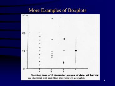
More Examples of Boxplots
2
(No Transcript)
3
(No Transcript)
4
(No Transcript)
5
(No Transcript)
6
(No Transcript)
7
(No Transcript)
8
Quantile Plots
- Quantile plots visually portray the quantiles, or
percentiles (which are quantiles times 100) of
the distribution of sample data. - Percentiles of importance e.g. median, quartiles
are easily discerned from a quantile plot. - With experience, the spread, skewness, as well as
bimodal character, can be examined. - Quantile plots have 3 advantages
- 1. Arbitrary categories are not required, as with
histograms and S and Ls. - 2. All the data are displayed, unlike boxplots.
- 3. Every point has a distinct position, without
overlap.
9
(No Transcript)
10
Construction of a Quantile Plot
- Data of size n are ranked from smallest to
largest. The smallest data value is assigned a
rank i 1. - The data values are plotted along the x-axis
usually. - The y-axis is the plotting position, which is a
function of the rank i and size n. The plotting
position is
11
- As sample sizes increase, the quantile plot will
more closely mimic the underlying population cdf. - Example calculation n 55
- i qi pi
- 1 994.3 0.01
- 2 1263.1 0.03
- . . .
- . . .
- 54 7270.1 0.97
- 55 7730.7 0.99
- Plot pi versus qi.
- Note Other plotting positions are sometimes used
e.g. Hazen, Weibull, Blom, Gringorten, etc.
Cunnanes is a compromise formula.
12
Probability Plots
- One variation of the quantile plot is the
probability plot. - Probability plots are used to determine how well
data fit a theoretical distribution, such as the
normal, lognormal, or Gumbel. - By expressing the theoretical distribution as a
straight line, departures from the distribution
are more easily perceived. This is what occurs
with a probability plot. - Probability plots are thus plots of the quantiles
of sample data versus the quantiles of the
standardized theoretical distribution. - For a quantile plot, plot qi vs. pi.
13
- For a normal probability plot, plot qi vs. zi
where zis are the normal quantiles for a given
pi. - The zis can be obtained from a table of
standard normal distribution or - For comparison it is useful to plot a reference
straight line on the plot. The solid line on the
plot below is the normal distribution which has
the same mean and standard deviation as do the
sample data. - The equation of the line can be obtained by
linear regression between qi and zi. Linearity
is easily checked by degree of correlation
between qi and zi. A table is available to test
for this. - The mean is at zi 0, the standard deviation is
the slope of the line.
14
(No Transcript)
15
- Commercially printed probability paper is often
used for probability plots (by hand). This paper
retransformed the linear scale for zi back into a
nonlinear scale of pi. - Also, probits scale paper are available probit
zi 5. - Probability paper can be easily constructed for
distributions other than the normal and
lognormal. E.g. Gumbel, Weibull, etc. - Normal probability plots can easily be done on
Minitab. It will also test whether the data are
normal. - Minitab can also do other types of probability
plots e.g. Weibull, lognormal, logistic, etc.
16
Deviations From a Linear Pattern
- Indicates data are left or right skewed.
- Indicates outliers present.
- Indicates heavy or thick tailed data.
17
(No Transcript)
18
(No Transcript)
19
(No Transcript)
20
Use of Probability Plots for Obtaining Summary
Statistics for Censored Data - a Robust Method.
- Set all less-thans to slightly different values
all below the reporting limit. - Develop a linear regression equation between qi
and zi using only above-limit observations. - Estimates for the below-limit data are
extrapolated using the regression equation from
zi for the below-limit data. - Extrapolated estimates are used together with
above-limit data to obtain summary statistics of
interest for whole data set.
21
(No Transcript)
22
(No Transcript)
23
Other useful graphical procedures
- X-Y Scatter plots. For looking at whether there
is a relationship or correlation between X and Y.
This plot is very useful in correlation and
regression analysis. - Bubble plots Similar to the simple X-Y scatter
plot, but the size of the bubble now represents
the magnitude of a third variable. E.g. X
Eastings, Y Northings, and Z size of bubble
(mean concentration of a chemical). Bubble plots
are not available in Minitab.
24
Summary
- 1. Reasons for using graphics.
- 2. Advantages and disadvantages of
- Histograms
- Stem and leaf plots
- Dotplots
- Boxplots
- Quantile plots
- Normal probability plots - construction and
testing - Most useful aids are x-y plots, boxplots, and
normal probability plots
Recommended
