
Population%20Pyramids%20a.k.a. - PowerPoint PPT Presentation
Title:
Population%20Pyramids%20a.k.a.
Description:
Population Pyramids a.k.a. Population Diagrams Population Structures Age-Sex Diagrams Age-Sex Structures Age-Sex Pyramids What is a population pyramid? – PowerPoint PPT presentation
Number of Views:140
Avg rating:3.0/5.0
Title: Population%20Pyramids%20a.k.a.
1
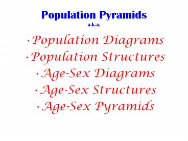
Population Pyramidsa.k.a.
- Population Diagrams
- Population Structures
- Age-Sex Diagrams
- Age-Sex Structures
- Age-Sex Pyramids
2
What is a population pyramid?
- A visual representation of the population of a
country. - graphically display a population's age and gender
composition - show numbers or proportions of males and females
in each age group - show gains of members due to immigration and
birth, and loss of members due to emigration and
death - reflect population growth or decline
3
Interpreting a Population Pyramid
- Remember that a population pyramid is basically a
bar graph turned on its side. Each line is
showing you what percentage of the population is
a certain age. - Examine the title and the type of data presented.
(ex. Age breakup, numbers listed below,
male-female notation.) - True pyramids are developing countries. The
majority of the population is younger and not
many people live to an old age. Developed
countries are more rectangular the population is
spread more equally through the age groups.
4
How to interpret population pyramids
- There main types of pyramids
- Rapid growth
- Slow growth
- Negative growth
Shape of rapid growth
Shape of Slow growth
Shape of negative growth
5
High, Slow Negative Growth
6
Rapid growth
7
Rapid growth pyramids
- Have a large base to show high birth rates
- Amount of people decreases as the ages goes up
indicating a lower standard of living - Associated with developing countries like
- Brazil, Uganda, China
8
Slow Growth
9
Slow growth pyramids
- Take on a more rectangular shape
- Indicates population is remaining fairly steady
- Birth rates and death rates are similar
- Associated with developed countries like the UK,
Germany, Canada
10
Negative growth
11
Negative growth pyramids
- Looks like a reverse pyramid
- Indicates the population of the country is
decreasing - Death rates are higher than birth rates
- Associated with developed countries like
- Austria, Japan, Italy
12
(No Transcript)
13
What does a Baby Boom look like over
time?http//www.nd.edu/dmyers/courses/old/102au0
0/bb.jpg
14
Look at what else one can see in these diagrams
Recommended
CrystalGraphics Presentations


