
How To Optimize Mobile Checkouts With 5 Basic Steps - PowerPoint PPT Presentation
Title:
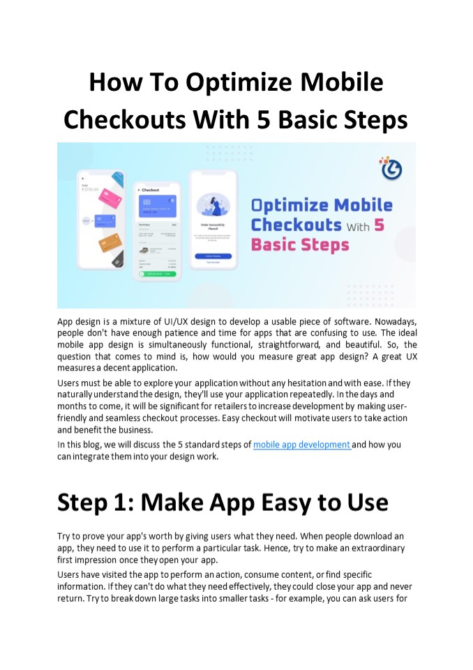
How To Optimize Mobile Checkouts With 5 Basic Steps
Description:
In this blog, we will discuss the 5 standard steps of mobile app development and how you can integrate them into your design work. – PowerPoint PPT presentation
Number of Views:1
Title: How To Optimize Mobile Checkouts With 5 Basic Steps
1
How To Optimize Mobile Checkouts With 5 Basic
Steps
- App design is a mixture of UI/UX design to
develop a usable piece of software. Nowadays,
people don't have enough patience and time for
apps that are confusing to use. The ideal mobile
app design is simultaneously functional,
straightforward, and beautiful. So, the question
that comes to mind is, how would you measure
great app design? A great UX measures a decent
application. - Users must be able to explore your application
without any hesitation and with ease. If they
naturally understand the design, they'll use your
application repeatedly. In the days and months
to come, it will be significant for retailers to
increase development by making user- friendly
and seamless checkout processes. Easy checkout
will motivate users to take action and benefit
the business. - In this blog, we will discuss the 5 standard
steps of mobile app development and how you can
integrate them into your design work. - Step 1 Make App Easy to Use
- Try to prove your app's worth by giving users
what they need. When people download an app,
they need to use it to perform a particular task.
Hence, try to make an extraordinary first
impression once they open your app. - Users have visited the app to perform an action,
consume content, or find specific information.
If they can't do what they need effectively, they
could close your app and never return. Try to
break down large tasks into smaller tasks - for
example, you can ask users for
2
their information simultaneously, yet they'll
find it easier to fill in information over
various steps their delivery address, billing
data, credit card information, and so on. Try to
be more informative keep it crisp and simple so
that users get an idea with one glance at your
app. Step 2 Navigation of Your App Must Be
Predictable Individuals become used to the
designs they experience every day. For example,
they would expect to swipe through pictures
smoothly. Hence, it would help if you stuck to
the shared navigation techniques on the
Internet. Your clients' previous experiences
involving other apps will talk about their
expectations for utilizing all applications,
including yours. Integrate these common examples
into your design to permit them to explore your
app easily. Take suggestions from UX design
patterns and the most well-known designs
utilized today. Users must have the option to
access any part of your application in under
three clicks. Keep the order of your navigation
bar simple and easy. Save users' progress as
users today are easily distracted and busy. They
could close your app to answer an email or watch
another episode of their number one TV show.
Therefore, save their progress so they can return
and complete their job without beginning once
again. Step 3 Have an Extraordinary,
Prioritized, And Clear Page Design Ensure that
the names you decide for products are appealing
and descriptive. For example, a user could find
it difficult to see the difference between
"regular shipping" and "standard shipping." Pick
labels that show the differences between the two
choices. Also, show the main features in the
primary menu and leave all the other things for
the secondary menu. On the other hand, changing
background contrast, font size, and surrounding
whitespace can assist you with diverting users'
attention to the main features of your app. Users
filter visual content in a Z-formed design.
Place your most effective visuals in the areas
where they will probably be seen by the clients,
following the Z-shape design on your website
pages.
3
Step 4 Loading Must Be Well Communicated and
Fast
Users are pretty impatient when waiting for the
application to load completely. Ensure your app
loads quickly to limit any friction. Assuming
your app is loading something, ensure your user
knows it's loading and not broken. Seeing a blank
loading screen could mislead your user to think
that your app doesn't work. Your app must load
parts of the content step-by-step to display
something quickly. Along with this setup, users
can begin utilizing the app immediately,
regardless of whether they have a proper
internet connection. Also, you can use progress
bars or simple loops to show loading progress
however, users are bound to continue to wait if
you make a basic yet engaging loading
animation. Step 5 Optimize Your App for Mobile
and Different Mobile Users If your app will
incorporate a lot of text, ensure that it shows
well on a wide range of screens. Text is much
simpler to understand when each line contains
about 40 characters and not more than that. It
would be best to change the line spacing to give
a clean text representation. If your mobile app
development should consist of visual content like
pictures and videos, ensure your app can be seen
in both - landscape and portrait modes. Also,
while creating a layout for your application,
design properly spaced-out buttons which are
easily clickable. Users must not click something
accidentally that they shouldn't. For example,
put appropriate space between the Next and Back
buttons to keep away from accidental
clicks. Conclusion Designing and developing an
app from scratch is a lot of work, as we have
seen from the principles above. Every detail
needs to be kept in mind while finalizing any
part of the app design. By making your UI/UX
design features as productive as they could be
expected and
4
testing your mobile processes daily, you will
develop a consistent and great experience that
will improve customer loyalty and boost sales. If
users find your products and services useful,
they will return to you, however, with a
confusing checkout cycle, they will go elsewhere.
It's that simple! That means if retailers give
the users a reasonable, engaged, smoothed out,
and lightweight way to make their purchase
while recognizing the benefits and limitations of
a mobile experience mentioned above all
parties will benefit. We at GlanceSys offer the
best UI/UX Design services for websites of
different backgrounds. In significantly less
time, the company has achieved many milestones.
Connect us today to get the best consultation
solutions.
Recommended
CrystalGraphics Presentations


