7 Data visualization best practices you simply can’t ignore - PowerPoint PPT Presentation
Title:
7 Data visualization best practices you simply can’t ignore
Description:
If you don't want your dashboards to be just another piece of art with little information, read on to learn about the data gurus' 7 data visualisation best practises. Dashboards have become ingrained in our daily routines. Data scientists are always trying to come up with new ways to make numerical and quantitative data more interesting and understandable. Unfortunately, a substantial number of images stand out as poor instances of data visualisation. – PowerPoint PPT presentation
Number of Views:81
Title: 7 Data visualization best practices you simply can’t ignore
1
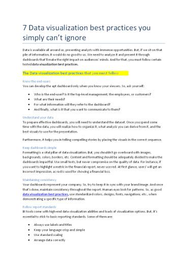
7 Data visualization best practices you simply
cant ignore
Data is available all around us, presenting
analysts with immense opportunities. But, if we
sit on that pile of information, it would do no
good to us. We need to analyze it and present it
through dashboards thatll make the right impact
on audiences minds. And for that, you must
follow certain tested data visualization best
practices.
The Data visualization best practices that you
must follow
- Know the end-users
- You can develop the apt dashboard only when you
know your viewers. So, ask yourself - Who is the end-user? Is it the top-level
management, the employees, or customers? - What are their needs?
- For what information will they refer to the
dashboard? - And finally, what is it that you want to
communicate to them? - Understand your data
- To prepare effective dashboards, you will need to
understand the dataset. Once you spend some - time with the data, you will realize how to
organize it, what analysis you can derive from
it, and the best visuals to use for the
presentation. - Furthermore, it helps you in telling compelling
stories by placing the visuals in the correct
sequence. - Keep dashboards simple
- Formatting is a vital pillar of data
visualization. But, you shouldnt go overboard
with images, - backgrounds, colors, borders, etc. Content and
formatting should be adequately divided to make
the dashboards impactful. Use small texts, but
never compromise on the quality of data. For
instance, if you want to highlight a metric in
the financial report, never use red. At first
glance, users' will get an incorrect impression,
as red is used for showing a financial loss. - Maintaining consistency
- Your dashboards represent your company. So, try
to keep it in sync with your brand image. And
once that's done, maintain consistency
throughout the report. Human eyes look for
patterns. So, as good
2
Avoid cluttering Your visuals should speak before
you. So, try avoiding too much information in one
visual or stuffing one report with too many
charts and graphs. Instead, segregate your data
in small and compelling visuals it'll help you
explain your data better. Stick to designing
principle KISS, i.e., Keep It Simple Stupid, is a
designing principle, which means design your
visuals for a novice. Use colors and elements
which are relevant, and avoid complicated graphs
until necessary.
To Conclude
To sum up the above data visualization best
practices always remember, Simplicity is a
virtue. And a DataViz experts role is to break
down complex information in easy-to-understand
visuals. For more details please visit our
website Address 308, Sonigara Landmark, Near
Chatrapati Chowk, Kaspate Wasti, Wakad, Pune -
411057, Maharashtra, India. 91 81497
61146 Email info_at_sranalytics.io


