
Step 7: Proper Screen-Based Control PowerPoint PPT Presentation
1 / 80
Title: Step 7: Proper Screen-Based Control
1
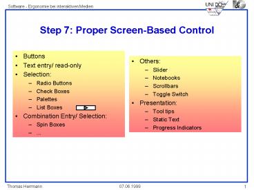
Step 7 Proper Screen-Based Control
- Buttons
- Text entry/ read-only
- Selection
- Radio Buttons
- Check Boxes
- Palettes
- List Boxes
- Combination Entry/ Selection
- Spin Boxes
- ...
- Others
- Slider
- Notebooks
- Scrollbars
- Toggle Switch
- Presentation
- Tool tips
- Static Text
- Progress Indicators
2
Buttons Description and Purpose
- Description
- A square or rectangular-shaped control with a
label inside that indicates action to be
accomplished. - The label may be either text, graphics, or both.
- Graphics can represent an Icon or a symbol.
- Purpose
- To start actions.
- To change properties.
- To display a pop-up menu.
- gt Alles, was sofort passieren soll.
3
Three types of Buttons
- Command buttons
- Bar buttons without labels
- Symbol buttons
4
Structure of Command Buttons
- Structure
- Provide a rectangular shape with the label
inscribed within it. - Maintain consistency in style through an
application.
5
Labels of Command Buttons
- Labels
- Use standard button labels when available.
- Use single-word labels whenever possible.
- Use two-three words for clarity, if necessary.
- Use mixed-case letters with the first letter of
each label word capitalized. - Display labels
- In the regular system font.
- In the same size font.
- Do not number labels.
- Center the label within the button borders
leaving at least two pixels between the text and
the button border. - Provide consistency in button labeling across all
screens.
6
Button size
? Restrict the number of buttons to six for ever
7
Buttons Location and Layout
- Maintain consistency in button location between
windows. - Never simply fit-in buttons in available space.
- If buttons are for exiting the dialog
- Position centered and aligned horizontally at the
bottom. - If buttons are for invoking a dialog feature or
expanding the dialog - Position centered and aligned vertically on the
right side. - If a button has a contingent relationship to
another control - Position adjacent to the related control.
- If a button has a contingent relationship to a
group of controls - Position at the bottom or to right of related
controls to support a logical flow - For exiting and expanding/ invoking feature
buttons, do not - Align with the other screen controls.
- Present displayed within a line border.
- Provide equal and adequate spacing between
adjacent buttons.
8
Organization of Buttons
- Organize standard buttons in the manner
recommended by the platform being used. - For other buttons, organize in common and
customary grouping schemes. - For buttons ordered left to right, place most
frequent actions to the left. - For buttons ordered top to bottom, place most
frequent actions at the top. - Keep related buttons grouped together.
- Separate potentially destructive buttons from
frequently chosen selections. - Buttons found on more than one window should be
consistently positioned. - The orders should never change.
- For mutually exclusive actions, use two buttons,
do not dynamically change the text.
9
Intent Indicators (1)
- When a button causes an action to be immediately
performed - no intent indicator is necessary.
Apply
- When a button leads to a cascading dialog
- Include an ellipsis (...) after the label.
Open...
- When a button leads to a menu
- Include a triangle pointing in the direction the
menu will appear after the label.
Menu gt
10
Intent Indicators (2)
- When a button leads to an expanding dialog
- Include a double arrow (gtgt) with the label
Options gtgt
- When a button contingent relationship to another
control must be indicated - Include a single arrow (-gt) pointing at the
control
lt- Clear
11
Defaults (1)
- Intent
- When a window is first displayed, provide a
default action, if practical. - Selection
- A default should be the most likely action
- A confirmation.
- An application of the activity being performed.
- A positive action such as OK, unless the result
is catastrophic. - If a destructive action is performed (such as
deletion), the default should be CANCEL.
12
Defaults (2)
- Presentation
- Indicate the default action by displaying the
button with a bold or double border. - Procedures
- The default can be changed as the user interacts
with the window. - When the user navigates to a button, it can
temporarily become the default. - Use the ENTER key to activate a default button.
- If another control requires use of the ENTER key,
temporarily disable the default while the focus
is on the other control. - Permit double-clicking on a single selection
control on a window to also carry out the default
command.
13
Buttons - Sonstiges
- Beschleuniger anbieten
- Buttons dürfen beim Scrollen nicht verschwinden
- Ausgewählte Buttons hervorheben
- nicht-verfügbare zurücktreten lassen
- Aktivierte Buttons kennzeichnen
- solche mit Wiederholmöglichkeit besonders
darstellen
14
Buttonbars/ Toolbarssize (1)
- Usage
- To provide easy access to most frequently used
commands or options. - To invoke a sub-application within an
application. - Size
- Button.
- 24 (w) by 22 (h) pixels including border.
- 32 (w) by 30 (h) pixels inculding border.
- Larger buttons can be used on high resolution
displays.
15
Buttonbars/ Toolbarssize (2)
- Label.
- 16 (w) by 16 (h) pixels.
- 14 (w) by 24 (h) pixels.
- Default.
- Provide the smaller size as the default with a
user option to change. - Image
- Center image in button.
16
Organization and Location
- Organization
- Separate potentially destructive buttons from
frequently chosen selections. - Permit user reconfiguration of button
organization. - Location
- Position main features and functions bar
horizontally across top of window just below menu
bar. - Position sub-task and sub-features bars along
sides of window. - Permit the location of the bar to be changed by
the user. - Permit display of the bar to be turned on or off
by the user. - Provide access through standard menus.
IundG Anpassen - Befehle
17
Text Boxes
Proper Usage
- Most useful for data that is
- Unlimited in scope.
- Difficult to categorize.
- Of a variety of different lengths.
- When using a selection list is not possible
18
Selection Controls Radio ButtonsDescription,
Purpose
- Description
- A two-part control consisting of the following
- Small circles, diamonds, or rectangles.
- Choice descriptions.
- When a choice is selected
- The option is highlighted.
- Any existing choice is automatically
un-highlighted and de-selected. - Purpose
- To set one of a small set of mutually exclusive
options (2-8).
IundG Animationsfenster - zeitlicher Ablauf
19
Selection Controls Radio Buttons Advantages/
Disadvantages
- Advantages/ Disadvantages
- Easy to access choices.
- Easy to compare choices.
- Preferred by users.
- - Consume screen space.
- - Limited number of choices.
20
Radio Buttons Proper Usage
- For setting attributes, properties, or values.
- For mutually exclusive choices (i.e., only one
can be selected). - Where adequate screen space is available.
- Most useful for data and choices that are
- Discrete.
- Small and fixed in number.
- Not easily remembered.
- In need of a textual description to meaningfully
describe the alternatives. - Most easily understood when the alternatives may
be seen together and compared to one another. - Never changed in content.
- Do not use
- For commands.
- Singly to indicate the presence or absence of a
state.
IundG Vergleichskonzept - Listbox bei OPEN
21
Radio Buttons
- Defaults, Accelerators and Captions should be
used - also vertical structure and indication of
non-available choices.
IundG Animationsfenster - zeitlicher Ablauf -
Verbessern
22
Check Boxes-Description Purpose
- Description
- A two-part control consisting of
- A square box.
- Choice text.
- Each option acts as a switch and can be either
on or off. - When an option is selected (on), a mark such as
an X or check appears within the square box,
or the box is highlighted in some other manner. - Otherwise the square box is unselected or empty
(off). - Each box can be
- Switched on or off independently.
- Used alone or grouped in sets.
- Purpose
- To set one or more options as either on or off.
23
Check Boxes - Gestaltungshinweise
- Weitgehend analog zu Radio-Buttons
- auch nur eine Check Box kann sinnvoll sein
- Beschreibung der Auswahlmöglichkeiten, Anordnung
und Organisation sind bei Check Boxes und Radio
Buttons gleich - Bei beiden Selektionsmechanismen
- Defaults, nicht verfügbare Optionen und
Beschleuniger beachten
24
Radio-Buttons and Check Boxes - Choice
Description
- Provide meaningful, fully spelled-out choice
descriptions clearly describing the values or
effects set by the radio buttons. - Display in a single line of text.
- Display using mixed-case letters with each
significant word capitalized. - Position descriptions to the right of the button
/ box. Separate by at least one space from the
button. - When a choice is conditionally unavailable for
selection, display choice description grayed or
dimmed. - RADIO BUTTONS Include a NONE choice if it adds
clarity.
25
Structure (1)
- Provide groupings of related check boxes.
- A columnar orientation is the preferred manner of
presentation for multiple related check boxes. - Left-align the check boxes and choice
descriptions. - If vertical space on the screen is limited,
orient the boxes horizontally. - Provide adequate separation between boxes so that
the buttons are associated with the proper
description. - A distance equal to three spaces is usually
sufficient.
26
Structure (2)
- Enclose the boxes in a border to visually
strengthen the relationship they possess.
27
Selection Method and Indication (1)
- Pointing
- The selection target area should be as large as
possible. - Include the check box and the choice description
test. - Highlight the selection choice in some visually
distinctive way when the cursors resting on it
and the choice is available for selection. - This cursor should be as long as the longest
choice description plus one space at each end. Do
no place the cursor over the check box.
IundG Extra- Symbolleiste Zurücksetzen Problem
28
Selection Method and Indication (2)
- Activation
- When a choice is selected, distinguish it
visually from the nonselected choices. - A check box should be filled in, or made to look
depressed, or higher, through use of shadow. - Defaults
- If a check box is displayed which contains a
choice previously selected or default choice,
display the selected choice as set in the control.
29
Check Boxes Mixed value State
- When a check box represents a value, and a
multiple selection encompasses multiple value
occurences set in both the on and off state,
display the check box in a mixed value state. - Fill the check box with another easily
differentiable symbol or pattern. - Toggle the check box as follows
- Selection 1 Set the associated value for all
elements. Fill the check box with an x or
check. - Selection 2 Unset the value for all associated
elements. Blank the check box. - Selection 3 Return all elements to their
original state. Fill the check box with the mixed
value symbol or pattern.
Bold Italic Underline
IundG Zeichen
30
Defaults
- When the control possesses a state or affect that
has been predetermined to have a higher
probability of selection than the others,
designate it as the default and display its
button filled in. - When the control includes choices whose states
cannot be predetermined, display all the buttons
without setting a dot, or in indetermined state. - When a multiple selection includes choices whose
states vary, display the buttons in another
unique manner, or in the mixed value state. - When a control possesses a state or affect that
has been preset, designate it as the default and
display its check box marked.
31
PalettesDescription Purpose
- Description
- A control consisting of a series of graphical
alternatives. The choices themselves are
descriptive, being comprised of colors, patterns,
or impages. - In addition to being a standard screen control, a
palette may also be presented on a pull-down or
pop-up menu, or a buttonbar. - Purpose
- To set one of a series of mutually exclusive
options that are presented graphically or
pictorially.
32
PalettesAdvantages/ Disadvantages
- Pictures aid comprehension.
- Easy to compare choices.
- Usually consume less screen space than textual
equivalents. - - Limited number of choices can be displayed.
- - Difficult to organize for scanning efficiency.
- - Requires skill and time to design meaningful
and attractive graphical representations.
33
PalettesProper Usage (1)
- For setting attributes, properties, or values.
- For mutually exclusive choices (i.e., only one
can be selected). - Where adequate screen space is available.
- Most useful for data and choices that are
- Discrete.
- Frequently selected.
- Limited in number.
- Variable in number.
- Most easily understood when the alternatives may
be seen together and compared to one another. - Most meaningfully represented pictorially or by
example. - Can be clearly represented pictorially.
- Rarely changed in content.
34
PalettesProper Usage (2)
- Do not use
- Where the alternatives cannot be meaningfully and
clearly represented pictorially. - Where words are clearer than images.
- Where the choices are going to change.
35
PalettesGraphical Representation
- Provide meaningful, accurate, and clear
illustrations or representations of choices. - Create images large enough to
- Clearly illustrate the available alternatives.
- Permit ease in pointing and selecting.
- Create images of equal size.
- Always test illustrations before implementing.
36
List BoxesDescription and Purpose
- Description
- A permanently displayed box-shaped control
containing a list of attributes or objects from
which - A single selection is made (mutually exclusive),
or - Multiple selections are made (non-mutually
exclusive) - The choice may be text, pictorial
representations, or graphics. - Selections are made by using a mouse to point and
click. - Capable of being scrolled to view large lists of
choices. - No text entry field exists in which to type text.
- A list box may be associated with a text box
control where the selected choice may be
displayed or an item added to the list. - Purpose
- To select from a large set of choices that may
be - Mutually exclusive options.
- Non-mutually exclusive options.
37
List BoxesAdvantages/ Disadvantages
- Advantages/ Disadvantages
- Unlimited number of choices
- Reminds users of available options.
- Box always visible.
- - Consumes screen space.
- - Often requires an action (scrolling) to see all
list choices. - - The list content may change, making it hard to
find items. - - The list may be ordered in an unpredictable
way, making it hard to find items
38
List Size
- Not limited in size.
- Present all available alternatives.
- Require no more than 40 pagedowns to search a
list. - If more, provide method for using search criteria
or scoping the options.
39
Box Size (1)
- Must be long enough to display six to eight
choices without requiring scrolling. - Exceptions
- If screen space constraints exist, the box may be
reduced in size to display at least three items. - If it is the major control within a window, the
box may be larger. - If more items are available than are visible in
the box, provide vertical scrolling to display
all items.
40
Box Size (2)
- Must be wide enough to display the longest
possible choice - When box cannot be made wide enough to display
the longest entry - Make it wide enough to permit entries to be
distinguishable, or, - Break the long entries with an ellipsis (...) in
the middle, or, - Provide horizontal scrolling.
41
Single-Selection List Box vs.Multiple-Selection
List Box
42
Single-Selection List Box- Design Guidelines (1)
-
- Related Text Box
- If presented with an associated text box control
- Position the list box below, and as close as
possible to, the text box. - The list box caption should be worded similarly
to the text box caption.
43
Single-Selection List Box- Design Guidelines (2)
-
- If the related text box and the list box are very
in close proximity, the caption may be omitted
from the list box. - Use the same background color for the text box as
is used in the list box.
44
Ergänzungen einer Multiple-SelectionList Box
3
selected
- A summary list box.
- Position it to the right of the list box.
- Use the same colors for the summary list box as
are used in the list box. - A display-only text control indicating how many
choices have been selected. - Position it justified upper-right above the list
box. - Select All / Deselect Buttons
- Provide command buttons to accomplish fast
select all and deselect actions, when these
actions must be frequently or quickly performed.
Groceries Selected
Bread Dairy Foods Meat, Fish and Poultry
45
Weitere Differenzierung der Auswahlmöglichkeiten
Drop-Down Pop-Up List Boxes (S. 381-387)
List Boxes (S. 371-381)
IundG Schrift - Selektion und beliebiger Text
bei Schriftgröße und bei Schriftart
Spin Boxes (S. 387-391) Attached Combination
Boxes (S.391-392)
IundG Zoom-Einstellung - Entertaste beachten
Drop-Down/ Pop-Up Combination Boxes (S. 393-396)
Spin Boxes ? Attached Combination Boxes?
46
Drop-Down vs. Pop-Up
- Prompt Button
- Provide a visual cue that a list box is hidden by
including a downward pointing arrow, or other
meaningful image, to the right of the selection
field. - Position the button directly against, or within,
the selection field.
47
Spin ButtonsDescription Purpose
- Description
- A single-line field followed by two small,
vertically-arranged buttons. - The top button has an arrow pointing up.
- The bottom button has an arrow pointing down.
- Selection/ entry is made by
- Using the mouse to point at one of the
directional buttons and clicking. Items will
change by one unit or step with each click. - Keying a value directly into the field itself
- Purpose
- To make a selection by either scrolling through a
small set of meaningful predefined choices or
typing text. - Nachteil Auswahl schwer vergleichbar
48
Proper Usage
- Most useful for data and choices that are
- Discrete
- Infrequently selected
- Well know, easily remembered
- Ordered in predicted fashion
- Infrequently changed
- Small in number
- Fixed or variable in ist length
49
Attached Combination BoxesDescription Purpose
- Description
- A single rectangular box beneath which is a
larger rectangular box displaying a list of
options - The text box permits a choice to be keyed within
it - The larger box contains a list of mutually
exclusive choices. One can be selected for
placement in the entry field - Information keyed does not necessarily have to
match the list items - Purpose
- To allow either typed entry in a text box or
selection from a list of options in a permanently
displayed list box attached to the text box.
50
Proper Usage
- Most useful for data and choices that are
- Best represented textually.
- Somewhat familiar or known.
- Ordered in a non-predictable fashion.
- Frequently changed.
- Large in number.
- Variable or fixed in list length.
51
Weitere Differenzierung der Auswahlmöglichkeiten
Drop-Down Pop-Up List Boxes (S. 381-387)
List Boxes (S. 371-381)
Spin Boxes (S. 387-391) Attached Combination
Boxes (S.391-392)
Drop-Down/ Pop-Up Combination Boxes (S. 393-396)
Spin Boxes ? Attached Combination Boxes?
52
Sliders- Description -
- A scale exhibiting more or less of a quality on a
continuum. - Includes the following
- A shaft or bar.
- A range of values with appropriate labels.
- An arm indicating relative setting through its
location on the shaft. - Optionally, a pair of buttons to permit
incremental movement of the slider arm - Optionally, a text box for typing and/ or
displaying an exact value. - Optionally, a detent position for special values.
- Selected by using the mouse to
- Drag a slider across the scale until the desired
value is reached. - Point at the buttons at one end of the scale and
clicking to change the value. - Keying a value in the associated text box.
53
Sliders- Purpose -
- To make a setting when a continuous qualitative
adjustment is acceptable, it is useful to see the
current value relative to the range of possible
values.
54
Slider
Shaft
Arm
Detent
Buttons
65
Fahrenheit
Temparature
Scale
Text Box
IundG Canvas -Strichelung
55
SliderProper Usage
- To set an attribute.
- For mutually exclusive choices.
- When an object has a limited range of possible
settings. - When the range of values is continuous.
- When graduations are relatively fine.
- When the choices can increase or decrease in some
well-known, predictable, and easily understood
way. - When a spatial representation enhances
comprehension and interpretation. - When using a slider provides sufficient accuracy.
56
Slider Scales
- Show a complete range of choices.
- Mark the low, intermediate, and high ends of the
scale. - Provide scale interval markings, where possible.
- Provide consistent increments.
- Permit the user to change the units of measure.
- If the precise value of a quantity represented is
important, display the value set in an adjacent
text box.
57
Slider Buttons
- Provide slider buttons to permit movement by the
smallest increment. - If the user cannot change the value shown in a
slider, do not display slider buttons
58
Slider Detents
- Provide detents to set values that have special
meaning. - Permit the user to change the detent value.
59
NotebookDescription Purpose
- Description
- A series of windows resembling a bound notebook.
- May contain tabbed divider pages creating
sections. - Navigation is permitted between pages or
sections. - Purpose
- To present information that can be logically
organized into pages or sections within the same
window.
IundG Word - Voreinstellungen
60
NotebookSection Pages
- Section
- Place related information within a section.
- Pages
- Order meaningfully.
- Arrange pages so they appear to go deeper,
left-to-right and top-to-bottom. - Provide pages of equal size.
- If there is more than one page in a section,
provide page numbers in a consistent location
within the page.
61
NotebookTabs
- Provide fixed-width tabs for sections of related
information. - Provide either text or graphic labels.
- If text
- Use system fonts.
- Use mixed-case, capitalizing each significant
word. - Assign a mnemonic for keyboard access.
- If graphics, provide tooltip controls.
- Center the labels within the tabs.
- Restrict tabs to only one row.
- Arrange tabs so that they appear to go deeper,
left-to-right and top-to-bottom.
62
Scroll Bars - Purpose,Advantages/ Disadvantages
and Proper-Use
- Purpose
- To find and view information that takes more
space than the allotted display space. - Advantages/ Disadvantages
- Permits viewing data of unlimited size.
- - Consumes screen space.
- - Can be cumbersome to operate.
- Proper Use
- When more information is available than the
window space for displaying it. - Do not use to set values.
63
Richtlinie für Scrollbars (1)
- Scroll Slider Box or Handle
- To indicate the location and amount of
information being viewed, provide a slider box or
handle. - Constructed of a movable and sizable open area of
the scroll area displayed in a technique that
contrasts with the scroll area. - Indicate by its position, spatially, the relative
location in the file of the information being
viewed. - Indicate by its size, proportionately, the
percentage of the available information in the
file being viewed. - Scroll Directional Arrows
- To indicate the direction that scrolling may be
performed, directional arrows should be provided. - Construct of arrows in small boxes with
backgrounds contrasting with the scroll area.
64
Richtlinie für Scrollbars (2)
- Selection
- When the slider box/ handle has been selected,
highlight it in some visually distinctive way. - Location
- Position a vertically (top-to-bottom) scroll bar
to the right of the window. - Position a horizontal (left-to-right) scroll bar
at the bottom of the window. - Size
- A vertical scroll bar should be the height of the
scrollable portion of the window body. - A horizontally scroll bar should be at least
one-half the width of the scrollable portion of
the window body.
65
Richtlinie für Scrollbars (3)
- Current State Indication
- Whenever the window size or information position
changes, the scroll bar components must also
change, reflecting the current state. - Include scroll bars in all sizable windows.
- If no information is currently available through
scrolling in a particular direction, the relevant
directional arrow should be subdued or grayed. - Directional Preference
- Where the choice exists, vertical (top-to-bottom)
scrolling is preferred to horizontal
(left-to-right) scrolling.
66
Tooltips -Advantages/ Disadvantages
- Identifies an otherwise unidentified control.
- Reduces possible screen clutter caused by
control captions. - Enables control size to be reduced.
- - Not obvious, must be discovered.
- - Inadvertent appearance can be distracting.
67
Tooltip Guidelines
- Display after a short-time out.
- Present at the lower-right edge of the pointer.
- Display fully on the screen.
- For text boxes, display centered under the
control. - Display in the standard system tooltip colors.
- Remove the tooltip when the control is activated,
or the pointer is moved away.
68
Progress IndicatorGuidelines
- When filling the indicator
- If horizontally-arrayed, fill left-to-right.
- If vertically-arrayed, fill bottom-to-top.
- Fill with a color or a shade of gray.
- Include descriptive text for the process, as
necessary. - Place text outside of the control.
69
Choosing a Type of Control
- For familiar, meaningful data, choose the
technique that, in theory, requires the fewest
number of keystrokes to complete. - If the data is unfamiliar, or prone to typing
errors, choose a selection technique.
70
Aided versus Unaided Entry
- Provide aided entry whenever possible.
- Absorb any extra and unnecessary keystrokes.
- Provide an auditory signal that autocompletion
has been performed.
71
Comparison of GUI Controls
- Preference Speed
- Direct Manipulation. O O
- Drag and Drop On.
- Drag and Drop Between.
- Selection.
- Icons.
- Radio Buttons.
- Menus (Drop-down list boxes).
- Entry
- One entry area.
- Four entry areas.
72
Comparison of GUI Controls
- Preference Speed
- Direct Manipulation. O O
- Drag and Drop On.
- Drag and Drop Between.
- Selection.
- Icons.
- Radio Buttons.
- Menus (Drop-down list boxes).
- Entry
- One entry area.
- Four entry areas.
73
Comparison Beispiel
Filename
Number
Size
Date
74
Weitere Ergebnisse
- Bis zu 30 Items können für Radio Buttons oder
Check-Boxes (8 Ankreuzungen) sinnvoll sein. - Entry field Radio-Buttons ist eine erwünschte
Kombination, wenn nicht vordefinierte Eingaben
möglich sind - Eingabe von Werten
- Spin Buttons am genauesten
- Text Entry field bevorzugt, am schnellsten
75
Control Selection Criteria- Art der Daten -
- Mutually exclusive or nonexclusive
- discrete or continuous
- limited or unlimited in scope
- fixed or variable entry length
- predictable or unpredictable order
- can be pictorially presented or not
76
CriteriaArt der Nutzung
- How often is an item entered or selected?
- How often is an item changed?
- How precise must the item be entered or selected?
77
CriteriaEigenschaften der Nutzer
- How much training in control operation will be
provided? - How meaningful or known is the property or data
for the user? - How rememberable or learnable is the property or
data for the user? - How frequently used will the system be?
- Is the user an experienced typist?
78
When to permit Text Entry
- Permit text entry if any of the following
questions can be answered YES - Is the data unlimited in size and scope?
- Is the data familiar?
- Is the data not conducive to typing errors?
- Will typing be faster than choice selection?
- Is the user an experienced typist?
79
Choosing a Command Form
- The following considerations are involved in
choosing the correct command form - Is the command part of a standard tool set?
- The total number of commands in the application.
- The complexity of the commands.
- The frequency with which commands are used.
- Whether or not the command is used in association
with another control.
80
What kind of Control to Choose
- Task
- Mutually Exclusive
- non-mutually exclusive
- Select or type a value
- Setting a Value within a Range
- Best Control
- Radio Buttons
- Check Boxes
- Radio Buttons with Other Text Entry Field
- Spin Button
- If Screen Space
- Constraints Exist
- Drop-down List Box
- Multiple-selection List Box
- Drop-down Combination Box
- Text Entry Field
Recommended
