
Human-computer Interaction - PowerPoint PPT Presentation
1 / 77
Title: Human-computer Interaction
1
LECTURE 11.
Human-computer Interaction
2
- Design of the user interface is one of the key
design activities - Interface provides interaction between the user
and computer system in form of a dialog
(therefore dialog design). - I. The User Interface
- Many people think of the user interface as a
component added to the system near the end of the
development process - This view is changing as user interfaces become
more important and systems become more
interactive - To the end user, the user interface is the
system itself - The user interface is everything the end user
comes into contact with while using the system
physically, perceptually, and conceptually (see
Figure 11-1) - Therefore, consideration of the user interface
should come early in the development process - The term human-computer interaction (HCI) is
used to refer to the study of end users and their
interaction with computers - Physical Aspects of the User Interface
- Physical aspects of the user interface include
the devices the user actually touches, including
the keyboard, mouse, touch screen, keypad
3
FIGURE 11-1 Physical, perceptual and conceptual
aspects of the user interface.
4
- Other physical parts include reference manuals,
printed documents, data-entry forms, etc. that
the end user works with completing tasks at a
computer - The desk space, the lighting, and the terminal
hardware also make up the physical interface for
the end user - Perceptual Aspects of the User Interface
- Perceptual aspects of the user interface
include everything the end user sees, hears, or
touches (beyond the physical devices) - This includes
- All the data and instructions displayed on the
screen, including shapes, lines, numbers and
words, sounds (like beeps etc.) - Recently, computer-generated speech is another
aspect - The user touches objects such as menus, dialog
boxes, and buttons on the screen using a mouse - The user touches objects such as documents,
drawings, or records of transactions - Conceptual Aspects of the User Interface
- Conceptual aspects of the user interface
include everything the user knows about using the
system including the problem domain things in
the system the user is manipulating, the
operations that can be performed and the
procedures followed to carry out the operations
5
- To use the system, the end user must know about
all these details. This knowledge is referred to
as the users model of the system - Designers model (of the system) is how the
designer sees and understands the system - Problems with user interfaces can be considered
as mismatches between the users model of the
system and the designers model it can be a big
gap! - Much of the users model is a logical model of
the system - A logical model can be detailed so a user must
know quite a few details to operate the system - A users knowledge of the requirements for the
system becomes the determinant of what the system
is, and if the users knowledge of the system is
part of the interface, then the user interface
must be much more than something added at the end - User-Centered Design
- User-centered design is a collection of
techniques that place the user interface at the
center of the development process because they
recognize the importance of the user interface to
system developers and system users - Three important principles are involved
- Focus early on the users and their work
- Evaluate designs to ensure usability
- Use iterative development
6
- The early focus on users and their work is
consistent with the approach to systems analysis
which emphasizes the importance of understanding
and identifying the system users and their
requirements - In contrast, the traditional approach focuses
more on the requirements from the business point
of view what needs to be done from a processing
perspective rather than a user perspective - The object-oriented approach focuses more on
users and their work - By identifying use cases, actors, scenarios etc.
- Tend to be more interactive systems
- User-centered design goes much further in
attempting to understand users - What do they know?
- How do they prefer to work?
- What motivates them?
- Second principle of user-centered design is to
evaluate designs to ensure usability - Usability refers to the degree to which a
system is easy to learn and use - Ensuring usability is not easy
- There are many different types of users with
different preferences and skills to accommodate
to - If the system is too flexible, some users may
feel lost - If the system is too rigid some users will be
frustrated
7
- On the other hand, an interface which is easy
to learn is not always easy to use (e.g.
menu-based applications with multiple forms and
dialog boxes and extensive prompts and
instructions are easy to learn self-explanatory
but if some operator uses the system all day, it
is important to make the interface fast and
flexible, with shortcuts, hot keys and
information-intensive screens - may be harder to
learn but easier to use once learned) - Developers use many techniques to evaluate
interface design to ensure usability - User-centered design requires testing all
aspects of the user interface Some methods are - Formal surveys
- Focus group meetings
- Design walkthroughs
- Paper and pencil evaluations
- Expert evaluations
- Formal laboratory experiments
- Informal observation
- Some methods allow collection of objective data
that can be analyzed statistically to compare
designs
8
- Third principle of user-centered design is
using iterative development doing some
analysis, then some design then some
implementation (and repeat the process) - After each iteration the project team evaluates
the work on the system and makes changes if
needed - Iterative development keeps the focus on the user
by continually returning to the user requirements
and refining the system after each iteration - Human-Computer Interaction as a Field of Study
- User-interface design techniques and HCI as a
field of study evolved from studies of human
interaction with machines in general human
factors engineering or ergonomics - Formal study of human factors began in World
War II, when aerospace engineers studied the
effects of arranging controls in the cockpit on
airplane pilots - The field of human factors was first associated
with engineering, since engineers designed
machines - But engineers often found human factors
frustrating (different personality types) - Gradually specialists emerged who drew on many
disciplines to understand people and their
behavior. These disciplines include cognitive
psychology, computer science, social psychology,
linguistics, sociology, anthropology and others
as shown in Figure 11-2
9
FIGURE 11-2 The field contributing to the study
of HCI.
10
- Example Impact of HCI work from Xerox PARC on
computers - In the 1970s an important contribution to the
field of HCI began at Xerox Corporation - Xerox produced high-speed photocopy machines
with ever increasing options - Recognized the importance of making these
machines easy to use and learn - Xerox hired people with many backgrounds e.g.
computers, psychology, anthropology etc. - Xerox started the Xerox Palo Alto Research
Center (Xerox PARC) to study issues that affect
how humans operate machines - Xerox began offering photocopy machines with
- Touch screens
- Menu-driven interfaces displaying icons like
stacks of paper, staples etc. - Research at Xerox PARC also included work on
computers - First object-oriented language, Smalltalk was
developed by Alan Kay at PARC - First laser printer
- Basis of portable computing worked out at PARC as
well - Kay developed a portable personal computing
platform (Dynabook) - Key aspects of GUI (graphical user interfaces)
also worked out at Xerox PARC
11
- Xerox began offering photocopy machines with
- Touch screens
- Menu-driven interfaces displaying icons like
stacks of paper, staples etc. - Research at Xerox PARC also included work on
computers - First object-oriented language, Smalltalk was
developed by Alan Kay at PARC - First laser printer
- Basis of portable computing worked out at PARC as
well - Kay developed a portable personal computing
platform (Dynabook) - Key aspects of GUI (graphical user interfaces)
also worked out at Xerox PARC - In late 70s Xerox developed the first
general-purpose personal computer with a
graphical user interface the Xerox Star - Although it was ahead of its time and too
expensive it is a landmark in computing - Key features of it were exploited in the early
1980s by Apple Computers (which was located
physically next to Xerox PARC in Silicon Valley) - The features from the Star became part of the
Apple Lisa, which led to the Apple Macintosh - The story doesnt end there! the Microsoft
Windows graphical user interface essentially
evolved from the Apple Macintosh interface
(initially was a legal battle between Apple and
Microsoft over the rights)
12
- Metaphors for Human-Computer Interaction
- The term metaphor (or analogy) describes the
overall concept you may use to organize all the
objects and actions in an interface - Three major metaphors, or analogies in HCI
- Direct manipulation metaphor
- Desktop metaphor
- Document metaphor
- Direct manipulation metaphor is a metaphor of
HCI in which the user interacts directly with
objects on the display screen - Objects are made visible on the screen so the
user can point at them and manipulate them with
the mouse or arrow keys - Earliest direct manipulation interfaces in the
early 1980s were word processors that let users
type in words directly into a document in a
spreadsheet (which on the screen was conceptually
similar to a paper spreadsheet) - Early direct manipulation applications that run
using MS DOS led to popularity of personal
computers the user typed numbers, formulas or
text directly into cell on a spreadsheet. It was
easy to understand and natural to use - However, those DOS-based applications did not
have graphical user interface
13
- Smalltalk language developed at Xerox PARC
extended direct manipulation to all objects on
the screen - Buttons
- Check boxes
- Scroll bars
- Slider controls
- New icons appeared e.g. Trash cans, which
allowed you to directly manipulate an object
put it in the trash - Direct manipulation coupled with
object-oriented programming eventually evolved
into the desktop metaphor, in which the display
screen includes an arrangement of common desktop
objects - Notepad, a calendar, a calculator, file folders
containing documents - Newer ones also include a telephone, an answering
machine, a CD player - Interacting with these objects is similar to
interacting with real-world objects they
represent (see Figure 11-3) - Document Metaphor is another view of the
interface, in which interaction with the computer
involves browsing and entering data on electronic
documents - These documents are much like printed
documents, but because they are in electronic
form, additional functionality is available to
make them more interactive
14
FIGURE 11-3 The desktop metaphor based on direct
manipulation shown on a display screen.
15
- Hypertext documents that allow the user to
click on a link and jump to a different part of
the document or to another document. Any document
can contain words, numbers and graphics making
documents collection of a sorts of interrelated
media - Hypermedia is technology that extends the
hypertext concepts to include multimedia content
such as graphics, video and audio that can be
linked together for navigation by the user in a
document - World Wide Web is organized around document
metaphor (see Figure 11-4) - Using HTML (hypertext markup language)
- Based on document metaphor and browser interface
- The dialog metaphor is a metaphor of HCI in
which interacting with the computer is much like
carrying on a conversation or dialog - User interface design is often referred to as
dialog design - Carrying on a dialog means that each person is
listening to and responding to questions and
comments from the other, exchanging information
in a sequence - The dialog metaphor is another way of thinking
about HCI since the computer listens to and
responds to questions or comments from the user,
who listens to and responds to questions and
comments from the computer - Like the direct manipulation metaphor, the dialog
metaphor is based on object-oriented view of the
system since communication involves messages from
one object to another (Figure 11-5 shows the
user-computer dialog)
16
FIGURE 11-4 The document metaphor shown as
hypermedia in a web browser.
17
FIGURE 11-5 The dialog metaphor expresses that
the user and computer interact by sending
messages.
18
- Example of a dialog between a manager and an
assistant - Manager Did I get any messages while I was out?
- Assistant Yes, you have three messages from
Bob, Mary and Lim - Manager What did Lim have to say?
- Assistant Lim left a message at 815 pm last
night regarding the meeting next Monday about the
inventory management system. - Manager I better respond. Say that the change
is not a problem - Assistant Okay, Ill leave him that message. Do
you want the next message? - The dialog involves
- A question
- A response
- Another questions
- A response that might include a request for
clarification, etc - Not unlike a dialog you carry out with a
computer - The assistant in the example could have been
computer application running an intelligent
assistant - The basic dialog is also the same for a typical
e-mail application - The user selects a menu item (e.g. read new mail)
- The computer lists the new mail messages
- If the user selects one, the computer displays it
19
- The user and the computer both send messages
- But each is forced to use a different language
- The user cannot understand cryptic binary codes,
nor plug in directly to the computer to interpret
the electrical impulses the computer uses to
represent the binary codes - The computer has to adapt to the user and provide
its messages in a form that is natural to the
user (text and graphics) - Similarly the computer cannot understand complex
voice messages (although research in speech
recognition is progressing) - Computer advances are improving things but the
typical user interfaces today still rely on mouse
and keyboard - Figure 11-6 shows the dialog between manager
and assistant transformed into the languages used
by the user and the computer - Interface designers use a variety of informal
diagrams and written narratives to model
human-computer interaction this figure is one
way the dialog design can be modeled
20
FIGURE 11-6 The users language and the
computers language used to implement an e-mail
application based on the natural dialog between
manager and assistant.
21
- II. Interface Design Guidelines
- Many interface design guidelines have been
published to help system developers. They range
from general principles to very specific rules - Interface design standards are general
principles and rules that must be followed for
the interface of any system developed by the
organization - Following the standards helps to ensure that
all user interfaces are usable and all systems
developed by the organization have a similar look
and feel - Visibility and Affordance
- Are two key principles to ensure good
human-computer interaction (proposed by Donald
Norman) - Visibility is a key principle of HCI that
states all controls should be visible (so users
know it is available) and provide immediate
feedback to indicate the control is responding to
the users actions - E.g. a button that can be clicked should be
visible, and when it is clicked should look like
it has been pressed to indicate it is responding
(sometimes, buttons make a clicking sound to
provide feedback) - Affordance is a key principle of HCI that
states that the appearance of any control should
suggest its functionality, i.e. the purpose for
which the control is used - e.g. a button affords clicking, a scroll bar
affords scrolling, an item in a list affords
selecting etc.
22
Normans principles apply to any objects on the
desktop (such as those shown in Figures 11-3 and
11-4) Implications for designers If designers
make all controls visible and clear more likely
the interface will be usable Most users are now
familiar with Windows user interface and common
Windows controls These principles should also
be applied very carefully to design of web pages,
where there are new types of controls and
possible designs of interfaces (not standardized)
more objects are clickable, but it is nor
always clear what is cleakable and what the click
will accomplish Eight Golden Rules Ben
Shneiderman proposes eight underlying principles
applicable to most interactive systems (and key
to usability) Although they are general
guidelines rather than specific rules, he named
them golden rules They are as follows
23
- Strive for consistency
- Enable frequent users to use short cuts
- Offer informative feedback
- Design dialogs to yield closure
- Offer simple error handling
- Permit easy reversal of actions
- Support internal locus of control
- Reduce short-term memory load
- Strive for Consistency
- Consistent interface is one of the most
important design goals. Information - arrangement on forms, the names and arrangement
of menu items, the size and shape of - icons etc. should be consistent throughout the
system - By force of habit, it allows for many actions
to become automatic otherwise if a new - application comes along with a different way of
functioning, people should have to - relearn all the basic operations
- Apple Macintosh was first to emphasize the
benefits of consistency in 1980s. Mac - applications were consistent and a standards
document was created for people writing - Mac applications (so if you knew one, you could
figure out other applications easily - since they were consistent)
24
E.g. original standards required to include
menus on the menu bar for File, Edit and Format
in every application (all document-oriented
applications, such as word processing, really
need those menus. But many business system dont
have file, edit or format functions other
standards should be applied!) Research has also
shown that inconsistent interface sometimes are
beneficial. E.g. if the user interact with
multiple applications, a different visual
appearance may help to differentiate them and
memorize which application is which 2. Enable
Frequent Users to Use Short Cuts Users who work
with one application all the time are willing to
invest time to learn short cuts They begin to
lose patience with long menu sequences when they
know exactly what they want to do Short-cut
keys can reduce the number of interactions for a
given task Designers should provide macro
facilities for users to create their own short
cuts E.g. mail-order-entry clerks at RMO who
enter orders into the system all day long from
paper forms, wouldnt want long dialogs, multiple
menus to slow them down, but instead simple, fast
and accurate interface (short-cuts) would make
them more productive
25
3. Offer Informative Feedback Every action a
user takes should result in some type of feedback
from the computer so the user knows the action
was recognized (e.g. if the user clicks a button
it should visually change and perhaps make a
sound to indicate it has responded) Feedback of
information to the user is also important (e.g.
if a mail-order clerk enters a customer ID number
in the screen, the computer should display the
name and address for confirmation or if the clerk
enters a product ID for the order, the system
should display a description of the product) 4.
Design Dialogs to Yield Closure Each dialog
with the system should be organized with a clear
sequence (with a beginning, middle and an end)
If the system requirements are defined as events
to which the system responds, each event leads to
processing of one specific, well-defined
activity With the traditional approach , each
activity is defined by data flow diagrams and
structured English With the object-oriented
approach, each activity (a use case) might be
further defined as multiple scenarios, each with
a flow of events Each scenario is a
well-defined interaction therefore, event
decomposition sets the stage for dialog with
closure in both approaches
26
- 5. Offer Simple Error Handling
- Errors can be costly so designers must try to
prevent users from making errors - Chief way is by limiting available options and
allowing user to choose from valid options at any
point in the dialog - Adequate feedback also reduces errors
- When errors occur, the system needs ways to
handle them - Error messages should state specifically what is
wrong and explain how to correct it - Avoid message that scare or blame the user e.g.
FATAL ERROR 2001 - Also provide information that makes it easy to
correct the error e.g. The date of birth
entered is not valid. Check to be sure only
numeric characters in appropriate ranges are
entered in the date of birth fields - The input form should be redisplayed with all
fields still filled in and the cursor should be
at the field with invalid data, ready for the
user to edit it - 6. Permit Easy Reversal of Actions
- Users need to feel that they can explore
options and take actions that can be canceled or
reversed easily - Allows users to learn about the system by
exploring - If they make a mistake, they can cancel the
action - All dialog boxes should include cancel buttons
to go back one step at any time - Also if user is going to delete something
substantial (e.g. a file, a record or a
transaction) the system should ask the user to
confirm the action
27
7. Support Internal Locus of Control
Experienced users want to feel they are in charge
of the system and the system responds to their
commands They should not be forced to do
anything or made to feel as the system is
controlling them quite the contrary, they should
feel that they are deciding what to do Much of
this comfort and control can be provided by the
wording of prompts and messages Writing out a
dialog (like example we saw) can help to lead to
such a design 8. Reduce Short-Term Memory Load
People have short-term memory limitations (people
can remember only about seven chunks of
information at a time) Interface designer
cannot assume the user will remember anything
from form to form, or from dialog box to dialog
box during an interaction with the system If
user has to stop and ask Now what was the
filename? The customer ID? - it is a bad design
solution to place a burden on the users memory
28
- III. Documenting Dialog Designs
- There are many techniques to help design
dialogs. The dialog are based on the inputs and
outputs requiring user interaction - These are used to create a menu hierarchy that
allows the user to navigate to each dialog - Storyboards, prototypes and UML diagrams can be
used to complete the design - Events, Subsystems and Menu Hierarchy
- In chapter 11 we saw how inputs and outputs are
obtained from data-flow diagrams (traditional
approach) and from sequence diagrams (OO
approach) - Generally, each input obtained interactively
from a user requires a dialog design each output
produced at the request of a user also requires a
dialog design - The events documented early in analysis are the
key to listing needed dialogs (external events
are triggered by inputs and temporal events
produce outputs) - Dialog design must be done simultaneously with
other design activities - Traditional approach
- Structure charts for each subsystem (transaction
analysis) includes details about menu structure
of the interactive parts - Structure chart for each event (transform
analysis of each DFD fragment) also includes
details about the dialog
29
- OO approach
- Sequence diagrams and collaboration diagrams
contain details about the dialog - Menu Hierarchy
- From the standpoint of the user, the overall
system structure is reflected in the menus
available - Each menu contains a hierarchy of options, and
they are arranged by sub-system or by actions on
objects - RMO example includes
- Order entry subsystem
- Order fulfillment subsystem
- Customer maintenance subsystem
- Catalog maintenance subsystem
- Reporting subsystem
- Alternatively, menus could be arranged based
not on subsystems but on objects - Customers
- Orders
- inventory, and shipments
- Within each menu, there might be duplicated
functions (e.g. Look up past orders, under
customers and under inventory)
30
- Sometimes several versions of the menus are
needed based on type of user - E.g. mail-order clerks at RMO do not need to know
many of the options available since they only
process new orders - Menus should also include options that are not
in the event list (e.g. options related to
controls (see Chapter 11). These include - Backup and recovery of databases
- User account maintenance
- User preferences are usually provided to allow
the user to tailor the interface - Finally, menus should always include help
facilities - See Figure 11-8 for the menu hierarchy for RMO
customer support system (all events are listed
and grouped by subsystems) - A dialog design is created for each menu option
(e.g. for each menu option on previous slide) - After completing the dialog design for all
options, the designer can define the structure of
the menus for different types of users - Menu hierarchies can be rearranged easily as
the design evolves
31
FIGURE 11-8 An overall menu hierarchy design for
the RMO CSS (not all users will have all of those
available).
32
- Dialogs and Storyboards
- Dialog designs can be documented in many ways
- Often evolve from descriptions of scenarios
- One approach is to list the key steps followed
for the dialog with a written descriptions of
what the user and the computer are to do at each
step (i.e. scenarios) - The format of these steps may have already been
obtained during analysis when we described the
flow of events model for scenarios (also called
in use case scenarios) - See next slide for example of such written
descriptions of use scenarios (this example was
given in chpt. 7 on OO analysis, when we
documented use cases) - Design can go from the use scenarios, like one
on last slide and break it down further into a
sequence of user actions, e.g. - Customer calls RMO and talks to order clerk
- Order clerk verifies the customer information
- If this is a new customer, a new customer record
is created - Other ways of describing dialogs include
- Writing out a dialog in tabular form as shown in
Figure 11-6 - Designers can go from written description of
user interactions to sketching out various series
of screens that the make the design more visible
33
FIGURE 7-3 Two scenarios for Create new order.
34
- Storyboarding
- Storyboarding is a technique used to document
dialog design by showing a sequence of sketches
of the display screen. The sketches do not have
to be very detailed to show basic design concept - These sketches can be made using a prototyping
tool (like Visual Basic) or can even just be
drawn out on paper (each page showing one screen
of the dialog) - It is possible to make the screen drawings
based on steps from the written scenarios (or
written versions of dialogs) - See next 2 slides for an example of a written
description of the dialog representing the event
Customer rents videos (a written scenario) - See Figure 11-9 for the corresponding
storyboard showing drawings of potential screens
for each step (note - screen numbers in written
description refer to screens in this slide) - The system has a menu hierarchy based on the
event list plus needed controls, preferences and
help - The dialog uses one form and a few dialog boxes
- Note that in Figure 11-9, the questions the
computer asks are shown in the prompt area at the
bottom of the form (matching almost identically
the phrases in the written dialog) - The user would have the option of either scanning
or typing the few IDs that must be entered - Information provided to the user is shown in
labels on the form
35
System What Downtown Videos option do you want?
(screen 1) User I need to rent some
videos System Okay, what is the customers ID
number for this rental? (screen 2) User
It is 201564 System Fine, your customer is
Nancy Wells as 1122 Silicon Avenue. Note that
she has two kids, Bob and Sally, who can only
rent PG-13 videos. Correct? (screen 3)
36
User Yes. System Whats the ID number of the
first video she wants to rent? (screen
4) User It is 5312. (screen 5) System Fine,
that Titanic (the 1953 with Barbara Stanwyck)
with a rental charge of 1.00 for three days,
rated PG. Whats the ID number of the next
video or is that it? User It is 8645. (screen
6) System Fine, that is Titanic (the 1998
version) with a rental charge of 3.00 for
three days ..
37
FIGURE 11-9 Storyboard for the DownTown Videos
rent.
38
- The user is allowed to confirm the identity of
the customer, see any restrictions that might
apply and pass on information about cost and
return dates to the customer - This approach to dialog design provides only a
framework to work from. As working prototypes are
produced, many further details may still need to
be worked out - Evaluating storyboards and emerging design
- As the design progresses, reviewing the golden
rules and other guidelines will keep focus on
usability - Note you can even do usability testing with
screen mockups of interface/system (from our
storyboard) but can even still do using paper
screens - Give user a task and ask to think aloud or
comment on the screens and their sequencing - Can video tape users doing this (ie. work with
the prototype) - Can analyze and use this information to feedback
iteratively into screen design and redesign - As design progresses you will end up doing this
usability testing on the actual working computer
prototype of the system, or early on can even
make and show a video dramatization of what the
system will look like)
39
- Dialog Documentation with UML Diagrams
- OO approach provides specific UML diagrams
useful for modeling user-computer dialogs - Objects send messages back and forth listening to
and responding to each other in sequence - People also send messages to objects and receive
messages back from objects - The sequence diagram shows a user (actor) sending
messages to objects - OO approach involves adding interface objects
to class diagrams (see chapter 9) - They show more detail about dialog between user
and computer - OO Approach to Dialog Documentation
- Determine what forms are required for the dialog
based on the techniques described above - The sequence diagram for the scenario is expanded
to show the user (an actor) interacting with the
forms - The user-interface classes that make up the forms
can be modeled using a class diagram - Finally, the sequence diagram is further expanded
to show the user interacting with specific
objects that make up the form - 5. A collaboration diagram can also show
another view of the dialog design
40
- Example
- Figure 7-12 shows the sequence diagram for the
RMO use case Look up item availability - Figure 11-10 shows the expanded version of the
sequence diagram that includes a form object (or
window) with which the user interacts - The form has been inserted between the actor and
problem domain objects - The actor interacts with the interface objects on
the form to talk to the problem domain objects,
which reply through the interface objects on the
form - Note that the analysis model of the interaction
just shows the messages between the actor and the
problem domain objects - Note that the design model inserts the interface
to create a physical model of how the interaction
is implemented - Figure 11-11 shows a class diagram with the
interface classes used to make up the form. The
Frame class represents the basic structure that
contains other interface objects (using
whole-part or aggregation relationships) - A menu bar is attached to the Frame
- The menu bar contains Menus
- A menu contains Menu Items etc.
- List, Button and Label are also parts of the
frame - The associations between these classes are
aggregations shown with the diamond symbol on the
class diagram
41
FIGURE 7-12 A sequence diagram for the RMO Look
up item availability
42
FIGURE 11-10 A sequence diagram for the RMO Look
up item availability with an item search form
added.
43
FIGURE 11-11 A class diagram showing interface
classes making up the item search form.
44
- This example is based on Java and enables the
frame to listen for events that occur to
interface objects, e.g. clicking a menu or
choosing a button - The frames actionListner() method is invoked
when the frame hears that an event has occurred - Expanding the Sequence Diagram to include
interface design - A sequence diagram can be used to model the
messages between the user and the specific
objects making up the forms, including the
messages the interface objects send each other - We can make an expanded sequence diagram that
emphasizes the details of the forms design (so
problem domain details can be omitted) - Figure 11-12 for Look up item availability
- Nothing has changed in part of sequence diagram
where problem domain objects interact with
themselves - The interface objects have simply been plugged in
between them and the actor - The user interacting with the Look up item
availability form, selects an item to look up in
the list and then clicks the search button - The frame hears the click , asks the list for
the selected item, and uses the selected item in
the message to query the catalog object, which
then interacts with the other domain objects
45
FIGURE 11-12 A sequence diagram showing specific
interface objects for the Look up item
availability dialog (not all problem domain
objects are shown).
46
- When the catalog object returns the
information, the frame tells the label to display
the information to the user - Figure 11-13 shows a collaboration diagram
containing the same information as the sequence
diagram - The collaboration diagram with numbered messages
emphasizes the messages between objects but it
still shows sequence - Notes on OO approach
- System analyst needs to think through the
natural sequence of interaction early in the
development process to create a sequence diagram
for each scenario of each use case - The basic dialog is then extended to include
user-interface objects for the user and computer
when they interact - Since the same diagrams are used during
analysis and design (with design adding more
detail) the object-oriented approach lends itself
to iterative development - IV. Guidelines for Designing Windows Forms
- Each dialog might require several windows forms
- Each form must be carefully tested for usability
47
FIGURE 11-13 A collaboration diagram for the
Look up item availability dialog.
48
- Most business systems today are developed for
Microsoft Windows, X-Windows (UNIX) or Macintosh
environment - Form design principles are similar for these
three environment - We should distinguish between standard input
forms and browser input forms - Standard input forms vs. Browser forms
- Standard input forms
- Programmed in a programming language like Visual
Basic or Java - Extremely flexible and can access data directly
on a workstation - Browser forms
- Programmed in HTML and XML and follow Internet
conventions - Browser forms can be displayed using a markup
language browser (e.g. Netscape or Explorer) - Currently they do not permit the same level of
design flexibility as standard input forms but
next generation markup languages may support all
the desired features - Advantage the same forms can be used for
internal staff as well as on the Internet - E-commerce is growing so rapidly that some
companies are designing their user interfaces on
all new systems based on HTML or XML formats
49
Use of Prototyping Tools After identifying the
objective of the input form and its associated
data fields, the system developer can develop the
form using prototyping tools Earlier,
developers used to spend tremendous amount of
time laying out the form on paper diagrams before
beginning programming Today, it is more
efficient to use a prototyping tool Developers
can design the look and feel of the form at the
same time This approach permits the user to be
heavily involved in development (provides a
strong sense of ownership and acceptance) Types
of Forms Input forms are used to record a
transaction or enter data some portion of the
form may contain information for the user (like
the example of forms we saw in Figure 11-9 for
the DownTown Videos storyboard example)
Input/Output forms are generally used to update
existing data they display information about a
single entity (e.g. a customer) and allow to user
to update the existing information by typing over
displayed data Output forms are used primarily
for displaying data their design is based on
same principles as report design
50
- Every form should include a careful analysis of
the integrity controls - There are four major issues to be considered in
the design of these forms - - Form layout and formatting
- - Data keying and entry
- - Navigation and support controls
- - Help support
- Form Layout and Formatting
- Form layout and formatting are concerned with
the general look and feel of the form - One method to ensure that forms are well laid
out is to prototype various alternatives and let
the user test them - In designing input forms you should consider
- Consistency
- Headings, labels and logos
- Distribution and order of data-entry fields and
buttons - Font sizes, highlighting and colors
- Some systems require large teams of programmers
and all forms within a system need to have the
same look and feel - Consistent use of function keys, short cuts,
control buttons and even color and layout makes a
system much more useful professionally looking
51
- The headings, labels and logos of the form
convey the purpose of the form. A clear
descriptive title at the top of the form helps to
minimize confusion about the use of the form
labels should also be easily identified and easy
to read - The designer should also carefully place data
entry fields around the form - Related fields should be placed near each other
and even isolated within a box - If input is from a paper form, the tab order
should follow the reading of the paper - Use blank space where needed to distinguish the
fields - De facto traditions for placement of buttons
should be considered (they are developed based on
standards of the large firms such as Apple,
Microsoft, Sun, Oracle) - Font size, highlighting and color can be used
to make the form easy to read - Careful mix of large and small fonts, bold and
normal, different color fonts or background is
useful - Too much variation can cause the form to be
cluttered and difficult to use - Column headings and totals should be larger or
boldfaced - Figure 11-14 is an example of form design for
RMO CSS. This form is used to look up information
about a product and to add it to an order - The title and labels make it easy to read
- Natural flow of the form is top to bottom
- Related fields are placed together
- Navigation and close buttons are easily found
52
FIGURE 11-14 The RMO Product Detail form used to
look up information about a product, select size
and color and then add in to an order.
53
- Data Keying and Entry for Standard Windows
- The heart of any input form is the entry of new
data. There are several types of data-entry
controls widely used in windows systems - Text box is an input control that accepts
keyboard data entry - A text box consists of a rectangular box that
accepts keyboard data - It is a good idea to add a descriptive label to
identify what should be typed in - Can be designed to limit the entry to a specific
length on a single line or permit scrolling with
multiple lines - List box is an input control that contains a
list of acceptable entries the user can select - Usually consists of a list of predefined list of
data values and user can select one from the list - The list can be presented either within the box
or as a drop-down list - Spin box is a variation of the list box that
presents multiple entries in the text box itself
from which the user can select - Two spinner arrows let the user scroll through
all values - Combo box is another variation of the list box
that permits the user to enter a new value when
the list does not contain the required value
54
- Two types of input controls are used in groups
radio buttons and check boxes - Radio buttons ( or option buttons) are input
controls that enable the user to select one
option from a group. - The system automatically turns off all the other
buttons in the group when one is selected - Check boxes are input controls that enable the
user to select more than one option from a group - Figure 11-15 shows a form with data-entry
controls - Navigation and Support Controls
- Standard Windows interfaces provide several
controls for navigation and window manipulation - For Microsoft applications these controls are
- Minimize, Maximize and Close buttons on top-right
corner - Horizontal and vertical scroll bars
- The selection bar
- Good idea to utilize these navigation controls
to maintain consistency across the system - However, you should place buttons on the screen
that allow users to move to other relevant
screens, to search and find data and to close the
open window
55
FIGURE 11-15 Examples of data-entry controls on
an input form.
56
- Data Keying and Entry for the Browser Interface
- Browser interfaces (e.g. Netscape, Explorer)
are dependent on the capabilities available in
the markup languages such as HTML and XML - The major difference between a standard windows
input form and browser input form is that the
windows form can easily perform edits field by
field as the data are entered while in a browser
input form, the edits are not performed until the
entire form is transmitted to the server computer - However with increase in use of Web, future
development will lead to browser forms and input
forms that have similar capabilities - Help Support
- Three types of help are available in current
systems - A tutorial that walks you through the use of the
form - Can be organized by task, which generally
includes one dialog with a set of related forms - An indexed list of help topics
- The list can be invoked through a keyword search
or help wizard (a program that does an automatic
keyword search based on words found in a question
or sentence will return several alternative
topics based on results of the keyword search - Context-sensitive help automatically displays the
appropriate help topic based on what the user is
doing (i.e. on the location of cursor)
57
- V. Dialog Design for Rocky Mountain
OutfittersRMO customer support system includes
support for the phone-order sales representative
processing an order for a customer - The dialog corresponds to the event Customer
places an order and specifically to the scenario
Phone-order representative creates new order - As we saw, the designer starts by looking at the
data-flow diagram fragment and detailed DFD for
the activity (if traditional approach) - If OO analysis was done, start by looking at the
sequence diagram - Steps for scenario Phone-order representative
creates new order are as follows - Record customer information
- Create a new order
- Record transaction details
- Produce order confirmation
- In Figure 7-17 is the original sequence diagram
from analysis phase, which could be updated to
include forms the user will need for interaction - Figure 11-16 that is a partial sequence diagram
showing - A main menu form
- A customer form
- An order form
- added to the sequence diagram
58
FIGURE 7-17 A sequence diagram for the
telephone-order scenario of the Create new order
use case.
59
FIGURE 11-16 Partial sequence diagram for Create
new order dialog, adding the main menu, the
customer form and the order form.
60
- The actor (user) clicks a menu item on the main
menu form that sends a display message to the
customer form - The actor supplies customer information and a
new customer object is created or the status is
checked if it is an existing customer - The customer form sends a display message to
the order form - Based on this sequence of processing, a basic
dialog can be written to show flow from the
users perspective see next slides - While working on this dialog, the designer can
begin to define the forms that will be needed - Main menu form
- Customer form
- Item search form
- Product detail form
- Order summary form
- Shipping and payment options form
- Order confirmation form
- The designer can then use the forms to define a
design concept for the flow of interaction from
form to form - One approach is to show potential forms in
sequence see Figure 11-17
61
Computer What customer support system option do
you want? User I need to create a new
order. Computer Okay, is it a new or existing
customer? User Its a new customer. Computer Fi
ne, give me the customers name,
address, phone, and so on. User The customer
is Ginny Decker, 11980 Visual Blvd. Computer Okay
, what is the first item she wants to
order? User Boots, Womens, Hiking Supreme Line
in the Spring Fling catalog. Computer They
come in these sizes and colors, and we have
all in stock, except size 9.
62
Computer That comes to 65.50 plus tax,
shipping, and handling. Anything
else? User Yes, Raincoat, Womans, On the Run
Line in the Spring Fling catalog. Computer The
y come in these sizes and colors, and we have
all in stock except medium and large
blue User Okay, one coat size small in
brown Computer That comes to 87.95 plus tax,
shipping, and handling. Anything
else? User Thats it. Computer How does the
customer want the order shipped? User UPS
two-day air. Computer Does the customer want to
use a credit card, or is there another payment
approach for this order? User Use the
Mastercard number 674-22-3888
63
FIGURE 11-17 A design concept for the sequential
approach to the Create new order dialog
64
- After the main menu form, the customer form
appears first (which the user fills in or
updates) and then the search form displays to let
the user search for an item - Product details are shown for the item, and
then the search form is shown again - When all the items are selected, the order
summary form is shown - After considering what information to put on
each form, the designer can create a more
detailed storyboard, or implement prototype forms
(using a tool such as Visual Basic) - Comments on the initial design concept
- It is very sequential but reasonable for a
first iteration - Phone sales representatives at RMO evaluated
the storyboard and found the sequence too rigid - It assumes the dialog always follows the same
sequence - However, because the phone-order representatives
are on the phone with customers, they have to
follow the customers lead - E.g. sometimes the customer may not want to give
the information about themselves until the order
is processed and confirmed. But the sequential
design assumes the customer information always
comes first - Although the sequential approach might work well
for mail-order clerks, more flexibility is
required for phone-order representatives
65
- To address the flexibility and information
needs, the project team developed a second design
concept (Figure 11-18) - Makes the order form the center of the dialog,
with options to switch to other forms at will - After each action, the order form is redisplayed
to the phone-order representative with the
current order details - Allows the same sequence to be followed as the
basic dialog, but also allows flexibility when
needed - Also shows more information throughout the dialog
in case the information is needed - After adopting the order-centered concept, the
project team designed the detailed forms (see
figure 11-19) - After the user selects Place an order from the
main menu (a), the system displays the order
summary form with a new order number assigned to
it (b) - The user can then add the customer information
immediately - The user can then search for a requested item
and look up more details about the item on the
product detail form (c) - If the customer wants to order the item, the
user adds it to the order and the order summary
form redisplays (d) - The user can add another item to the order,
make changes to the first item or select shipping
options corresponding form appears (e)
66
FIGURE 11-18 A design concept for an
order-centered approach to the Create new order
dialog
67
FIGURE 11-19 Prototype forms for an
order-centered approach to the dialog, (a) The
main menu
68
(b) The order summary form beginning a new order
69
(c) The product detail form after the user
selects the Add Product item.
70
(d) The order summary form after the user adds
several products
71
(e) The shipping option form for a completed order
72
- Now we got what the phone-order representatives
wanted - This design took a number of iterations and
user evaluations - To achieve the best design
- VI. Dialog Design for Web Sites
- RMO customer support system event Customer
places order requires several different dialog
designs (one for each scenario) - Another key system objective allow customers
to interact with the system using the WWW - Basic dialog (between user and computer) for
this will be similar to that for the phone-order
representative, but the web site will provide
more information, be more flexible and be easier
to use - Customers may want
- To browse through all possible information about
a product - More pictures (in color showing patterns of items
etc.) - Will want information organized to make it easy
to locate details the first time they use the
system - The phone-order representative needs
- More information on screen to be able to answer
customers questions
73
- The system should be flexible very important
since customers will have different perspectives
for interacting with the system - -Some customers may want to browse first, and
enter information about themselves later - -Options like reviewing past orders, shipping and
payment will also be required - The system must be easy to learn and use
initial dialog options must be very clear and
self-explanatory (customers should not be
expected to have training sessions, like you
could for the clerks) - Guidelines for Design of Web sites
- There are many different specific guidelines
- As mentioned before regarding visibility and
affordance - controls used on a web page should be clear in
what they do and how they are used - The 8 golden rules described before also
apply - Most users are concerned with speed rather than
fancy (slow to download) graphics - Novice designers often go overboard on graphics
and animation at the expense of speed - Since the site reflects the company, it is
important to have graphic designers and public
relations professionals involved - Focus groups and other feedback methods should
be used to refine the design
74
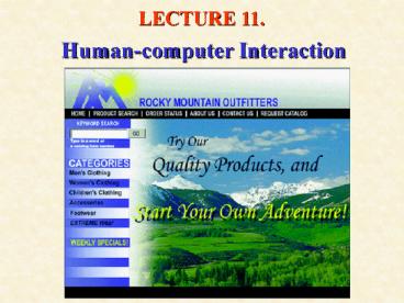
- Example RMOs home page
Recommended
CrystalGraphics Presentations


