
Scatter Graphs and Lines of Best Fit - PowerPoint PPT Presentation
1 / 21
Title:
Scatter Graphs and Lines of Best Fit
Description:
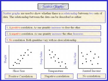
Scatter Graphs Scatter graphs are used to show whether there is a relationship between two sets of data. The relationship between the data can be described as either: – PowerPoint PPT presentation
Number of Views:260
Avg rating:3.0/5.0
Title: Scatter Graphs and Lines of Best Fit
1
1. A positive correlation. As one quantity
increases so does the other.
2. A negative correlation. As one quantity
increases the other decreases.
3. No correlation. Both quantities vary with no
clear relationship.
No correlation
Negative correlation
Positive Correlation
2
Scatter Graphs
A positive correlation is characterised by a
straight line with a positive gradient.
A negative correlation is characterised by a
straight line with a negative gradient.
3
Positive
None
Negative
People with higher maths scores tend to get
higher physics scores.
There is no relationship between KS 3 results and
the height of students.
As the engine size of cars increase, they use
more petrol. (Less mpg)
As the outside air temperature increases, heating
bills will be lower.
People tend to buy more sun cream when the
weather is sunnier.
People tend to buy less ice cream in rainier
weather.
Negative
Positive
Negative
4
Weak Positive
Moderate Positive
Strong Positive
Weak negative
Moderate Negative
Strong negative
5
Lobf
A line of best fit can be drawn to data that
shows a correlation. The stronger the correlation
between the data, the easier it is to draw the
line. The line can be drawn by eye and should
have roughly the same number of data points on
either side.
The sum of the vertical distances above the line
should be roughly the same as those below.
6
Question 1
7
(No Transcript)
8
(No Transcript)
9
(No Transcript)
10
(No Transcript)
11
(No Transcript)
12
Positive
- (c) Use your line of best fit to estimate
- The mass of a man with shoe size 10½.
- (ii) The shoe size of a man with a mass of 69 kg.
13
Question2
14
(No Transcript)
15
(No Transcript)
16
(No Transcript)
17
Negative
- (c) Use your line of best fit to estimate
- The number of visitors for 4 hours of sunshine.
- (ii) The hours of sunshine when 250 people visit.
18
Means 1
(b) Draw a line of best fit and comment on the
correlation.
If you have a calculator you can find the mean of
each set of data and plot this point to help you
draw the line of best fit. Ideally all lines of
best fit should pass through
(mean data 1, mean data 2) In this case
(8.6, 79.6)
19
Means 2
(b) Draw a line of best fit and comment on the
correlation.
If you have a calculator you can find the mean of
each set of data and plot this point to help you
draw the line of best fit. Ideally all lines of
best fit should pass through co-ordinates
(mean data 1, mean data 2) In
this case (5.2, 258))
Mean 2
20
Worksheet 1
21
Worksheet 2