
Construction and Interpretation of Simple Diagrams and Graphs [I] - PowerPoint PPT Presentation
1 / 31
Title:
Construction and Interpretation of Simple Diagrams and Graphs [I]
Description:
7 Construction and Interpretation of Simple Diagrams and Graphs [I] Mathematics in Workplaces 7.1 Broken Line Graphs and Pie Charts 7.2 Stem-and-leaf Diagrams – PowerPoint PPT presentation
Number of Views:235
Avg rating:3.0/5.0
Title: Construction and Interpretation of Simple Diagrams and Graphs [I]
1
Construction and Interpretation of Simple
Diagrams and Graphs I
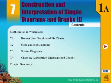
7
Mathematics in Workplaces
7.1 Broken Line Graphs and Pie Charts
7.2 Stem-and-leaf Diagrams
7.3 Scatter Diagrams
7.4 Choosing Appropriate Diagrams and Graphs
Chapter Summary
2
Mathematics in Workplaces
Stock Analyst The prices of stocks are recorded
on every stock exchange day. One of the main
duties of stock analysts is to analyze the
records of stock prices. These prices are
presented in statistical graphs, such as broken
line graphs.
Stock analysts forecast future trends from
past records over a fixed period of time, and
make predictions to support the investments made
by investors.
3
7.1 Broken Line Graphs and Pie Charts
The 4 main stages of statistics are 1.
collection of data,
2. organization of data,
3. presentation of data, and
4. analysis of data.
In this chapter, we are going to study the
presentation and analysis of data.
Broken line graphs, pie charts, stem-and-leaf
diagrams and scatter diagrams are common
statistical graphs for presenting data.
4
A. Broken Line Graphs
7.1 Broken Line Graphs and Pie Charts
A broken line graph is a statistical graph that
shows the change in frequencies of the data over
a period of time.
From it, we may know the trend of the data.
The vertical axis usually represents frequency
while the horizontal axis represents time.
The points are marked to show the frequencies at
different times.
5
Example 7.1T
7.1 Broken Line Graphs and Pie Charts
A. Broken Line Graphs
Solution
(b) The sales of brand B decreased from 04 to 07,
while that of brand A increased from 06 to 07.
Hence, brand A would have better sales figures
in 2008.
6
B. Pie Charts
7.1 Broken Line Graphs and Pie Charts
A pie chart is a circle divided into several
sectors that each sector represents an item.
The angle at the centre of each sector represents
the portion of that items frequency to the total
frequency.
7
B. Pie Charts
7.1 Broken Line Graphs and Pie Charts
(a) Construction of Pie Charts
Given a set of known data
Step 1 Find the angle represented by each item.
Step 2 Construct a pie chart.
Step 3 Give a title to the pie chart.
8
B. Pie Charts
7.1 Broken Line Graphs and Pie Charts
(b) Interpretation of Pie Charts
Given a pie chart with angles at the centre or
percentages marked on it, we can find the
corresponding data.
9
Example 7.2T
7.1 Broken Line Graphs and Pie Charts
B. Pie Charts
The given pie chart shows the favourite fruit of
a group of students. (a) Among the fruit
recorded, which one is the least
popular? (b) Find the angle of the sector
representing mango. (c) If 112 students chose
apple, find the total number of
students. (d) Find the total number of students
who chose apple or orange.
Solution
(a) Pear is the least popular.
(b) Angle of the sector ? 360 ? 20
10
Example 7.2T
7.1 Broken Line Graphs and Pie Charts
B. Pie Charts
The given pie chart shows the favourite fruit of
a group of students. (a) Among the fruit
recorded, which one is the least
popular? (b) Find the angle of the sector
representing mango. (c) If 112 students chose
apple, find the total number of
students. (d) Find the total number of students
who chose apple or orange.
Solution
(c) Let y be the total number of students.
? The total number of students is 400.
112 100
11
7.2 Stemandleaf Diagrams
A. Stem-and-leaf Diagrams
We can use a stem-and-leaf diagram to present the
distribution of the numbers with 2 or more digits.
A stem-and-leaf diagram consists of 2 columns,
named stemand leaf .
Usually, the leading digits of the data are
listed in the stemcolumn, while the remaining
digits of the data are listed in the leaf
column.
12
7.2 Stemandleaf Diagrams
A. Stem-and-leaf Diagrams
(a) Construction of Stem-and-leaf Diagrams
Step 1 Rearrange the data in ascending order,
such as 57, 57, 59, 61, 62, 63, 66, 67, 68, 72,
73, 74, 75, 77, 81, 82, 84, 84, 86, 90.
Step 2 Put the tens digits from 5 to 9 in
the stem column.
Step 3 Put the units digits in the leaf column
accordingly.
7 7 9
1 2 3 6 7 8
2 3 4 5 7
1 2 4 4 6
0
13
7.2 Stemandleaf Diagrams
A. Stem-and-leaf Diagrams
The stem-and-leaf diagram looks like a horizontal
bar chart, from which we can easily observe the
distribution of the data.
Advantages of using stem-and-leaf diagrams over
other statistical diagrams/graphs
- They are easy to do as the only equipment needed
is a pencil and paper.
- The value of each datum can be read directly from
- the diagram.
14
7.2 Stemandleaf Diagrams
A. Stem-and-leaf Diagrams
(b) Interpretation of Stem-and-leaf Diagrams
Given a stem-and-leaf diagram, we can observe the
original data values, the distribution of the
data and other information.
15
Example 7.3T
7.2 Stemandleaf Diagrams
A. Stem-and-leaf Diagrams
Time spent on reading a newspaper by 25 teenagers Time spent on reading a newspaper by 25 teenagers
Stem (10 min) Leaf (1 min)
1 0 2 5 5 5 8
2 0 0 2 4 5 7 8 8
3 0 1 6 7
4 5 8
5 0 2 4 5
6 0
Solution
(a) The minimum time is 10 minutes.
(b) Most of the data fall into stem 2.
16
Example 7.3T
7.2 Stemandleaf Diagrams
A. Stem-and-leaf Diagrams
The following stem-and-leaf diagram shows the
time spent on reading a newspaper by 25 teenagers
on a certain day.
Time spent on reading a newspaper by 25 teenagers Time spent on reading a newspaper by 25 teenagers
Stem (10 min) Leaf (1 min)
1 0 2 5 5 5 8
2 0 0 2 4 5 7 8 8
3 0 1 6 7
4 5 8
5 0 2 4 5
6 0
(c) How many teenagers spent 40 minutes 49
minutes on reading a newspaper? (d) How many
teenagers read a newspaper for at least 50
minutes?
Solution
(c) 2 teenagers spent 40 minutes 49 minutes on
reading a newspaper.
(d) 5 teenagers read a newspaper for at least 50
minutes.
17
7.2 Stemandleaf Diagrams
B. Back-to-back Stem-and-leaf Diagrams
A compound bar chart or 2 broken line graphs can
be used to compare the distribution of 2 sets of
data at the same time.
We can also combine 2 individual stem-and-leaf
diagrams into a back-to-back stem-and-leaf
diagram.
18
Example 7.4T
7.2 Stemandleaf Diagrams
B. Back-to-back Stem-and-leaf Diagrams
The following diagram shows the number of viruses
in some specimens in 2 laboratories, A and
B. (a) How many specimens are there in
laboratory A? (b) How many more specimens with
300 399 viruses are there in laboratory A
than in laboratory B?
3 data
7 data
Solution
(a) There are 13 specimens in laboratories A.
(b) There are 7 specimens and 3 specimens with
300 399 viruses in laboratories A and B
respectively.
? There are 7 3 4 more specimens with 300
399 virus in laboratory A than in
laboratory B.
19
Example 7.5T
7.2 Stemandleaf Diagrams
B. Back-to-back Stem-and-leaf Diagrams
The table shows the number of earthquakes
recorded in 2 cities, A and B, in each of the
past 15 years.
(a) Construct a back-to-back stem-and-leaf
diagram to present the data.
Solution
0 2 4 6 8 9
0 1 2 3
9 7 5 2 1 0 0 0
0 5 5 6 9
8 5 2 0 0
0 2 4
6
1
3
20
Example 7.5T
7.2 Stemandleaf Diagrams
B. Back-to-back Stem-and-leaf Diagrams
The diagram shows the number of earthquakes
recorded in 2 cities, A and B, in each of the
past 15 years.
(b) What is the difference in years between the
2 cities having more than 20 earthquakes? (c) Whi
ch city had more earthquakes in total?
2 data
Solution
3 data
(b) There are 2 years and 3 years having more
than 20 earthquakes in cities A and B
respectively.
? Difference 3 2
21
Example 7.5T
7.2 Stemandleaf Diagrams
B. Back-to-back Stem-and-leaf Diagrams
The diagram shows the number of earthquakes
recorded in 2 cities, A and B, in each of the
past 15 years.
(b) What is the difference in years between the
2 cities having more than 20 earthquakes? (c) Whi
ch city had more earthquakes in total?
Solution
(c) Total number of earthquakes in city A 1
2 5 7 9 10 10 12 15 18 26 33 ? 148
Total number of earthquakes in city B 2 4 6
8 9 10 15 15 16 19 20 22 24 31
? 201
? City B had more earthquakes in total.
22
7.3 Scatter Diagrams
All the statistical diagrams/graphs we previously
learnt present only one type of data at one time.
In order to analyze the relation between 2 types
of data from one single group, a scatter diagram
can be used.
- Examples of relations can be presented using
- scatter diagrams
- The number of traffic accidents occurring at
a road junction and the number of vehicles
passing through the junction
- The number of internet connections and the
average speeds of data transfer during
particular hours in a day.
- The monthly salaries of selected people and
their levels of education.
23
7.3 Scatter Diagrams
(a) Construction of Scatter Diagrams
Scatter diagrams are drawn on a plane with 2
axes the horizontal and the vertical axes.
Each marking on the plane represents 2 different
types of data at the same time.
24
Example 7.6T
7.3 Scatter Diagrams
The following table shows the electricity charges
of 6 families and the corresponding number of
family members. Construct a scatter diagram to
present the data.
Family A B C D E F
Electricity charge () 400 550 200 850 300 150
Number of family members 4 5 3 7 2 1
Solution
Use the horizontal axis to represent the number
of family members.
25
7.3 Scatter Diagrams
(b) Interpretation of Stem-and-leaf Diagrams
- Data with no relation
- are randomly distributed and show no clear
pattern, - no conclusion can be made about the relation
between the 2 quantities.
26
Example 7.7T
7.3 Scatter Diagrams
The following scatter diagram shows the number of
earthquakes that occurred during each of the past
12 years in a country and the corresponding
number of casualties. (a) What was the number of
casualties in the year during which 20
earthquakes occured? (b) Describe the relation
between the 2 types of data.
Solution
(a) There were 150 casualties in the year during
which 20 earthquakes occurred.
(b) There is no relation between the 2 types of
data.
27
7.4 Choosing Appropriate Diagrams and Graphs
Each kind of statistical diagram / graph has its
own functions.
We should choose an appropriate diagram / graph
to present collected data according to the aspect
of the data that we want to analyze.
Diagram / graph Function
Bar chart
Broken line graph
Pie chart
Stem-and-leaf / back-to-back stem- and-leaf diagram
Scatter diagram
- To show the frequency of each item of data
- To compare the frequencies of different items
- To show the changes of data over time
- To predict the trend of data
- To show the proportion or percentage of the
frequency of an item to the total frequency of
data
- To show the distribution of numerical data
- To compare the distribution of 2 sets of data by
a back- to-back stem-and-leaf diagram
- To show the relation between 2 types of data
28
Example 7.8T
7.4 Choosing Appropriate Diagrams and Graphs
Mr. Au recorded the sizes of 50 stars and their
distances from the Earth at the same
time. (a) Suggest an appropriate statistical
diagram/graph to present the data. (b) Is it
appropriate to use a back-to-back stem-and-leaf
diagram to present the data?
Solution
(a) A scatter diagram should be used to present
the data.
(b) Since there are 2 different types of data, it
is not appropriate to use a back-to-back
stem-and-leaf diagram to present the data.
29
7.1 Broken Line Graphs and Pie Charts
Chapter Summary
A broken line graph is constructed by marking
points and drawing straight lines to join
adjacent points on a plane. It is usually used to
show the changes of data over time.
A pie chart is formed by sectors with different
angles. It is used to show the portion or
percentage of the frequency of an item to the
total frequency of data.
30
7.2 Stem-and-leaf Diagrams
Chapter Summary
A stem-and-leaf diagram is formed by numbers in
stem and leaf columns. It is used to show the
distribution of numerical data.
We can use a back-to-back stem-and-leaf diagram
to compare 2 sets of data.
31
7.3 Scatter Diagrams
Chapter Summary
A scatter diagram is used to show the relation
between 2 types of data.
7.4 Choosing Appropriate Diagrams and Graphs
An appropriate diagram/graph should be chosen
according to the aspect of the data that we want
to analyze.
32
Follow-up
7.1 Broken Line Graphs and Pie Charts
A. Broken Line Graphs
Solution
33
Follow-up
7.1 Broken Line Graphs and Pie Charts
A. Broken Line Graphs
(b) What was the biggest difference between the
number of students who were late in S.3 and S.4
on a particular day? On which day did it
happen? (c) Predict which form will have more
late students next week.
Solution
It happened on last Friday.
(c) The number of late students of S.3 decreased
from Thu to Fri while that of S.4 increased.
Hence, S.4 will have more late students next
week.
34
Follow-up
7.1 Broken Line Graphs and Pie Charts
B. Pie Charts
The pie chart shows the favourite colour of a
group of children. (a) Find the angle of the
sector representing Yellow. (b) If 39 children
like green, what is the total number of children
reviewed in the group? (c) How many more children
like blue rather than red?
Solution
(a) Angle of the sector ? 360 ? 12
(b) Let y be the total number of children
reviewed in the group.
? The total number of children is 300.
35
Follow-up
7.1 Broken Line Graphs and Pie Charts
B. Pie Charts
The pie chart shows the favourite colour of a
group of children. (a) Find the angle of the
sector representing Yellow. (b) If 39 children
like green, what is the total number of children
reviewed in the group? (c) How many more children
like blue rather than red?
Solution
36
Follow-up
7.2 Stemandleaf Diagrams
A. Stem-and-leaf Diagrams
Solution
(a) There are 36 students in S.1A.
(b) 0 students have heights between 160 cm ? 169
cm.
37
Follow-up
7.2 Stemandleaf Diagrams
A. Stem-and-leaf Diagrams
(c) What percentage of students have heights
between 150 cm ? 159 cm? (d) How many students
are shorter than 150 cm?
Solution
(c) 9 students have heights between 150 cm ?
159 cm.
(d) 24 students are shorter than 150 cm.
38
Follow-up
7.2 Stemandleaf Diagrams
B. Back-to-back Stem-and-leaf Diagrams
The diagram below shows the ages of staff in 2
companies, A and B. (a) How many staff are
there in companies A and B respectively? (b) Wha
t is the difference in the number of staff
who are 45 years old or above in the 2
companies?
5 data
11 data
Solution
(a) There are 29 staff and 30 staff in companies
A and B respectively.
(b) There are 11 staff and 5 staff who are 45
years old or above in companies A and B
respectively.
? Difference 11 5
39
Follow-up
7.2 Stemandleaf Diagrams
B. Back-to-back Stem-and-leaf Diagrams
The following data show the number of cars
which passed through 2 roads, A and B, each hour
yesterday.
(a) Present the data using a back-to-back
stem-and-leaf diagram.
Solution
0 0 0 3 6 6 8
6 7 8 9 10 11
4 3 2 1 1
7 7 8
7 6 3
5 5 6 8 9
9 2 1
6 5 4
7
2 2 5 9
7 5 3 3
0 5 7 7
9 9 9 5 3 0
40
Follow-up
7.2 Stemandleaf Diagrams
B. Back-to-back Stem-and-leaf Diagrams
The following diagram shows the number of cars
which passed through 2 roads, A and B, each hour
yesterday.
10 data
8 data
(b) Traffic jams occur when more than 100 cars
pass through either of the 2 roads in an hour.
What was the difference in the number of hours
of traffic jams that occurred on the 2 roads
yesterday? (c) Which road was busier overall?
Explain your answer briefly.
Solution
(b) There are 10 hours and 8 hours of traffic
jams that occurred on roads A and B yesterday
respectively.
? Difference 10 8
(c) From the diagram, road A has more records
with 90 or more cars passed through. Road A was
busier overall.
41
Follow-up
7.3 Scatter Diagrams
The following table shows the amounts of profit
made by a fast food restaurant during 8 promotion
periods with different durations. Construct a
scatter diagram to present the data.
Promotion Period A B C D E F G H
Profit (100 000) 2 3 5 6 4 7 3 1
Promotion duration (weeks) 2 2 6 9 5 5 4 1
Table 7.14
Solution
Use the horizontal axis to represent the
promotion duration.
42
Follow-up
7.3 Scatter Diagrams
Solution
(a) 15 days of records were collected.
(b) The rainfall was 0.5 mm.
(c) The rainfall and the number of visitors to
the theme park have a negative relation.
43
Follow-up
7.4 Choosing Appropriate Diagrams and Graphs
- Judy recorded the profits made by 5 companies in
2006. - Suggest 2 appropriate diagrams/graphs that Judy
could use to present the data. - (b) Is it appropriate to use a broken line graph
to present the data?
Solution
(a) Judy could use a bar chart and a pie chart to
present the data.
(b) Since a broken line graph is used to present
data changes over time, it is not appropriate in
this case.
Recommended
CrystalGraphics Presentations


