
Designing Your Page - PowerPoint PPT Presentation
Title:
Designing Your Page
Description:
Designing Your Page Step 1: Design for a Computer Medium A computer screen is not a printed page. Readability changes depending on color, layout and format. – PowerPoint PPT presentation
Number of Views:81
Avg rating:3.0/5.0
Title: Designing Your Page
1
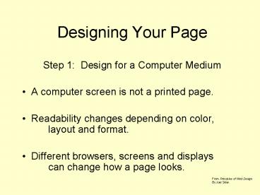
Designing Your Page
- Step 1 Design for a Computer Medium
- A computer screen is not a printed page.
- Readability changes depending on color,
layout and format. - Different browsers, screens and displays can
change how a page looks.
From Principles of Web Design By Joel Sklar.
2
How We Read Text
- Following normal reading habits, the users eye
moves from left to right.
3
How We View Screens
- Looking at a screen, the users eye scans in a
more clockwise pattern.
4
How Will Your Users Read/View?
- If a page uses a lot of text, the user will read
in a more traditional, left to right manner. - If a page has more graphical elements, the user
is more likely to take in the whole page.
5
Accepted Relative Areas of Importance
2
5
1
3
4
6
Questions to Ask Yourself
- What is the Purpose of my Website?
- What is my Main Audience? My
secondary Audience? - What Information do I want to present?
7
Designing Your Site
- Step 2 Plan your sites Hierarchy
- How are your pages linked together?
- How many links exactly?
- Where does the User go next?
8
A Structure That is More Wide Than Deep
Main
Work
Class
Me
Play
Family
Sample
9
A Structure That is More Deep Than Wide
Main
Work
Me
Class
Play
Sample
Family
10
How Would You Structure It?
?
11
Designing Your Content
- Step 3 The Dos of Good Web Design
- Use all lower-case and no spaces when naming
files. - Keep a Consistent Look and Feel.
- Use Colors that are High in Contrast.
- Design for Low Bandwidth.
- Use a Grid Structure.
12
Designing Your Content
- More Dos
- Use Active White Space.
- Design for Interaction.
- Use Hypertext Linking Effectively.
- Design for Accessibility.
- Keep Your Site Updated on a Regular Basis
13
Designing Your Content
- Step 4 Things to Avoid. aka The Donts
- Dont Overuse Media
- Dont Make Your Users Scroll Too Much.
- Dont Flood Your Pages with Content.
- Dont Choose Colors or Images that Make the Page
Hard to Read.
14
Designing Your Content
- Dont Forget to Title Everything images and
pages. - Dont Assume that Your Users Know Where to Go.
- DONT USE FRAMES!
15
The Worst of the Worst
- For a good luck at what not to do, visit
- www.webpagesthatsuck.com
Recommended
CrystalGraphics Presentations


