
The Principles of Design PowerPoint PPT Presentation
1 / 20
Title: The Principles of Design
1
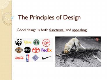
The Principles of Design
- Good design is both functional and appealing.
2
Technological Design
- Architectural Design interior/exterior
design and urban planning. - Electronic Design hardware/software
- Industrial Design mechanical, fashion
manufacturing, engineering - Graphic Design communication, marketing,
art
3
Graphic Design
- The designer finds the most effective placement
of the elements to best communicate the message
to the audience. - Size, shape,
- weight
- and CoLoR of the
- elements make a
- difference
4
Visual Noise
- Visual noise is anything that interferes with
the message being received by the intended
audience.
5
Bottom Line
- The bottom line with any design is that it
.must first attract attention or create
interest .then we look for the message.
6
Design Principles
- Design is based on easily understood and
identified principles which include - Balance
- Proportion
- Contrast
- Rhythm
- Unity
7
Balance
- Balance is expressed as a sense of equilibrium
- Well balanced designs are visually
- stable
- formal
- and
- conservative
8
Formal Balance
elements are equally placed around the vertical
center.
9
Informal Balance
- asymmetrical meaning that design elements of
varying size, shape, weight, and color are placed
around (but not on) the vertical center. - This placement creates excitement and is
effective in creating attention and interest
10
Informal Balance
SIZE
SHAPE
Weight
Color
11
Proportion
- Proportion is a principle that describes the
size, location or amount of one element to
another (or to the whole).
12
Proportion in Design
13
Contrast
- The purpose of contrast in design is to create
interest. - This is typically done by changing
- Size
- Shape
- Color
- And combining illustrations, fonts, photos etc.
14
Contrast and Shape
- Contrast through shape is achieved by using
different geometric shapes such as squares,
triangles, circles or irregular shapes
15
Contrast and Color
- All colors (hues) are derived from the three
primary colors - red, blue and yellow - When equal parts of primary colors are mixed
together the result is the creation of secondary
colors - Blue Yellow Green
16
- Complimentary colors are those opposite each
other on the color wheel - Hot colors are - red, yellow, orange
- Cool colors are - blue, green
17
The Color Wheel
- When equal parts of a primary color and secondary
color are mixed together the result is a tertiary
color - Yellow Green
18
Rhythm
- Rhythm is how the eye moves across a graphic
design - Good rhythm helps maintain the readers interest
19
- Achieved in two ways
- Repetition of shape, value or color
- Through the use of a rhythm of lines.
- It steers the audience
- attention through the
- the artwork.
20
Unity
- A design that meets the original intention has
Unity - Affected by all the elements (Balance,
proportion, line, shape, color, contrast) that
combine to deliver the message.
Recommended
