
Find the M, M, M, R - PowerPoint PPT Presentation
1 / 26
Title:
Find the M, M, M, R
Description:
Graphs and statistics are often used to persuade. Advertisers and others may accidentally or intentionally present information in a misleading way. – PowerPoint PPT presentation
Number of Views:55
Avg rating:3.0/5.0
Title: Find the M, M, M, R
1
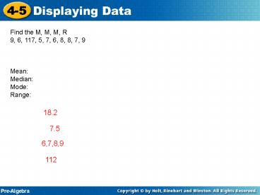
Find the M, M, M, R 9, 6, 117, 5, 7, 6, 8, 8, 7,
9 Mean Median Mode Range
18.2
7.5
6,7,8,9
112
2
Hours of television Frequency
0 2
1 3
2 1
3 3
4 0
5 1
3
- A histogram is a type of bar graph. The bars of a
histogram represent intervals that the data is
grouped. (the bars touch)
4
Money () Tally Frequency
0 0.99 4
1.00 1.99 3
2.00 2.99 2
3.00 3.99 3
5
Displaying Data in a Line Graph
Make a line graph of the given data. Use the
graph to estimate Mr. Ys salary in 1992.
Salary ()
Year
42,000
1985
49,000
1990
58,000
1995
69,000
2000
6
Salary ()
Year
42,000
1985
49,000
1990
58,000
1995
69,000
2000
Mr. Ys 1992 salary was about
Salary
Year
7
What quarter was the percent of all positive
plays
8
(No Transcript)
9
200 140 300 030 100 130 230 030 245 100
200 135 130 300
Time Spent at Day Care Tally Frequency
000 to 030
031 to 100
101 to 130
131 to 200
201 to 230
231 to 300
10
(No Transcript)
11
(No Transcript)
12
Graphs and statistics are often used to persuade.
Advertisers and others may accidentally or
intentionally present information in a misleading
way.
For example, art is often used to make a graph
more interesting, but it can distort the
relationships in the data.
13
Explain why each graph is misleading.
The graph suggests that the stock will continue
to increase through 2020, but theres no way to
foresee the future.
14
Explain why each graph is misleading.
Because the scale leaves out 0 to 100, the bar
heights make it appear that the sixth grade sold
about three times as many tickets as either of
the other two grades. In fact, the sixth grade
sold only about 20 more.
15
Explain why each graph is misleading.
The scale is so compressed that its hard to see
any difference among the brands.
16
Explain why each graph is misleading.
of Return on Investment
60
50
The graph suggests that the rate of investment
return will continue to increase, but there are
no guarantees
40
30
20
10
0
1
2
3
4
5
6
projected
17
Explain why each graph is misleading.
Preferred Juice Flavors
The graph appears to indicate that significantly
more people prefer grape drink over the others
when in fact there is a small margin of
difference. (0 to 140 is not graphed)
150
148
146
144
142
140
Grape
Cherry
Apple
18
Explain why each graph is misleading.
Drink Sales
This graph is too compressed to see much
difference between the brands indicating that
they are fairly equal.
120
No data from 50 to 120
100
80
60
40
20
0
Brand X
Brand Y
Brand Z
19
Explain why each statistic is misleading.
A. Sam scored 43 goals for his soccer team
during the season, and Jacob scored only 2.
Although Jacob scored only 2 goals, he may have
played most of his time on defense.
B. Four out of five dentists surveyed preferred
UltraClean toothpaste.
This statement does not give the sample size or
state what UltraClean toothpaste was compared
with.
20
Explain why each statistic is misleading.
C. Shopping at Save-a-Lot can save you up to
100 a month!
The words save up to 100 mean that the maximum
you can save is 100, but there is no guarantee
that you will save that amount.
21
Explain why each statistic is misleading.
A. Four out of five breeders recommend Pet Blend
dog food for a healthier coat.
This statement does not give the sample size or
state what Pet Blend dog food was compared with.
B. Fruity Squares makes the cereal 100 more fun.
You cannot measure how much fun Fruity Squares
makes the cereal.
22
Explain why each statistic is misleading.
C. The total revenue for bathing suits sold in
May at Worthmans Florida stores is 250,000. The
total revenue for bathing suits sold in May at
Worthmans North Dakota stores is 10,000.
The states have different populations and
climates.
23
Lesson Quiz Part 1
Explain why each graph or statistic is misleading
1.
24
Lesson Quiz Part 2
Explain why each graph or statistic is misleading
2. A budget area of a used-car lot has five cars
on it, with prices of 4200, 4700, 4900, 5200,
and 900 (a wrecked one). The car ad in the local
paper reads Average priced car on budget lot is
3980.
25
Lesson Quiz Part 1
Explain why each graph or statistic is misleading
1.
Possible answer The size of the trucks is larger
than the size of the cars, so it looks like there
are as many trucks as cars, although there are 6
cars and 4 trucks.
26
Lesson Quiz Part 2
Explain why each graph or statistic is misleading
2. A budget area of a used-car lot has five cars
on it, with prices of 4200, 4700, 4900, 5200,
and 900 (a wrecked one). The car ad in the local
paper reads Average priced car on budget lot is
3980.
The wrecked cars price brings the average down.
Without using the price of the wrecked car, the
average price would be 4750.