
Association between 2 variables - PowerPoint PPT Presentation
1 / 16
Title:
Association between 2 variables
Description:
Association between 2 variables We've described the distribution of 1 variable - but what if 2 variables are measured on the same individual? Examples? – PowerPoint PPT presentation
Number of Views:81
Avg rating:3.0/5.0
Title: Association between 2 variables
1
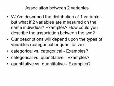
Association between 2 variables
- We've described the distribution of 1 variable -
but what if 2 variables are measured on the same
individual? Examples? How could you describe the
association between the two? - Our descriptions will depend upon the types of
variables (categorical or quantitative) - categorical vs. categorical - Examples?
- categorical vs. quantitative - Examples?
- quantitative vs. quantitative - Examples?
2
(No Transcript)
3
- One common task is to show that one variable can
be used to explain variation in the other. - Explanatory variable vs. Response Variable
- (sometimes these are called independent vs.
dependent variables) - These associations can be explored both
graphically and numerically - begin your analysis with graphics
- find a pattern look for deviations from the
pattern - look for a mathematical model to describe the
pattern - But again we do the above depending upon what
type variables we have we'll start with
quantitative vs. quantitative ...
4
A scatterplot is the best graph for showing
relationships between two quantitative variables
In a scatterplot, one axis is used to represent
each of the variables, and the data are plotted
as points on the graph.
Student Beers BAC
1 5 0.1
2 2 0.03
3 9 0.19
6 7 0.095
7 3 0.07
9 3 0.02
11 4 0.07
13 5 0.085
4 8 0.12
5 3 0.04
8 5 0.06
10 5 0.05
12 6 0.1
14 7 0.09
15 1 0.01
16 4 0.05
5
Explanatory and response variables
A response variable measures or records an
outcome of a study. An explanatory variable
explains changes in the response
variable. Typically, the explanatory or
independent variable is plotted on the x axis,
and the response or dependent variable is plotted
on the y axis.
6
- Describe the pattern of the relationship between
the two variables in a scatterplot by its
direction, strength, and form. - direction positive, negative or flat (no
direction) - strength strong, weak, moderately strong, etc.
- form linear, curved (non-linear), clusters, no
pattern - See example 2.8
- on page 91. Note the
- identical responses ...
7
Form and direction of an association
Linear
8
Positive association High values of one variable
tend to occur together with high values of the
other variable. Negative association High values
of one variable tend to occur together with low
values of the other variable. The scatterplots
below show perfect linear associations
9
No relationship X and Y vary independently.
Knowing X tells you nothing about Y.
One way to think about this is to remember the
following Imagine a line through the data
points.. the equation for that line is y 5. x
is not involved.
10
Strength of the relationship or association ...
This is a very strong relationship. The daily
amount of gas consumed can be predicted quite
accurately for a given temperature value.
This is a weak relationship. For a particular
state median household income, you cant predict
the state per capita income very well.
11
- What if there are categorical variables involved?
either as the explanatory variable or as a
lurking variable? - A scatterplot sometimes can help by
indicating the categories of the lurking variable
with different plotting symbols or colors... - Often though the best way to see the pattern if
the explanatory variable is categorical is to
draw side-by-side boxplots. Put the categorical
variable on the horizontal axis, and draw a
boxplot for each category, side-by-side. - Here are some some examples of various
explanatory, lurking, and response variables...
12
Categorical variables in scatterplots
Often, things are not simple and one-dimensional.
We need to group the data into categories to
reveal trends. Lurking Variable!
What may look like a positive linear relationship
is in fact a series of negative linear
associations. Plotting different habitats (the
lurking variable) in different colors allows us
to make that important distinction.
13
Comparison of men and women racing records over
time. Each group shows a very strong negative
linear relationship that would not be apparent
without the gender categorization.
Relationship between lean body mass and metabolic
rate in men and women. Both men and women follow
the same positive linear trend, but women show a
stronger association. As a group, males typically
have larger values for both variables.
14
- Look at Figure 1.23 on page 52 -
- Note the ordinal scale of the explanatory
variable education level. Are these two
variables associated ? Why? - The next slide is tricky...
15
Example Beetles trapped on boards of different
colors
Beetles were trapped on sticky boards scattered
throughout a field. The sticky boards were of
four different colors (categorical explanatory
variable). The number of beetles trapped
(response variable) is shown on the graph below.
What association? What relationship?
When both variables are quantitative, the order
of the data points is defined entirely by their
value. This is not true for categorical data.
16
- HW Read the Introduction to Chapter 2 and
section 2.1 - Do 2.6-2.9, 2.11, 2.13-2.15, 2.18, 2.19, 2.21,
2.26 (use JMP to draw all scatterplots - Analyze
-gt Fit Y by X - (Y is the response will go on
the vertical axis, X is the explanatory will go
on the horizontal axis) - Look ahead to correlation and regression in
sections 2.2 and 2.3
Recommended
CrystalGraphics Presentations


