Typography - PowerPoint PPT Presentation
Title:
Typography
Description:
Typography Basic terminology/concepts A dozen typefaces and their characteristics Screen-friendly fonts and examples How Web type differs from print type – PowerPoint PPT presentation
Number of Views:58
Avg rating:3.0/5.0
Title: Typography
1
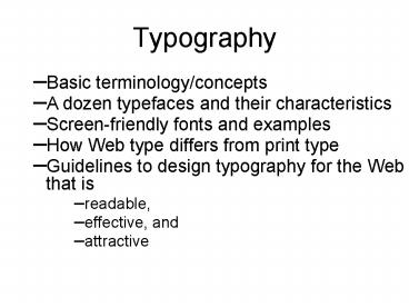
Typography
- Basic terminology/concepts
- A dozen typefaces and their characteristics
- Screen-friendly fonts and examples
- How Web type differs from print type
- Guidelines to design typography for the Web that
is - readable,
- effective, and
- attractive
2
Concepts and Terminology
3
A sans serif font, Arial
4
Size of a font
5
These letters are all 72 points the lines are
one inch ( 72 points) apart
How big type is depends on the font size and on
the design of the font family. Dont forget the
little bit!
The fonts are Garamond, Goudy, Bookman Old Style,
AlleyCat ICG, Caslon Open Face, Arial Black, Park
Avenue, and Ultra Condensed Sans Two
6
Some text with reduced line spacing, to show what
happens without the little bit
7
Times New Roman, 10 point, with 1pt leading and
with 3pt leading
8
A Dozen Font Families
- 2 serif
- 6 sans serif
- 2 monospaced
- 1 script
- 1 Wingdings
- 1 Symbol (Greek)
9
Times New Roman and its screen-friendly cousin
Georgiain same font size
10
Times Roman letters have oblique stress Georgia
has vertical stress
11
The pixel view how Georgia gets vertical stress
(and the letters are bigger)
12
Times New Roman and Georgia
13
Six sans serif fonts
14
Comparison of some sans serif fonts
- Arial bold and Arial Black
Arial and Impact
Arial and Comic Sans
Arial and Trebuchet
15
Arial and its screen-friendly cousin Verdanain
same font size
16
Courier New and Times New Roman
Courier New is a monospaced font the comma gets
as much horizontal space as the W. For program
listings, this is exactly what we want. Seldom
desirable otherwise!!
17
A bit of C code in Courier
18
In Times New Roman the same thing seems
strangeto a programmer
19
Andale Mono is a screen-friendly version of
Courier
20
Nuptial Script
21
Webdings
22
The Greek alphabet in the Symbol font
23
A Web Page is Not a Printed Page
- Some things a Web designer cant be sure of
- The resolution of the users monitor
- The size of the users browser window
- The text size users can change it
- The settings and quality of the users monitor,
in terms of brightness, contrast, and color
balance - The fonts available to a user
- Very different from print design!
24
Text in graphics
- What if you want to use a font your users
probably dont have? Answer make a graphic of it
- With a drop shadow
25
Guidelines Body Type on the Web
- Use Georgia or Verdana
- Use 10 point or 12 point type
- Avoid bold or italic in body type,
- except for a few words for emphasis
- Use upper case only for the first word of
sentences, proper names, etc. - Use left alignment
- Use dark text on a light background
- Never use underlining for emphasis
26
Guidelines Display type on the Web
- Big is beautiful
- Use any typeface that is legibleif your users
have it insert as a graphic if they dont - Use the HTML line-height attribute for control of
line spacing - Use HTML letter spacing and word spacing to get
effects you want - Dont use any form of animation of textever
27
Summary
- The basic terminology and concepts of typography
- A dozen typefaces and their characteristics
- What a screen-friendly font is, and how it works
- How typography on the Web differs from typography
in print - Guidelines for text and display type on the Web


