
Chapter 2 Descriptive Analysis - PowerPoint PPT Presentation
1 / 64
Title:
Chapter 2 Descriptive Analysis
Description:
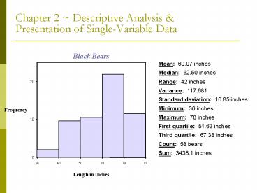
Standard deviation: 10.85 inches. Minimum: 36 inches. Maximum: 78 inches. First quartile: 51.63 inches. Third quartile: 67.38 inches ... Denoted by 'x tilde' ... – PowerPoint PPT presentation
Number of Views:61
Avg rating:3.0/5.0
Title: Chapter 2 Descriptive Analysis
1
Chapter 2 Descriptive Analysis Presentation
of Single-Variable Data
2
Chapter Goals
- Learn how to present and describe sets of data
- Learn measures of central tendency, measures of
dispersion (spread), measures of position, and
types of distributions
- Learn how to interpret findings so that we know
what the data is telling us about the sampled
population
3
2.2 Graphic Presentation of Data
- Use initial exploratory data-analysis techniques
to produce a pictorial representation of the data
- Resulting displays reveal patterns of behavior of
the variable being studied
- The method used is determined by the type of data
and the idea to be presented
- No single correct answer when constructing a
graphic display
4
Pie Graphs Bar Graphs
- Pie Graphs and Bar Graphs Graphs that are used
to summarize categorical (some time numerical)
data
- Pie graphs show the amount of data that belongs
to each category as a proportional part of a
circle
- Bar graphs show the amount of data that belongs
to each category as proportionally sized
rectangular areas
5
Example
- Example The table below lists the number of
automobiles sold last week by day for a local
dealership. Describe the data using a circle
graph and a bar graph
6
Bar Graph Solution
7
Key Definitions
- Numerical Data One reason for constructing a
graph of numerical data is to examine the
distribution - is the data compact, spread out,
skewed, symmetric, etc.
Distribution The pattern of variability
displayed by the data of a variable. The
distribution displays the frequency of each value
of the variable.
Dotplot Display Displays the data of a sample by
representing each piece of data with a dot
positioned along a scale. This scale can be
either horizontal or vertical. The frequency of
the values is represented along the other scale.
8
- Example A random sample of the lifetime (in
years) of 49 home washing machines is given
below
The figure below is a dotplot for the 49
lifetimes
- .
- . . .. .
- .. ... .. ... . . .
. . . - -------------------------------------
--------------- - 0.0 4.0
8.0 12.0 16.0
20.0
Note Notice how the data is bunched near the
lower extreme and morespread out near the
higher extreme
9
Stem-and-Leaf Display
Stem-and-Leaf Display Pictures the data of a
sample using the actual digits that make up the
data values. Each numerical data is divided into
two parts The leading digit(s) becomes the stem,
and the trailing digit(s) becomes the leaf. The
stems are located along the main axis, and a leaf
for each piece of data is located so as to
display the distribution of the data.
10
Example
- Example A city police officer, using radar,
checked the speed of cars as they were traveling
down the main street in town. Construct a
stem-and-leaf plot for this data
41 31 33 35 36 37 39 49 33
19 26 27 24 32 40 39 16 55 38
36
Solution All the speeds are in the 10s, 20s,
30s, 40s, and 50s. Use the first digit of each
speed as the stem and the second digit as the
leaf. Draw a vertical line and list the stems,
in order to the left of the line. Place each
leaf on its stem place the trailing digit on the
right side of the vertical line opposite its
corresponding leading digit.
11
- 20 Speeds
- ---------------------------------------
- 1 6 9
- 2 4 6 7
- 3 1 2 3 3 5 6 6 7 8 9 9
- 4 0 1 9
- 5 5
- ----------------------------------------
- The speeds are centered around the 30s
Note The display could be constructed so that
only five possible values (instead of ten) could
fall in each stem. What would the stems look
like? Would there be a difference in appearance?
12
Remember!
- 1. It is fairly typical of many variables to
display a distribution that is concentrated
(mounded) about a central value and then in some
manner be dispersed in both directions.
2. A display that indicates two mounds may
really be two overlapping distributions
3. A back-to-back stem-and-leaf display makes it
possible to compare two distributions graphically
4. A side-by-side dotplot is also useful for
comparing two distributions
13
2.3 Frequency Distributions Histograms
- Stem-and-leaf plots often present adequate
summaries, but they can get very big, very fast
- Need other techniques for summarizing data
- Frequency distributions and histograms are used
to summarize large data sets
14
Frequency Distributions
- Frequency Distribution A listing, often
expressed in chart form, that pairs each value of
a variable with its frequency
1. A table that summarizes data by classes/class
intervals, is called frequency table 2. In a
typical grouped frequency distribution, there are
usually 5-12 classes of equal width 3. The table
may contain columns for class number, class
interval, tally (if constructing by hand),
frequency, relative frequency, cumulative
relative frequency, and class midpoint 4. In an
ungrouped frequency distribution each class
consists of a single value
15
- Guidelines for constructing a frequency
distribution
1. All classes should be of the same
width 2. Classes should be set up so that they do
not overlap and so that each piece of data
belongs to exactly one class 3. For problems in
the text, 5-12 classes are most desirable. The
square root of n is a reasonable guideline for
the number of classes if n is less than
150. 4. Use a system that takes advantage of a
number pattern, to guarantee accuracy 5. If
possible, an even class width is often
advantageous
16
Procedure for constructing a frequency
distribution
1. Identify the high (H) and low (L) scores.
Find the range.Range H - L 2. Select a number
of classes and a class width so that the product
is a bit larger than the range 3. Pick a starting
point a little smaller than L. Count from L by
the width to obtain the class boundaries.
Observations that fall on class boundaries are
placed into the class interval to the right.
17
Example
- Example The hemoglobin test, a blood test given
to diabetics during their periodic checkups,
indicates the level of control of blood sugar
during the past two to three months. The data in
the table below was obtained for 40 different
diabetics at a university clinic that treats
diabetic patients
- 6.5 5.0 5.6 7.6 4.8 8.0 7.5 7.9
8.0 9.2 - 6.4 6.0 5.6 6.0 5.7 9.2 8.1 8.0
6.5 6.6 - 5.0 8.0 6.5 6.1 6.4 6.6 7.2 5.9
4.0 5.7 - 7.9 6.0 5.6 6.0 6.2 7.7 6.7 7.7
8.2 9.0
18
Solutions
1)
- Class Frequency Relative
Cumulative Class - Boundaries f Frequency
Rel. Frequency Midpoint, x - --------------------------------------------------
------------------------------------- - 3.7 - lt4.7 1 0.025 0.025 4.2
- 4.7 - lt5.7 6 0.150 0.175 5.2
- 5.7 - lt6.7 16 0.400 0.575 6.2
- 6.7 - lt7.7
- 7.7 - lt8.7 10 0.250 0.925 8.2
- 8.7 - lt9.7
2) The class 5.7 - lt6.7 has the highest
frequency. The frequency is 16 and the relative
frequency is 0.40
19
Histogram
Histogram A bar graph representing a frequency
distribution of a quantitative variable. A
histogram is made up of the following components
1. A title, which identifies the population of
interest 2. A vertical scale, which identifies
the frequencies in the various classes 3. A
horizontal scale, which identifies the variable
x. Values for the class boundaries or class
midpoints may be labeled along the x-axis. Use
whichever method of labeling the axis best
presents the variable.
- Notes
- The relative frequency is sometimes used on the
vertical scale - It is possible to create a histogram based on
class midpoints
20
Example
- Example Construct a histogram for the blood test
results given in the previous example
21
Example
- Example A recent survey of Roman Catholic nuns
summarized their ages in the table below.
Construct a histogram for this age data
- Age Frequency Class
Midpoint - --------------------------------------------------
---------- - 20 up to 30 34 25
- 30 up to 40 58 35
- 40 up to 50 76 45
- 50 up to 60 187 55
- 60 up to 70 254 65
- 70 up to 80 241 75
- 80 up to 90 147 85
22
Solution
23
Characteristics of Histograms
Symmetrical Both sides of the distribution are
identical mirror images. There is a line of
symmetry.
Uniform (Rectangular) Every value appears with
equal frequency
Skewed One tail is stretched out longer than the
other. The direction of skewness is on the side
of the longer tail. (Positively skewed vs.
negatively skewed)
J-Shaped There is no tail on the side of the
class with the highest frequency
Bimodal The two largest classes are separated by
one or more classes. Often implies two
populations are sampled.
Normal A symmetrical distribution is mounded
about the mean and becomes sparse at the extremes
24
Important Reminders
- Graphical representations of data should include
a descriptive, meaningful title and proper
identification of the vertical and horizontal
scales
25
Cumulative Frequency Distribution
Cumulative Frequency Distribution A frequency
distribution that pairs cumulative frequencies
with values of the variable
- The cumulative frequency for any given class is
the sum of the frequency for that class and the
frequencies of all classes of smaller values
- The cumulative relative frequency for any given
class is the sum of the relative frequency for
that class and the relative frequencies of all
classes of smaller values
26
Example
- Example A computer science aptitude test was
given to 50 students. The table below summarizes
the data
- Class Relative Cumulative
Cumulative - Boundaries Frequency Frequency
Frequency Rel. Frequency - --------------------------------------------------
---------------------- - 0 up to 4 4 0.08 4 0.08
- 4 up to 8 8 0.16 12 0.24
- 8 up to 12 8 0.16 20 0.40
- 12 up to 16 20 0.40 40 0.80
- 16 up to 20 6 0.12 46 0.92
- 20 up to 24 3 0.06 49 0.98
- 24 up to 28 1 0.02 50 1.00
27
2.4 Measures of Central Tendency
- Numerical values used to locate the middle of a
set of data, or where the data is clustered
- The term average is often associated with all
measures of central tendency
28
Mean
Mean The type of average with which you are
probably most familiar. The mean is the sum of
all the values divided by the total number of
values, n
29
Example
- Example The following data represents the number
of accidents in each of the last 6 years at a
dangerous intersection. Find the mean number of
accidents 8, 9, 3, 5, 2, 6, 4, 5
- In the data above, change 6 to 26
Note The mean can be greatly influenced by
outliers
30
Median
Median The value of the data that occupies the
middle position when the data are ranked in order
according to size
31
Example
- Example Find the median for the set of data
4, 8, 3, 8, 2, 9, 2, 11, 3
32
Mode Midrange
Mode The mode is the value of x that occurs most
frequently
Note If two or more values in a sample are tied
for the highest frequency (number of
occurrences), there is no mode
Midrange The number exactly midway between a
lowest value data L and a highest value data H.
It is found by averaging the low and the high
values
33
Example
- Example Consider the data set 12.7, 27.1, 35.6,
44.2, 18.0
34
2.5 Measures of Dispersion
- Measures of central tendency alone cannot
completely characterize a set of data. Two very
different data sets may have similar measures of
central tendency.
- Measures of dispersion are used to describe the
spread, or variability, of a distribution
- Common measures of dispersion range, variance,
interquartile range, and standard deviation
35
Range
Range The difference in value between the
highest-valued (H) and the lowest-valued (L)
pieces of data
- Other measures of dispersion are based on the
following quantity
36
Example
- Example Consider the sample 12, 23, 17, 15,
18.Find 1) the range and 2) each deviation from
the mean.
37
Mean Absolute Deviation
- Note (Always!)
Mean Absolute Deviation The mean of the absolute
values of the deviations from the mean
38
Sample Variance Standard Deviation
Sample Variance The sample variance, s2, is the
mean of the squared deviations, calculated using
n - 1 as the divisor
Standard Deviation The standard deviation of a
sample, s, is the positive square root of the
variance
39
Example
- Example Find the 1) variance and 2) standard
deviation for the data 5, 7, 1, 3, 8
40
Notes
- The shortcut formula for the sample variance
- The unit of measure for the standard deviation is
the same as the unit of measure for the data
41
2. Percentiles and Quartiles
GRE SCORES
- If your are in the 90th percentile of the
population, what scored higher than you?
- If you are in the 25th percentile, what percent
scored less than or equal to you?
- What percent lie between the 25th and 75th
percentiles?
- What percentile is the median?
- The 25th percentile is also called first
quartile.
- The 75th percentile is also called third quartile.
(We will see these concepts again later.)
42
2. INTERQUARTILE RANGE (IQR)
- Defined as the difference between the 75th and
25th percentiles - The length of data needed to cover 50 of the
data. - This is a robust measure of variability
- Why do I say it is robust?
43
2.6 Measures of Position
- Measures of position are used to describe the
relative location of an observation
- Quartiles and percentiles are two of the most
popular measures of position
- An additional measure of central tendency, the
midquartile, is defined using quartiles
- Quartiles are part of the 5-number summary
44
Quartiles
Quartiles Values of the variable that divide the
ranked data into quarters each set of data has
three quartiles
- 1. The first quartile, Q1, is a number such that
at most 25 of the data are smaller in value than
Q1 and at most 75 are larger - 2. The second quartile, Q2, is the median
- 3. The third quartile, Q3, is a number such that
at most 75 of the data are smaller in value
than Q3 and at most 25 are larger
45
Percentiles
Percentiles Values of the variable that divide a
set of ranked data into 100 equal subsets each
set of data has 99 percentiles. The kth
percentile, Pk, is a value such that at most k
of the data is smaller in value than Pk and at
most (100 - k) of the data is larger.
46
5-Number Summary
5-Number Summary The 5-number summary is
composed of
- Notes
- The 5-number summary indicates how much the data
is spread out in each quarter - The interquartile range is the difference between
the first and third quartiles. It is the range
of the middle 50 of the data
47
Box-plot
Box-plot A graphic representation of the
5-number summary
48
Example
- Example A random sample of students in a sixth
grade class was selected. Their weights are
given in the table below. Find the 5-number
summary for this data and construct a boxplot
- 63 64 76 76 81 83 85 86
88 89 90 91 92 93 93 93
94 97 99 99 99 101 108 109 112
49
Boxplot for Weight Data
50
z-Score
z-Score The position a particular value of x has
relative to the mean, measured in standard
deviations. The z-score is found by the formula
- Notes
- Typically, the calculated value of z is rounded
to the nearest hundredth - The z-score measures the number of standard
deviations above/below, or away from, the mean - z-scores typically range from -3.00 to 3.00
- z-scores may be used to make comparisons of raw
scores
51
Example
- Example A certain data set has mean 35.6 and
standard deviation 7.1. Find the z-scores for
46 and 33
52
2.7 Interpreting Understanding Standard
Deviation
- Standard deviation is a measure of variability,
or spread
- Two rules for describing data rely on the
standard deviation - Empirical rule applies to a variable that is
normally distributed - Chebyshevs theorem applies to any distribution
53
Empirical Rule
Empirical Rule If a variable is approximately
normally distributed, then
- 1. Approximately 68 of the observations lie
within 1 standard deviation of the mean - 2. Approximately 95 of the observations lie
within 2 standard deviations of the mean - 3. Approximately 99.7 of the observations lie
within 3 standard deviations of the mean
- Notes
- The empirical rule is more informative than
Chebyshevs theorem since we know more about the
distribution (normally distributed) - Also applies to populations
- Can be used to determine if a distribution is
normally distributed
54
Illustration of the Empirical Rule
55
Example
- Example A random sample of plum tomatoes was
selected from a local grocery store and their
weights recorded. The mean weight was 6.5 ounces
with a standard deviation of 0.4 ounces. If the
weights are normally distributed
- 1) What percentage of weights fall between 5.7
and 7.3? - 2) What percentage of weights fall above 7.7?
56
A Note about the Empirical Rule
Note It is feasible to use empirical rule when a
set of data is approximately normally
distributed. To find out whether the data is
approximately normally distributed, you may use
histogram or box-plot.
57
Chebyshevs Theorem
Chebyshevs Theorem The proportion of any
distribution that lies within k standard
deviations of the mean is at least 1 - (1/k2),
where k is any positive number larger than 1.
This theorem applies to all distributions of data.
58
Important Reminders!
- Chebyshevs theorem is very conservative and
holds for any distribution of data
- Chebyshevs theorem also applies to any population
- The two most common values used to describe a
distribution of data are k 2, 3
59
Example
- Example At the close of trading, a random sample
of 35 technology stocks was selected. The mean
selling price was 67.75 and the standard
deviation was 12.3. Use Chebyshevs theorem (with
k 2, 3) to describe the distribution.
60
2.8 The Art of Statistical Deception
- Good Arithmetic, Bad Statistics
- Misleading Graphs
- Insufficient Information
61
Good Arithmetic, Bad StatisticsThe mean can be
greatly influenced by outliersExample The mean
salary for all NBA players is 15.5 million
Misleading graphs 1. The frequency scale should
start at zero to present a complete picture.
Graphs that do not start at zero are used to save
space. 2. Graphs that start at zero emphasize the
size of the numbers involved 3. Graphs that are
chopped off emphasize variation
62
Flight Cancellations
63
Flight Cancellations
64
Insufficient Information
- Example An admissions officer from a state
school explains that the average tuition at a
nearby private university is 13,000 and only
4500 at his school. This makes the state school
look more attractive.
Recommended
CrystalGraphics Presentations


