
Math 7 Agenda 11-29-08 - PowerPoint PPT Presentation
1 / 29
Title:
Math 7 Agenda 11-29-08
Description:
Math 7 Agenda 11-29-08. 7-1 Frequency Tables, Stem-and-Leaves and Line Plots ... of years coached by the top 15 coaches in the all-time NFL coaching victories. ... – PowerPoint PPT presentation
Number of Views:65
Avg rating:3.0/5.0
Title: Math 7 Agenda 11-29-08
1
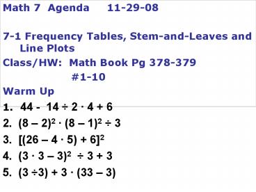
Math 7 Agenda 11-29-08 7-1 Frequency
Tables, Stem-and-Leaves and Line Plots Class/HW
Math Book Pg 378-379
1-10 Warm Up 1. 44 - 14 2 4 6 2. (8
2)2 (8 1)2 3 3. (26 4 5) 62 4. (3
3 3)2 3 3 5. (3 3) 3 (33 3)
Course 2
2
(No Transcript)
3
Learn to organize and interpret data in frequency
tables and stem-and-leaf plots, and line plots.
4
Vocabulary
frequency table cumulative frequency stem-and-leaf
plot line plot
5
A frequency table is a way to organize data into
categories or groups.
By including a cumulative frequency column in
your table, you can keep a running total of the
frequencies in each category.
6
Additional Example 1 Organizing and Interpreting
Data in a Frequency Table
The list shows the average high temperatures for
20 cities on one February day. Make a cumulative
frequency table of the data. How many cities had
average high temperature below 59 degrees? 69,
66, 65, 51, 50, 50, 44, 41, 38, 32, 32, 28, 20,
18, 12, 8, 8, 4, 2, 2
Step 1 Choose a scale that includes all of the
data values. Then separate the scale into equal
intervals.
019
2039
4059
6079
7
Additional Example 1 Continued
The list shows the average high temperatures for
20 cities on one February day. Make a cumulative
frequency table of the data. How many cities had
average high temperature below 59 degrees? 69,
66, 65, 51, 50, 50, 44, 41, 38, 32, 32, 28, 20,
18, 12, 8, 8, 4, 2, 2
Step 2 Find the number of data values in each
interval. Write these numbers in the Frequency
column.
7
019
5
2039
5
4059
3
6079
8
Additional Example 1 Continued
The list shows the average high temperatures for
20 cities on one February day. Make a cumulative
frequency table of the data. How many cities had
average high temperature below 59 degrees? 69,
66, 65, 51, 50, 50, 44, 41, 38, 32, 32, 28, 20,
18, 12, 8, 8, 4, 2, 2
Step 3 Find the cumulative frequency for each
row by adding all the frequency values that are
above or in that row.
7
12
17
20
17 cities had average high temperature below 59
degrees.
9
Check It Out Example 1
The list shows the grades received on an English
exam. Make a cumulative frequency table of the
data. How many students received a grade of 79 or
below? 85, 84, 77, 65, 99, 90, 80, 85, 95, 72,
60, 66, 94, 86, 79, 87, 68, 95, 71, 96
Step 1 Choose a scale that includes all of the
data values. Then separate the scale into equal
intervals.
6069
7079
8089
9099
10
Check It Out Example 1 Continued
The list shows the grades received on an English
exam. Make a cumulative frequency table of the
data. How many students received a grade of 79 or
below? 85, 84, 77, 65, 99, 90, 80, 85, 95, 72,
60, 66, 94, 86, 79, 87, 68, 95, 71, 96
Step 2 Find the number of data values in each
interval. Write these numbers in the Frequency
column.
4
4
6
6
11
Check It Out Example 1 Continued
The list shows the grades received on an English
exam. Make a cumulative frequency table of the
data. How many students received a grade of 79 or
below? 85, 84, 77, 65, 99, 90, 80, 85, 95, 72,
60, 66, 94, 86, 79, 87, 68, 95, 71, 96
Step 3 Find the cumulative frequency for each
row by adding all the frequency values that are
above or in that row.
4
8
14
20
8 students received grades of 79 or below.
12
A stem-and-leaf plot can be used to show how
often data values occur and how they are
distributed. Each leaf on the plot represents the
right-hand digit in a data value, and each stem
represents left-hand digits.
Key 27 means 27
13
Additional Example 2
Organizing and Interpreting Data in a
Stem-and-Leaf Plot
The data shows the number of years coached by the
top 15 coaches in the all-time NFL coaching
victories. Make a stem-and-leaf plot of the data.
Then find the number of coaches who coached fewer
than 25 years. 33, 40, 29, 33, 23, 22, 20, 21,
18, 23, 17, 15, 15, 12, 17
Step 1 Order the data from least to greatest.
Since the data values range from 12 to 40, use
tens digits for the stems and ones digits for the
leaves.
14
Additional Example 2 Continued
The data shows the number of years coached by the
top 15 coaches in the all-time NFL coaching
victories. Make a stem-and-leaf plot of the data.
Then find the number of coaches who coached fewer
than 25 years. 33, 40, 29, 33, 23, 22, 20, 21,
18, 23, 17, 15, 15, 12, 17
Step 2 List the stems from least to greatest on
the plot.
The stems are the tens digits.
1 2 3 4
15
Additional Example 2 Continued
The data shows the number of years coached by the
top 15 coaches in the all-time NFL coaching
victories. Make a stem-and-leaf plot of the data.
Then find the number of coaches who coached fewer
than 25 years. 33, 40, 29, 33, 23, 22, 20, 21,
18, 23, 17, 15, 15, 12, 17
Step 3 List the leaves for each stem from least
to greatest.
The stems are the tens digits.
The leaves are the ones digits.
5
5
7
7
8
2
1 2 3 4
0
3
1
2
3
9
3
3
0
16
Additional Example 2 Continued
Step 4 Add a key and a title.
Number of Years Coached
The stems are the tens digits.
The leaves are the ones digits.
Key 2 1 means 21.
11 coaches coached fewer than 25 years.
17
Check It Out Example 2
The list shows the number of times each soccer
player can bounce the ball on their knee. How
many soccer players can bounce the ball more than
36 times. 55, 60, 33, 30, 23, 45, 28, 41, 62, 29,
35, 40, 43, 37, 68, 30, 61, 27, 38, 41
Step 1
Order the data from least to greatest. Since the
data values range from 23 to 68, use tens digits
for the stems and ones digits for the leaves.
18
Check It Out Example 2 Continued
The list shows the number of times each soccer
player can bounce the ball on their knee. How
many soccer players can bounce the ball more than
36 times. 55, 60, 33, 30, 23, 45, 28, 41, 62, 29,
35, 40, 43, 37, 68, 30, 61, 27, 38, 41
Step 2 List the stems from least to greatest on
the plot.
The stems are the tens digits.
2 3 4 5 6
19
Check It Out Example 2 Continued
The list shows the number of times each soccer
player can bounce the ball on their knee. How
many soccer players can bounce the ball more than
36 times. 55, 60, 33, 30, 23, 45, 28, 41, 62, 29,
35, 40, 43, 37, 68, 30, 61, 27, 38, 41
Step 3 List the leaves for each stem from least
to greatest.
The stems are the tens digits.
The leaves are the ones digits.
8
3
7
9
0
0
3
7
8
5
0
1
1
3
5
5
1
2
8
0
20
Check It Out Example 2 Continued
Step 4 Add a key and a title.
Number of times a Soccer Player can bounce the
ball on their knee
The stems are the tens digits.
The leaves are the ones digits.
Key 4 0 means 40.
12 soccer players can bounce the ball on their
knee more than 36 times.
21
Additional Example 3
Organizing and Interpreting Data in a
Line Plot
Make a line plot of the data. How many hours per
day did Morgan babysit most often?
Number of Babysitting Hours in July
M T W Th F S Su
Wk 1 0 6 4 6 5 8 2
Wk 2 2 7 7 7 0 6 8
Wk 3 0 6 8 5 6 1 2
Wk 4 4 8 4 3 3 6 0
22
Additional Example 3 Continued
Make a line plot of the data. How many hours per
day did Morgan babysit most often?
Step 1 The data values range from 0 to 8. Draw a
number line that includes this range.
23
Additional Example 3 Continued
Make a line plot of the data. How many hours per
day did Morgan babysit most often?
Step 2 Put an X above the number on the number
line that corresponds to the number of
babysitting hours in July.
XXXXXX
XXXX
XXXX
XXX
XXX
XXX
XX
XX
X
The greatest number of Xs appear above the
number 6. This means that Morgan babysat most
often for 6 hours.
24
Check It Out Additional Example 3
Make a line plot of the data. How many slices of
pizza did most people eat?
Number of Slices eaten per Person
2 4 1 2 5 3 1
0 4 3 2 5 3 2
4 6 1 4 2 2 5
25
Check It Out Example 3 Continued
Make a line plot of the data. How many slices of
pizza did most people eat?
Step 1 The data values range from 0 to 6. Draw a
number line that includes this range.
26
Check It Out Example 3 Continued
Make a line plot of the data. How many slices of
pizza did most people eat?
Step 2 Put an X above the number on the number
line that corresponds to the number slices of
pizza eaten per person.
XXXXXX
XXXX
XXX
XXX
XXX
X
X
The greatest number of Xs appear above the
number 2. This means that most people ate 2
slices of pizza.
27
Lesson Quiz Part I
The data shows the ages of some hospital
nurses. 33, 35, 23, 39, 23, 24, 34, 21, 57, 45,
57, 60, 45, 24, 31, 42, 61, 45, 35, 38
1. Make a cumulative
frequency table of the data. How many of the
nurses are under the age of 40?
12
28
Lesson Quiz Part II
The data shows the ages of some hospital
nurses. 33, 35, 23, 39, 23, 24, 34, 21, 57, 45,
57, 60, 45, 24, 31, 42, 61, 45, 35, 38
2. Make a stem-and-leaf
plot of the data. How many nurses are over the
age of 45?
4
Key 4 2 means 42.
29
Lesson Quiz Part III
The data shows the ages of some hospital
nurses. 33, 35, 23, 39, 23, 24, 34, 21, 57, 45,
57, 60, 45, 24, 31, 42, 61, 45, 35, 38 3. Make a
line plot of the data. What age occurs most often?
45
XXXXXXX
XXXXX
XXXX
XX
XX
Recommended
CrystalGraphics Presentations


