
Affinity Diagram - PowerPoint PPT Presentation
1 / 133
Title:
Affinity Diagram
Description:
A tool to generate, organize, and consolidate information. ... Sawtooth - Two of three beyond 2-sigma - Four of five beyond 1-sigma. Check Sheet. What is it? ... – PowerPoint PPT presentation
Number of Views:212
Avg rating:3.0/5.0
Title: Affinity Diagram
1
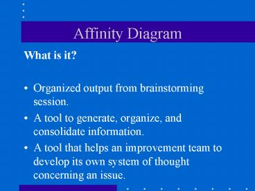
Affinity Diagram
- What is it?
- Organized output from brainstorming session.
- A tool to generate, organize, and consolidate
information. - A tool that helps an improvement team to develop
its own system of thought concerning an issue.
2
Affinity Diagram
- When is it used?
- Answer yes to the following
- Is the problem (or issue) complex and hard to
understand? - Is the problem uncertain, disorganized, or
overwhelming? - Does the problem require the involvement and
support of a group?
3
Affinity Diagram
- How is it made?
- Choose a group leader.
- State the issue or problem.
- Brainstorm and record ideas.
- Move the cards into like piles.
- Name each group with a header card.
- Draw the affinity diagram.
- Discuss the piles.
4
Affinity Diagram
- Remember
- Helps a team analyze a complex problem.
- Can further analyze by making a relations diagram.
5
Affinity Diagram
- Getting the most
- Use with other planning tools such as a relations
diagram. - Helps identify the area that may be most
important. - Use to break old thought pattern.
6
Attributes Charts
- What are they?
- Control charts used to monitor attributes data.
- Data is counted, not measured.
- Data is collected on certain characteristics that
have been operationally defined.
7
Attributes Charts
- What kinds are there?
- Nonconforming - Ex failing students
- np - number of sample failures.
- p - proportion of sample failures.
- Nonconformities - Ex discipline problems
- c - number of occurrences per subgroup
- u - number of occurrences per unit.
8
np Control Chart
- What is it?
- An attributes control chart that shows how a
system changes over time. - Measured by the number of nonconforming items
produced. - Helps minimize changes of overcontrol or
undercontrol. - Used to assess stability and monitor improvement.
9
np Control Chart
- When is it used?
- Answer yes to all of the following
- 1. Do you need to assess system stability?
- 2. Is the data the number of noncomforming
items per subgroup. - 3. Are all subgroups the same size?
- 4. Can there be only two outcomes to any given
check? - 5. Has the characteristic been operationally
defined prior to data collection? - 6. Is the time order of subgroups preserved?
10
np Control Chart
- How is it made?
- 1. Complete the header information.
- 2. Record the data.
- 3. Calculate the average number (np).
- 4. Calculate the control limits.
- 5. Determine the scaling for the chart.
- 6. Draw the center line and control limits.
- 7. Plot the values on the chart.
- 8. Interpret the control chart.
11
np Control Chart
- Remember
- It records the number of nonconforming items per
subgroup - The subgroups must all be the same size.
- The characteristic being charted must be
operationally defined prior to data collection.
12
np Control Chart
- Getting the most
- Use control charts for different
- purposes
- Assess system stability.
- As a tool to stratify data.
- Assess improvement theories.
- Interpret the data.
- Monitor the data following
- standardization.
13
np Control Chart
- What is it?
- An attributes control chart that shows how a
system changes over time. - Measured by the proportion of nonconforming items
produced. - A tool to help minimize the chance of overcontrol
or undercontrol. - Used to assess stability and monitor improvement.
14
p Control Chart
- When is it used?
- Answer yes to the following
- 1. Do you need to assess system stability?
- 2. Is the data composed of counts that can be
converted to proportions? - 3. Can there be only two outcomes to any given
check? - 4. Has the characteristic being charted been
operationally defined prior to data collection? - 5. Is the time order of subgroups preserved?
15
p Control Chart
- How is it made?
- 1. Complete the header information.
- 2. Record the data.
- 3. Calculate the proportion for each
subgroup. - 4. Calculate the average proportion (p).
- 5. Calculate the control limits.
- a. Calculate the average subgroup size
- (n).
- b. Determine the subgroup size limits.
16
p Control Chart
- How is it made? (cont.)
- 5. Calculate the control limits (cont.)
- c. Calculate the control limits for all the
data. - d. Calculate the control limits for
subgroups that vary excessively. - 6. Determine the scaling for the chart.
- 7. Draw the center line and control limits.
- 8. Plot the values on the chart.
- 9. Interpret the control chart.
17
p Control Chart
- Remember
- It records the proportion of nonconforming items
per subgroup. - The subgroup size can vary.
- The characteristic being charted must be
operationally defined prior to data collection.
18
p Control Chart
- Getting the most
- Use control charts for different purposes
- Assess system stability.
- As a tool to stratify data.
- Assess improvement theories.
- Interpretation of the data.
- Monitoring the data following standardization.
19
p Control Chart
- What is it?
- An attributes control chart that shows how a
system changes over time. - Measured by the number of nonconformities per
subgroup produced. - A tool to help minimize the chance of overcontrol
or undercontrol. - Used to assess stability and monitor improvement.
20
c Control Chart
- When is it used?
- Answer yes to all of the following
- 1. Do you need to assess system stability?
- 2. Is the data the number of nonconformities
per - subgroup.
- 3. Is the subgroup size the same for all
- subgroups?
- 4. Have the possible nonconformities been
- operationally defined prior to data
collection? - 5. Is the time order of subgroups preserved?
21
c Control Chart
- How is it made?
- Complete the header information.
- Record the data.
- Calculate the average number ( c ).
- Calculate the control limits.
- Determine the scaling for the chart.
- Draw the center line and control limits.
- Plot the values on the chart.
- Interpret the control chart.
22
c Control Chart
- Remember
- A c-chart records the number of nonconformities
per subgroup. - The characteristics being counted must be
operationally defined before data collection
begins. - The subgroup size must remain the same for all
subgroups.
23
c Control Chart
- Getting the most
- Use control charts for different purposes
- Assess system stability.
- As a tool to stratify data.
- Asses improvement theories.
- Interpret the data.
- Monitor the data following
- standardization.
24
u Control Chart
- What is it?
- An attributes control chart that shows how a
system changes over time. - Measured by the number of nonconformities per
subgroup produced. - A tool to help minimize the chance of overcontrol
or undercontrol. - Used to assess stability and monitor improvement.
25
u Control Chart
- When is it used?
- Answer yes to all of the following
- 1. Do you need to assess system stability?
- 2. Is the data the number of
- nonconformities per subgroup?
- 3. Have the possible nonconformities been
operationally
defined prior to data collection? - 4. Is the time order of subgroups preserved?
26
u Control Chart
- How is it made?
- 1. Complete the header information.
- 2. Record the data.
- 3. Calculate the number of nonconformities per
unit (u) for each subgroup. - 4. Calculate the average number (u).
- 5. Calculate the control limits.
- a. Calculate the average subgroup size
(n). - b. Determine the subgroup size limits.
27
u Control Chart
- How is it made? (cont.)
- 5. Calculate the control limits (cont.)
- c. Calculate the control limits for all data.
- d. Calculate the control limits for subgroups
that vary excessively - 6. Determine the scaling for the chart.
- 7. Draw the center line and control limits.
- 8. Plot the values on the chart.
- 9. Interpret the control chart.
28
u Control Chart
- Remember
- A u-chart records the number of nonconformities
per subgroup. - The characteristics being counted must be
operationally defined before data collection
begins. - The subgroup size can vary.
29
u Control Chart
- Getting the most
- Use control charts for different purposes
- Assess system stability.
- As a tool to stratify data.
- Assess improvement theories.
- Interpret the data.
- Monitor the data following standardization.
30
Brainstorming
- What is it?
- The free, uninhibited generation of ideas,
usually in a group setting. - A process for generating many ideas through group
dynamics. - A tool used by improvement teams in many
different settings when working on a project.
31
Brainstorming
- When is it used?
- To solicit ideas from a group on a given topic
such as project selection or problem causes. - To generate improvement actions.
32
Brainstorming
- Goals
- To generate a wide variety and extensive number
of ideas. - Everyone on the team becomes involved in the
problem solving process. - To insure that nothing is overlooked.
- To create an atmosphere of creativity and
openness.
33
Brainstorming
- Rules
- No criticism allowed.
- Each person has an equal opportunity to express
ideas. - Quantity over quality.
- Piggybacking or hitchhiking is encouraged.
34
Brainstorming
- How is it made?
- 1. Select a recorder and group facilitator.
- 2. Generate ideas.
- 3. Record the ideas.
- 4. (Optional) Organize results using
Affinity or C E Diagrams or Nominal Group
Technique.
35
Cause Effect Diagram
- What is it?
- A picture of various system elements that may
contribute to the problem. - Helps to identify possible causes of a specified
problem (or effect). - Useful in manufacturing, service, and
administrative applications. - Used by an improvement team to find special and
common causes of variation and to analyze causes. - Also called Ishikawa Diagram or Fishbone Diagram.
36
Cause Effect Diagram
- When is it used?
- Answer yes to one or both of these questions
- 1. Do root causes of a problem need to be
identified? - 2. Are there ideas and/or opinions about the
causes of a problem?
37
Cause Effect Diagram
- How is it made?
- 1. Identify the problem.
- 2. Record the problem statement.
- 3. Draw and label the main bones.
- 4. Brainstorm for problem causes.
- 5. Identify the most likely cause
candidates.
38
Cause Effect Diagram
- Remember
- A graphic way to display a lot of cause
information in a compact space - Helps teams move from opinions to theories that
can be tested - Is critical to understanding how to improve
systems - May be difficult to make
39
Cause Effect Diagram
- Getting the most
- Once causes have been selected from the diagram
- verify that causes produce the effect expected
- Verify that the effect is not produced in the
absence of these causes - Can be done at multiple levels in search of root
cause
40
Cause Effect Diagram
- Variations
- Process Analysis C E Diagram
- Negative C E Diagram
41
Control Chart Interpretation
- What is it?
- The process of analyzing the chart to understand
the performance of the system being studied - A way to help people who are managing systems
make the right decisions about how to control and
run them - A tool to help minimize the chance of making two
mistakes when working on a system overcontrol or
undercontrol
42
Control Chart Interpretation
- When is it used?
- Interpret every chart
- Re-interpret with every new point
43
Control Chart Interpretation
- How to interpret control charts
- 1. Look for unstable conditions
- - Any point outside control limits
- - Run of seven points
- - Nonrandom patterns
- 2. Declare the system in control (stable) or
out of control (unstable) - 3. Respond to the information on the chart.
44
Control Chart Interpretation
- Remember
- - Interpret charts after calculating control
limits. - - It is a way of reading signals in charts.
- - It is a mental process of questions and
pattern - recognition
- - Out of control does not always mean trouble.
- - Basic rules for recognizing unstable
conditions. - - Any point outside control limits.
- - Run of seven points.
- - Nonrandom patterns.
45
Control Chart Interpretation
- Getting the most
- Variables charts
- - Central location and variability
- - Variability first
- - X-MR points are not averages or medians
- Attributes charts
- - Note direction of point movement
- - Interpret p- and u-charts with variable
- limits in usual way
46
Control Chart Interpretation
- Getting the Most(cont.)
- Advanced rules
- - Trends
- - Clusters
- - Sawtooth
- - Two of three beyond 2-sigma
- - Four of five beyond 1-sigma
47
Check Sheet
- What is it?
- - A tool for collecting data in a consistent
- form.
- - Provides an easy, structured way of
- recording data as it is collected
- - Assures data will be recorded in similar
- manner
48
Check Sheet
- What is it? (cont.)
- - Formats can be designed for various needs
- - Most commonly arranged in columns or
- matrix
- - Used by improvement teams to gather data
49
Check Sheet
- When is it used?
- Answer yes to all of the following
- 1. Is data to be collected?
- 2. Is an organized format for collecting data
needed. - 3. Will different people be collecting or
using the data for study or project?
50
- How is it made?
- 1. List the data needs.
- 2. Decide on format.
- 3. Design and produce form.
- 4. Review design.
- 5. Test the form.
51
Check Sheet
- Remember
- - A check sheet provides a format for
- collecting data
- - A good design increases the efficiency of
- data use.
- - The check sheet is designed to make data
- gathering and analysis easier.
- - There are unlimited format designs.
52
Flow Chart
- What is it?
- - A picture of any process
- - Drawn with standard symbols
representing different types of activities - - Style and depth chosen should be
- consistent and useful
- - Different styles available, 2 covered
- - Deployment
- - Process
53
Flow Chart
- Purpose
- - Defines the system being studied
- - Gets agreement
- - Identifies value added activities
- - Identifies dead wood activities
- - Identifies areas of data stratification
- - Documents changes to the process
54
Deployment Flow Chart
- When is it used?
- Answer yes to all of the following
- 1. Is a picture of the process needed?
- 2. Is it necessary to show the
relationship of the people and process
steps? - 3. Will the process be pictured as it
actually operates?
55
Deployment Flow Chart
- How is it made?
- 1. Define the process boundaries.
- 2. Observe the process in operation.
- 3. Draw a People Coordinate.
- 4. List major steps in the process.
- 5. Draw the flow chart, using symbols
- 6. Study the flow chart.
56
Flow Chart
- Remember
- - A flow chart is a picture of a process.
- - Choosing the style and depth of detail
- depends on purpose.
- - Everyone involved with the process
- should help in construction and agree on
- picture.
- - A flow chart is a dynamic tool which
- should be changed when process changes
- are made.
57
Flow Chart
- Getting the most
- - Use them on an ongoing basis expand
- into more detail.
- - Keep them current, as they should
- represent the current, best known way to
- operate.
58
Process Flow Chart
- What is it?
- - A picture of the major steps in a process
- - Does not show the relationship of the
- people doing the work and the steps in
- the process
59
Process Flow Chart
- When is it used?
- Answer yes to all of the following
- 1. Is a picture of a process needed?
- 2. Are actual steps in the process shown?
- 3. Is it unnecessary to show the
- relationship between the people doing
the work and the work being done?
60
Process Flow Chart
- How is it made?
- 1. Observe the process.
- 2. List all steps in the process.
- 3. Arrange the steps in sequence.
- 4. Draw the Flow Chart.
- 5. Study the Flow Chart.
61
Force Field Analysis
- What is it?
- A problem-solving tool to help change occur
- Views change as a struggle between forces -
Driving forces help change occur - - Restraining forces block the change
62
Force Field Analysis
- When is it used?
- - Any time a change is expected to be
- difficult
63
Force Field Analysis
- How is it made?
- 1. Define the desired change or action.
- 2. Brainstorm the driving forces.
- 3. Brainstorm the restraining forces.
- 4. Prioritize the driving forces.
- 5. Prioritize the restraining forces.
- 6. List action to be taken.
64
Force Field Analysis
- Remember
- Reviews proposed change from both for and against
viewpoint. - Provides a starting point for action.
- A list of actions is the output.
65
Force Field Analysis
- Variations
- Match forces
- Driving forces and restraining forces are matched
in an attempt to cancel each other out - If no match exists for restraining force(s),
action will be developed to reduce, eliminate, or
reverse
66
Histogram
- What is it?
- - Bar graph of raw data
- - A tool to show central location, shape, and
- spread of data
- - A means to gain knowledge about the
- system
- - A way to assess stability so that
- predictions about system performance can
- be made.
67
Histogram
- When is it used?
- Answer yes to all of the following
- 1. Do you have a data set of related values?
- 2. Is it important to visualize central
location, shape, and spread of the data?
68
Histogram
- How is it made?
- 1. Select the classes.
- a. Determine the number of classes.
- b. Determine the class width and
- boundaries
- 2. Record the data.
- 3. Prepare the axes.
- b. Draw and label the horizontal and
- vertical axes.
- b. Scale and label each axis.
69
Histogram
- How is it made? (cont.)
- 4. Draw the histogram.
- 5. Study the shape.
- 6. Calculate the statistics.
- A. Central location.
- B. Spread
- 7. Compare your histogram to the normal
- distribution.
70
Histogram
- Remember
- Is a picture of a set of data
- Can use to make predictions about the future if
the system is stable - Shows central location, shape and spread
71
Histogram
- Getting the most
- Apply the concepts of central location, shape,
and spread. - Use to predict when the system is stable.
72
Measurement Examples
- Function Is the system doing what it is
supposed to do? - - Performance, of students who master
- first time, rework, errors
- Cost What are the costs to the customers,
either internal or external? - - Unit cost, losses, material costs (non)quality
- costs, loss of self-esteem, length of time
it takes - for a teacher to use a new teaching method
73
Measurement Examples
- (cont.)
- Delivery Is the product or service there when
and where the customer needs it? - - On-time, where needed, quantity needed,
- inventory, lead time, cycle time, cause
- availability
74
Measurement Examples
- (cont.)
- Safety Is the product or service physically and
psychologically safe for the user? - - Survey results, anecdotal information,
- critical incident reports
- Morale Are the internal customers satisfied?
- - Survey results, anecdotal information,
- critical incident reports
75
Nominal Group Technique
- What is it?
- - A structured group process used to help
- make decisions
- - A tool to give everyone on the team an
- equal voice in decision making
- - A way to generate more unique, higher
- quality ideas
76
Nominal Group Technique
- When is it used?
- When you need to generate and choose a course of
action for improvement
77
Nominal Group Technique
- How is it made?
- 1. State the defined area of opportunity
- 2. Silently generate action items
- 3. State and record the ideas
- 4. Discuss each item on the list
- 5. Establish criteria for the voting
78
Nominal Group Technique
- How is it made? (cont.)
- 6. Conduct a preliminary vote.
- a. Individuals choose the items most
- important to them.
- b. Rank order the cards.
- c. Record the votes.
- d. Discuss the results of the vote.
79
Nominal Group Technique
- Remember
- - Helps to generate and choose actions
- - Minimizes internal group influences
- - Promotes team commitment to actions by
- involving all members in decision making
80
Nominal Group Technique
- Getting the most
- - Use for planning continuous improvement.
- - Use over time.
81
Nominal Group Technique
- Variations
- - Decision matrix
82
Operational Definition
- What is it?
- - Gives a clear, concise, and detailed
definition of a measure - - Provides clear communication among everyone in
the system - - Yields a single yes or no answer, is
consistently applied, and is understandable - - Defines measures for improvement teams before
they begin gathering data
83
Operational Definition
- Attributes data
- - Data that is counted
- - number of absent students
- - number of missed homework items
- - number of tardies
- - The operational definition is fundamental to
improve uniformity of judgement.
84
Operational Definition
- Attributes data
- - Data that is counted
- - number of absent students
- - number of missed homework items
- - number of tardies
- - The operational definition is fundamental
- to improve uniformity of judgement
85
Operational Definition
- (cont.)
- Variables data
- - Data that is measured
- - time
- - money
- - electricity usage
- - The operational definition gives specific
- instruction on how criteria is measured.
86
Operational Definition
- What does it look like?
- 1. Characteristic of interest
- - Purchase delivery time.
- 2. Measuring instrument
- - A calendar and the holiday schedule.
87
Operational Definition
- What does it look like? (cont.)
- 3. Method of test
- - Three campuses and one support site will be
included in the sample for the months of
September-April (1991-92). Requisition will be
selected randomly (every 10th requisition does
not have a P.O., then select the next requisition
for which a P.O. was issued). The desired data
is the number of working days between issuance of
the requisition by a site and the date the
completed purchase order is received at the site.
This number is determined by subtracting the
requisition date and then subtracting the number
of non-working days and holidays during that
period.
88
Operational Definition
- What does it look like? (cont.)
- 4. Decision criteria
- - The number of working days required
- from requisition to delivery of
- materials at the site.
89
Operational Definition
- When is it used?
- - With every project when defining quality
- measures
90
Operational Definition
- How is it made?
- 1. Identify the characteristic of interest.
- 2. Select measuring instrument.
- 3. Describe the test method.
- 4. State the decision criteria.
- 5. Document the operational definition.
91
Operational Definition
- Remember
- - Helps reduce the variability in data
collection - - Is required for both attributed and variables
- data
- - Is used by improvement teams to define
- quality measures before gathering data
92
Operational Definition
- Getting the most
- - Check the operational definition and
- evaluation whenever system is unstable
- - Use as a communication tool between
- customer and supplier.
- - Test the operational definition before
- standardizing by applying the method of
- test.
93
Pareto Diagram
- What is it?
- - A bar chart which ranks related measures
- in decreasing order of occurrence
- - A tool to separate the significant aspects
- from the trivial ones
- - A way to stratify data, study improvement
- results, and plan for continuous
- improvement
94
Pareto Diagram
- When is it used?
- - Answer yes to all of the following
- 1. Can data be arranged in categories?
- 2. Is the rank of each category
- important?
95
Pareto Diagram
- How is it made?
- 1. Select logical categories.
- 2. Specify the time period.
- 3. Collect the data.
- 4. Construct a frequency table.
- 5. Draw and scale the horizontal and
- vertical axes.
- a. Draw the horizontal axis.
- b. Decide on the scaling floor.
96
Pareto Diagram
- How is it made? (cont.)
- 5. Draw and scale the horizontal and
- vertical axes. (cont.)
- c. Draw the vertical axis.
- d. Scale the vertical axis.
- 6. Draw and label the bars for each
- category
- 7. Draw the cumulative percentage line.
- 8. Review the results of the Pareto.
97
Pareto Diagram
- Remember
- - A pareto diagram is a bar chart that ranks
- data by categories
- - It is based on the idea that only a few
- categories contain most of the data.
- - The largest bar(s) directs team efforts.
- - Team can use tool for several purposes during
- the project.
- - Pareto is a simple, powerful tool.
98
Pareto Diagram
- Getting the most
- - Use subdivisions when the data is first
- collected at the general level.
- - Use multi-perspective analysis when the
- data can be stratified.
- - Repeat analysis to see how the system is
- changing.
- - Study the systems stability before doing
- Pareto analysis.
99
Relations Diagram
- What is it?
- - A picture of cause-and-effect relationships
- between elements of a problem
- - Management tool to help identify root
- causes and root effects of a problem
100
Relations Diagram
- When is it used?
- Answer yes to all of the following
- 1. Do the aspects of a complex issue
- need to be analyzed and understood?
- 2. Is the team having trouble getting to
- the root causes of a problem because
only symptoms seem to be apparent?
101
Relations Diagram
- How is it made?
- 1. Clearly define the issue or problem.
- 2. Construct the diagram layout.
- 3. Analyze the relationships.
- 4. Count the arrows.
- 5. Identify the root causes and effects.
- 6. Study the final diagram.
102
Relations Diagram
- Remember
- - Helps analyze cause-and-effect
- relationships among elements of a
- problem
- - Directs a team toward the root causes of a
- problem
103
Relations Diagram
- Getting the most
- - Use over time and revisit the diagram to
- check teams progress.
104
Run Chart
- What is it?
- - A line graph of data plotted over time
- - Data can be attributes or variables
- - A means of looking at the systems
- behavior over time
- - A tool used by an improvement team
- when gathering baseline data at the
- beginning of a project
105
Run Chart
- When is it used?
- Answer yes to all of the following
- 1. Is the data collected over time?
- 2. Is the time order of the data preserved?
106
Run Chart
- How is it made?
- 1. Complete the header information.
- 2. Record the data.
- 3. Determine the scaling for the chart.
- 4. Plot the values on the chart.
- 5. Interpret the chart.
107
Run Chart
- Remember
- - A plot of data over time
- - Time is plotted on horizontal axis, variable
- value on vertical axis.
- - Used to detect trends or patterns in data
- over time
- - The basis for a control chart
108
Run Chart
- Getting the most
- - Use often and with different kinds of data
- - Display of public
- - Use as a quick test of system performance
109
Sampling
- What is it?
- - The process of selecting the size and
- frequency of samples being taken from a
- subgroup
- - The process of selecting a representative
- part of a population to estimate
- characteristics of the population
- - A process of gathering data at a lower cost
- without reduced accuracy
110
Sampling
- Terms
- - Population
- - The area under study
- - Frame
- - A listing of all the elements in the
population - - Sample
- - The actual data gathered for quantitative
- analysis, also called subgroups
- - Conceptual Population
- - The past, current, and future population
- - Assumes that the process is ongoing
111
Sampling
- When is it used?
- Any time data is to be gathered
112
Sampling
- How is it made?
- 1. Determine what question you are
- thinking of the data.
- 2. Determine the frequency of sampling.
- 3. Determine the actual frequency times.
- 4. Select the subgroup size.
- a. Variables data
- b. Attributes data
113
Sampling
- Remember
- Guided the quantitative study of a system
- Is used to minimize cost and improve accuracy
- Frequency depends on how often a process changes
114
Scatter Diagram
- What is it?
- A graph showing the plotted values of two factors
- A tool demonstrating whether or not two factors
are related
115
Scatter Diagram
- When is it used?
- Answer yes to all of the following
- 1. Do you want to test whether the
- performance of one factor is related to
- the performance of another?
- 2. Are the two factors
- a. A quality characteristic and a factor
you suspect affects it, OR - b. Two related quality characteristics,
- OR
- c. Two factors suspected of relating to
- the same quality characteristics.
116
Scatter Diagram
- How is it made?
- 1. Draw and label the horizontal and vertical
axes. - 2. Scale each axis.
- 3. Plot the points.
- 4. Interpret the scatter diagram
- a. Look for patterns.
- b. Look for outliers.
117
Scatter Diagram
- Remember
- Can be constructed if a relationship is thought
to exist between two factors - Is used to verify causes
- The pattern, if any, gives information about how
the factors are related
118
Scatter Diagram
- Getting the most
- Data stratification may be required because of
intervening factors and changing patterns in the
relationship - The plotted relationship between two factors may
change direction.
119
Systematic Diagram
- What is it?
- A graphic representation of the different levels
of actions needed to achieve a goal - A management tool used to generate specific
action items that can be implemented to
accomplish a broad goal
120
Systematic Diagram
- When is it used?
- Answer yes to all of the following
- 1. Has a broad task or goal become the
- focus of the teams work?
- 2. Is the action plan to accomplish the goal
- or task likely to be complex?
121
Systematic Diagram
- How is it made?
- 1. Record the problem or goal statement.
- 2. Generate the first level of items.
- 3. Complete the systematic diagram under
- each major path.
- 4. Study the diagram.
122
Systematic Diagram
- Remember
- Used to generate a specific list of action items
which can be implemented to achieve a goal - Used by a team to
- plan a test for an improvement theory
- plan for standardizing an improvement
- plan for continuous improvement
123
Systematic Diagram
- Getting the most
- Assign responsibility for completion of action
items when diagram is completed
124
X-R Chart
- What is it?
- A picture of system data gathered over time
- A chart that shows how the mean and range of the
subgroups change over time - A tool to help minimize the chance of overcontrol
or undercontrol
125
X-R Chart
- When is it used?
- Answer yes to all of the following
- 1. Do you need to assess the stability of a
system? - 2. Is data in variables form?
- 3. Is data collected in subgroups larger than
one? - 4. Is the time order of subgroups preserved?
126
X-R Chart
- How is it made?
- Complete the header information.
- Record the data.
- Calculate the statistics for each subgroup.
- Calculate the averages for the subgroup
statistics. - Calculate the control limits.
- Determine the scaling for the charts.
- Draw the center line and control limits.
- Plot the values on the charts.
- Interpret the control chart.
127
X-R Chart
- Remember
- Shows how variables data changes over time
- Helps to identify special and common causes of
variation
128
X-R Chart
- Getting the most
- Assess stability
- Stratify data
- Track system changes as a result of implemented
improvement theories
129
X-MR Chart
- What is it?
- A picture of system data gathered over time
- A chart that shown how individual measured values
and the variability between subsequent values
change over time - A tool to help minimize the chance of overcontrol
or undercontrol
130
X-MR Chart
- When is it used?
- Answer yes to all of the following
- 1. Do you need to assess the stability of
- a system.
- 2. Is data in variables form?
- 3. Is data collected in subgroups of one?
- 4. Is the time order of subgroups
- preserved?
131
X-MR Chart
- How is it made?
- 1. Complete the header information.
- 2. Record the data.
- 3. Calculate the moving ranges.
- 4. Calculate the overall averages.
- 5. Calculate the control limits.
- 6. Determine the scaling for the charts.
- 7. Draw the center lines and control limits.
- 8. Plot the values on the charts.
- 9. Interpret the control chart.
132
X-MR Chart
- Remember
- Shows how variables data changes over time
- Helps to identify special and common causes of
variation - n 1
- The range is found by comparing subsequent
subgroups
133
X-MR Chart
- Getting the most
- Assess stability
- Stratify data
- Track system changes as a result of implemented
improvement theories
Recommended
CrystalGraphics Presentations


![Figure 22-48 Schematic diagram depicting the coordinated control of glycolysis and the citric acid cycle by ATP, ADP, AMP, Pi, Ca2+, and the [NADH]/[NAD+] ratio (the vertical arrows indicate increases in this ratio). PowerPoint PPT Presentation](https://s3.amazonaws.com/images.powershow.com/3889887.th0.jpg?_=201301130811)


