
Making Presentations That Audiences Will Love - PowerPoint PPT Presentation
1 / 15
Title:
Making Presentations That Audiences Will Love
Description:
Making Presentations That Audiences Will Love ' ... match our listening speed; hence, it confuses instead of reinforcing each other. ... – PowerPoint PPT presentation
Number of Views:24
Avg rating:3.0/5.0
Title: Making Presentations That Audiences Will Love
1
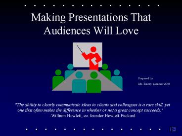
Making Presentations That Audiences Will Love
Prepared by Ms. Emery, Summer 2006
"The ability to clearly communicate ideas to
clients and colleagues is a rare skill, yet one
that often makes the difference in whether or not
a great concept succeeds." -William Hewlett,
co-founder Hewlett-Packard
2
Use a Template
- Use a set font and color scheme.
- Different styles are disconcerting to the
audience. - Strive for the audience to focus on what you
present, not the way you present.
3
Fonts
- Choose a clean font that is easy to read.
- Roman and Gothic typefaces are easier to read
than Script or Old English. - Stick with one or two types of fonts.
4
Font Size
- Bulleted items should be no smaller than 22
points. - The title should be no smaller than 28 points.
5
Bullets
- Keep each bullet to one line, two at the most.
- Limit the number of bullets on a screen to six,
four if there is a large title, logo, picture,
etc.
6
Bullets
- If you crowd too much text, the audience will not
read it. - Too much text makes it look busy and is hard to
read. - Why should they spend the energy reading it, when
you are going to tell them what it says? - Our reading speed does not match our listening
speed hence, it confuses instead of reinforcing
each other.
7
Caps and Italics
- Do not use all capital letters
- Makes text hard to read
- Conceals acronyms
- Denies the use for EMPHASIS
- Italics
- Used for quotes
- Used to highlight thoughts or ideas
- Used for book, journal, or magazine titles
8
Colors
- Reds and oranges are high-energy but can be
difficult to stay focused on. - Greens, blues, and browns are mellower, but not
as attention grabbing. - White on dark background should not be used if
the audience is more than 20 feet away.
9
Backgrounds
- A white on a dark background was used for this
set of slides because - Most users will view the presentation on their
own computer. - Having a dark background on a computer screen
reduces glare.
10
The Color Wheel
- Colors separated by another color are contrasting
colors (also known as complementary) - Adjacent colors harmonize with one another.
11
Clashing Colors
- Colors that are directly opposite from one
another are said to clash. - These provide readability
12
To make a slide stand out, change the font or
background
Attention Grabber
13
Illustrations
- Use only when needed, otherwise they distract
instead of communicate - Should relate to the message and help make a
point - Ask yourself if it makes the message clearer
- Simple diagrams are great communicators
14
Final Tips
- Do not use the media to hide you
- The media should enhance the presentation, not BE
the presentation - Print handouts and distribute the slides if all
you are going to do is read from them. - Prevent death by PowerPoint
15
References
- http//www.nwlink.com/donclark/leader/leadpres.ht
ml - http//www.nwlink.com/donclark/hrd/templates/pres
entation.rtf
Recommended
CrystalGraphics Presentations


