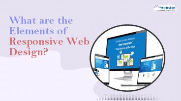
What are the Elements of Responsive Web Design? https://www.dubaiwebsitedesign.ae/ - PowerPoint PPT Presentation
Title:
What are the Elements of Responsive Web Design? https://www.dubaiwebsitedesign.ae/
Description:
Three main parts make up a responsive web design. Fluid grid systems, media queries, and fluid image utilisation are examples of these. For website designing in Dubai, use the best web design Dubai company. You will only be able to reach out to your target audience if you have an appealing website created to sell your business. – PowerPoint PPT presentation
Number of Views:11
Title: What are the Elements of Responsive Web Design? https://www.dubaiwebsitedesign.ae/
1
What are the Elements of Responsive Web Design?
2
Basics of Responsive Web Design
- A responsive web design is divided into
three key elements. These are fluid grid systems,
the media query, and fluid image use. This is
essentially an approach that facilitates the use
of the design of a website across different
devices such as a tablet, desktop, mobile, etc.
The design needs to be such that it should adjust
as per the users behavior on basis of the
platform, size, and orientation. Hire the best
web design Dubai Company for Website Designing in
Dubai. Only when you have an impressive website
built to market your business will you be able to
reach out to your target audience.
3
Understanding Fluid Grid System
- Before the advent of the internet, there was
only a print medium where the - content was put. In that medium size was only in
absolute measures. With - responsive websites, this concept does not hold
good. There is the use of - relative size in place of absolute size.
- Target size/context relative size
- For instance, if you are working on a site with a
wrapper that will display the - site at the width of only 960 pixels and the
width of the browser window is - 1280 pixels. So this means the target size is 960
pixels and the context is 1280 - pixels. This means as per the above formula
relative size will be 75
4
Fitting fluid Images
- The CSS command can be used to handle the fluid
images. The command will instruct the browser to
display the image at 100 pixel value. The image
will be scaled according to the container holding
the image. This will preclude the image to get
stretched when the container size is more.
Degradation of the image is prevented. The image
will shrink also accordingly whenever it is
needed.
5
Media Queries
- These are designed to modify the site layout when
certain specific conditions - are fulfilled. A series of CSS commands can be
used for the different - breakpoints. The content needs to be tested to
find where there are - breakpoints and then you need to plan
accordingly. Ultimately you will be - able to tell about the breakpoints on the basis
of the devices screen - resolution.
6
What Superb Web Design Entails?
- A little bit of practice ensures that Web
Designers in Dubai build a website that is
responsive. For the designers, the main aim is to
tailor the UX and UI of a website design across
various platforms and devices. Superb user
experience is the key to the success of any
website and a responsive web design makes sure
that the website structure adjusts as per the
size of the screen of the device without any
hassle. Catering to different devices has become
the need of the hour and websites must be
designed in such a manner that they adjust as per
the device from where they are accessed.
7
Thank You
Dubai Website Design
https//www.dubaiwebsitedesign.ae/


