
Responsive Websites – Build for Mobile First - PowerPoint PPT Presentation
Title:
Responsive Websites – Build for Mobile First
Description:
A responsive web design automatically adjusts for different-sized screens and viewports. With a responsive website, someone can browse your website from any device and it'll still look and function perfectly. A site that's responsive provides visitors with the best possible user experience no matter the device being used to access the site. Google highly recommends businesses invest in creating a responsive website versus a separate mobile website. A responsive website is easy to maintain, and it boosts your SEO efforts. A responsive website will reduce the bounce rate with fast loading, easy to use navigation, and clear call-to-action. Website developers in Castle Rock, CO can help convert your current site into a responsive one, or create a new responsive website from scratch. To know more visit here – PowerPoint PPT presentation
Number of Views:15
Title: Responsive Websites – Build for Mobile First
1
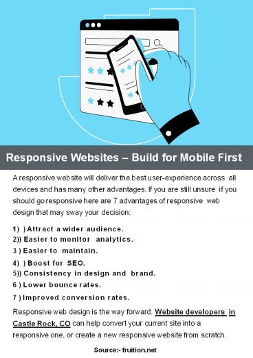
Responsive Websites Build for Mobile First
- A responsive website will deliver the best
user-experience across all devices and has many
other advantages. If you are still unsure if you
should go responsive here are 7 advantages of
responsive web design that may sway your
decision - ) Attract a wider audience.
- ) Easier to monitor analytics. 3 ) Easier to
maintain. - ) Boost for SEO.
- ) Consistency in design and brand. 6 ) Lower
bounce rates. - 7 ) Improved conversion rates.
- Responsive web design is the way forward. Website
developers in Castle Rock, CO can help convert
your current site into a responsive one, or
create a new responsive website from scratch. - Source- fruition.net
Recommended
CrystalGraphics Presentations


