
Benefits Of Displaying Online Poll Result On World Map - PowerPoint PPT Presentation
Title:
Benefits Of Displaying Online Poll Result On World Map
Description:
It's better to represent issue's result in graphical manner by displaying it on globe or world map. Online polls are one of the cost effective ways to collect data from prospective or current users. There are numerous approaches to visually displaying and summarizing quantitative data and seems some have a strong opinion on the correct way. PollDeep – an online polling tool – Displays poll results on World Map for better understanding of survey. – PowerPoint PPT presentation
Number of Views:25
Title: Benefits Of Displaying Online Poll Result On World Map
1
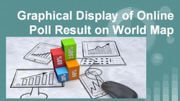
Graphical Display of Online Poll Result on World
Map
2
- Online polls are one of the cost effective ways
to collect data from prospective or current
users. Gathering meaningful insights begin with
summarizing the raw responses. - There are numerous approaches to visually
displaying and summarizing quantitative data and
seems some have a strong opinion on the correct
way.
3
Binary Responses
4
- If the question has only 2 possible response
options, it means a binary response option. Once
added, both options, are equivalent to a hundred
percent. - Nevertheless, if you like to estimate the
percentage of the users, your user population
could agree with the statement, you would want to
use the confidence intervals.
5
Rating Scales
6
- Questions with rating scales may be those that
ask the participants to rate their agreement
level or satisfaction level from 1-5, 1-7 or any
number range. - To make comparisons between the questions, find
the standard deviation, number of the responses,
know the mean, and try computing the confidence
interval.
7
Single Select
8
- If the participants were asked to choose a choice
out of the number of alternatives, its a
single-select response option. You can summarize
the proportion that chose every category. If you
like to summarize the responses in a survey, a
pie graph is enough. - Nevertheless, if you like to estimate the
prevalence of a response for the whole population
to know if its higher than another, using bar
graphs with the confidence intervals can be
helpful.
9
Multiple Select
10
- If the participants are allowed to choose
anything, the total number of the responses will
add up to more than a hundred percent. - You can summarize the proportion selecting with
the use of binary confidence intervals used in a
single-select method.
11
- Depending on the kind of online polls you have
used, having a graphical display of the results
on world map is important to summarize everything
and see the difference. - Graphical display can be created easily. The
first thing that you should do is to prepare the
results of your online polls.
12
- The available designs for graphical display may
vary. Regardless of your preferences, you can
decide to create your own and just insert the
results of your online poll. - However, if you want to set apart from others and
add a personal touch on your online poll results,
select a graphical display on the world map that
would match your business or needs.
13
About Us
Poll-Deep is an online tool that you can create
awesome polls with. Create polls with ease, get
instant feedback and learn more from your
audience than yes, no or maybe so. We'll help
you to understand what influences the answers to
your questions and enable you to quickly spot
trends in your home country and around the world.
14
P. O. Box HM 1152 , Hamilton HM EX
Bermuda Support- support_at_polldeep.com Sales-
sales_at_polldeep.com Enquiries-
info_at_polldeep.com
Recommended
CrystalGraphics Presentations


