
Reasons to Change New Google Logo - PowerPoint PPT Presentation
Title:
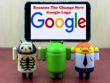
Reasons to Change New Google Logo
Description:
The new Google logo that was announced today reflects the fact that the search engine giant is going through a number of dramatic changes. On the new logo began to make more sense. That's important because it's the first thing everyone sees when trying to answer all of their burning questions, here are the reasons the new Google logo makes sense. – PowerPoint PPT presentation
Number of Views:9
Title: Reasons to Change New Google Logo
1
(No Transcript)
2
Overview
- The new Google logo that was announced today
reflects - The fact that the search engine giant is going
through a number of dramatic changes. - At first, the new font was a little unsettling.
- But, as the day wore, on the new logo began to
make more sense. - Here are the reasons the new Google logo makes
sense
3
New Google logo Simplified
It's no coincidence that the new Google logo
comes at a time when the Mountain View company is
being restructured into Alphabet, the tech firm's
new conglomerate.
4
Cross-platform logo
Google is everywhere, according to the company's
head of user experience, Tamar Yehoshua. That
didn't used to be the case 17 years ago when
everyone was glued to a desktop PC.
5
The new logo bytes less
Gone along with the serifed typeface are the
large file sizes associated with older logo.
There's now a special variant that's 305 bytes
instead of 14,000 bytes.
6
Contact us
www.facebook.com/arthisoftindia
twitter.com/arthisoft
Recommended
CrystalGraphics Presentations


