Graphing Guidelines - PowerPoint PPT Presentation
1 / 13
Title:
Graphing Guidelines
Description:
Graphing Guidelines. It is done on graph paper. ... Graphing Guidelines. Select a scale that uses the greatest portion of the paper. Leave enough room to title ... – PowerPoint PPT presentation
Number of Views:49
Avg rating:3.0/5.0
Title: Graphing Guidelines
1
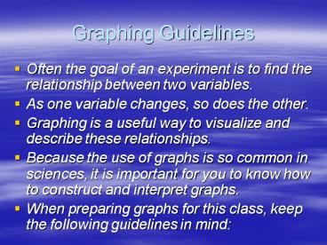
Graphing Guidelines
- Often the goal of an experiment is to find the
relationship between two variables. - As one variable changes, so does the other.
- Graphing is a useful way to visualize and
describe these relationships. - Because the use of graphs is so common in
sciences, it is important for you to know how to
construct and interpret graphs. - When preparing graphs for this class, keep the
following guidelines in mind
2
Graphing Guidelines
- It is done on graph paper.
- Use the x-axis for the independent variable (the
variable changed by the experimenter) and the
y-axis for the dependent variable (the variable
being measured). - The scale you select should be easy to work with
such as one square represents 1, 2, 5, or 10 or
five squares represents a unit of 1, 10, or a
multiple of ten (20, 100, 0.1). Never change the
scale along an axis. However, you may use a
different scale for each axis.
3
Graphing Guidelines
- Select a scale that uses the greatest portion of
the paper. Leave enough room to title your axis
and graph. - Label what the axes represent by including the
measurement and its units. For example "Length
(cm)" or Time in seconds
4
Graphing Guidelines
- For line graphs, plot your points. Sometimes you
will be asked to connect the dots. - Other times you will be asked to draw the line of
best fit. The line should pass as close as
possible to each of the points but should not be
connected point-to-point. If the relationship
appears to be linear, the line of best fit should
be a straight line.
5
Graphing Guidelines
- Title the graph. Make sure you describe what is
represented on the horizontal and vertical axes. - If you are plotting more than one curve on the
same graph, include a legend that identifies the
curves. Use different colors or different types
of lines such as solid or dashed lines between
them.
6
Example Graphs
7
(No Transcript)
8
(No Transcript)
9
Practice Graphs
- Recall that a bar graph is useful for comparing
information collected by counting. We are going
to use the clothing of students in this classroom
to demonstrate how to make a data table and bar
graph. We will look at the shirt color of boys
and girls in the room.
10
Practice Graphs
- Step 1 Gather Data
- An easy way to organize our data is to create a
table. Lets use this table to fill in our data.
11
Practice Graphs
- Step 2 Create the Graph
- Independent variable (x-axis) ________
- Dependent variable (y-axis) __________
- Choose two different colors to use (one to
represent boys, one to represent girls).
12
Key Features of Bar Graphs
- Title
- Axis are labeled with units
- Legend
- Check your graph to make sure you have these
three features
13
Line Graphs
- Recall that line graphs are useful for showing
trends. - Problem
- In an experiment, you check the air temperature
at certain hours of the day. At 8 A.M., the
temperature is 27 ?C at 10 A.M., the temperature
is 30 ?C at noon, the temperature is 32 ?C at 2
P.M., the temperature is 31?C and at 4 P.M., the
temperature is 30 ?C. Graph the results of your
experiment.


