
Business 90: Business Statistics - PowerPoint PPT Presentation
1 / 32
Title:
Business 90: Business Statistics
Description:
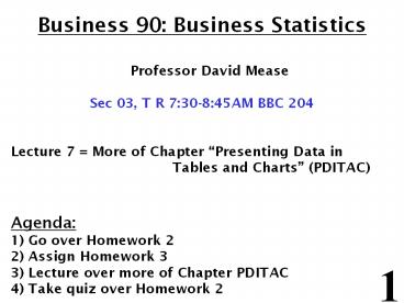
Business 90: Business Statistics Professor David Mease Sec 03, T R 7:30-8:45AM BBC 204 Lecture 7 = More of Chapter Presenting Data in Tables and Charts (PDITAC) – PowerPoint PPT presentation
Number of Views:112
Avg rating:3.0/5.0
Title: Business 90: Business Statistics
1
Business 90 Business Statistics Professor
David Mease Sec 03, T R 730-845AM BBC 204
Lecture 7 More of Chapter Presenting Data in
Tables and Charts (PDITAC) Agenda 1) Go
over Homework 2 2) Assign Homework 3 3) Lecture
over more of Chapter PDITAC 4) Take quiz over
Homework 2
2
Homework 2 - Due Tuesday 2/16
- 1) Read the chapter entitled Presenting Data in
Tables and Charts - 2) The Excel file at http//www.cob.sjsu.edu/mease
_d/old-quiz-scores.xls has Quiz 1 scores for a
Bus 90 class I thought last semester. Right click
this link and select "Save Target As..." to
download this file onto your computer. Then open
it using Excel. - a) Make the frequency distribution by hand. Begin
at 0 and end at 22 using 11 intervals. (Hint You
may use Excel to sort the data first if you
like). - b) Graph the frequency histogram by hand.
- c) Graph the percentage polygon by hand.
- d) Make the cumulative percentage distribution by
hand. - e) Graph the ogive by hand.
- f) Check your answer for part a using Excel.
- 3) The data at http//www.cob.sjsu.edu/mease_d/hou
ses.xls has house prices for a sample of 1500
California homes. The prices are in thousands of
dollars. Right click this link and select "Save
Target As..." to download this file onto your
computer. Then open it with Excel and use Excel
to do the following. Be sure to print out your
solutions and bring them with you to class for
the quiz. - a) Make the frequency distribution using Excel.
Begin at 0 and end at 3.5 million using 7
intervals. - b) Graph the percentage histogram using Excel.
- c) Graph the percentage polygon using Excel.
- d) Make the cumulative percentage distribution
using Excel. - e) Graph the ogive using Excel.
3
Homework 3 - Due Tuesday 2/23
- 1) The dataset at http//www.cob.sjsu.edu/mease_d
/sec4lettergrades.xls gives the letter grades for
a quiz I gave once. - a) Make a summary table for the letter grades
using the PivotTable in Excel. In your summary
table list the grades in the order A, A, A-, B,
etc. Double check a few of your answers by hand. - b) Make the bar chart using Excel with the
grades in the same order as in part A. - c) Make the pie chart using Excel.
- d) Make the pareto diagram using Excel.
- 2) The dataset http//www.cob.sjsu.edu/mease_d/Am
erica_West_Flights.xls contains flight status
information for America West flights departing
from four major West Coast airports. Make a
contingency table for this data using the
PivotTable feature in Excel. - 3) Do textbook problem number 48 in Chapter
Presenting Data in Tables and Charts. - 4) The dataset at http//www.cob.sjsu.edu/mease_d
/gpa-data.xls contains data from 20 San Jose
State University graduating seniors who were
asked to report their high school GPA (first
column) and their current college GPA (second
column). - a) Make a scatter plot of this data with High
School GPA on the X-axis and College GPA on the
Y-axis using Excel. - b) Give the equation of the least squares
regression line using Excel. - c) What is the slope of the least squares
regression line? - d) Interpret the slope of the least squares
regression line. - e) What is the coefficient of correlation?
- f) What is the value of R-squared?
- g) Use the least squares regression line to
predict the college GPA of a student who had a
high school GPA of 2.7.
4
Statistics for Managers Using Microsoft Excel
4th Edition
- Presenting Data in Tables and Charts
5
Chapter Goals
- After completing this chapter, you should be able
to - Create an ordered array
- Construct and interpret a frequency distribution,
histogram, and polygon for numerical data - Construct and interpret a cumulative percentage
distribution and ogive for numerical data - Create and interpret contingency tables, bar
charts, and pie charts for categorical data - Create and interpret a scatter diagram and a
least squares regression line (in other chapter
p. 387-398) - Describe appropriate and inappropriate ways to
display data graphically
6
Tables and Charts for Categorical Data
With categorical data Instead of a frequency
distribution we make a summary table
Instead of a histogram we make a bar
chart or maybe a pie chart
7
In class exercise 22 Construct the same bar
chart using Excel. ANSWER
8
Pareto Diagram
- Used to portray categorical data
- A bar chart, where categories are shown in
descending order of frequency - A cumulative polygon is often shown in the same
graph (but we wont do this part) - Used to separate the vital few from the
trivial many (Pareto Principal)
9
Pareto Diagram Example
Current Investment Portfolio
invested in each category (bar graph)
cumulative invested (line graph)
10
In class exercise 23 Construct the Pareto
Diagram for class level using Excel.
11
In class exercise 23 Construct the Pareto
Diagram for class level using Excel. ANSWER
12
Pie Charts Using Excel
Once you have a summary table, you can also use
this to make a pie chart using Insert then
Chart then Pie and selecting Pie (the first
choice). For data range highlight the numbers in
the summary table (both columns). Important
dont try to use the numbers straight from the
Pivot Table paste them somewhere else first and
then use them
13
Pie Charts Using Excel
14
Pie Charts Using Excel
15
In class exercise 24 Use Excel to make the pie
chart for class level.
16
In class exercise 24 Use Excel to make the pie
chart for class level. ANSWER
17
Pie Charts Using Excel Extra Touches
You can change the color of a pie slice by
clicking on it until just that slice is selected
and then change the color.
18
Pie Charts Using Excel Extra Touches
You can change the color of a pie slice by
clicking on it until just that slice is selected
and then change the color.
19
Pie Charts Using Excel Extra Touches
You can change the color of a pie slice by
clicking on it until just that slice is selected
and then change the color.
20
Pie Charts Using Excel Extra Touches
You can also add labels to the pie slices by
double clicking on the entire pie chart (not just
one slice) and putting check marks by Category
name, Value and Percentage under the Data
Labels tab.
21
Pie Charts Using Excel Extra Touches
You can also add labels to the pie slices by
double clicking on the entire pie chart (not just
one slice) and putting check marks by Category
name, Value and Percentage under the Data
Labels tab.
22
Graphs and Tables for Two Variables (Bivariate
Data)
Two Numerical Variables Scatter
Diagram Two Categorical Variables Contingency
Table (also called cross-classification
table or two-way table) Side-by-Side Bar
Chart
23
Contingency Tables Using Excel
Just like with summary tables, to make a
contingency table in Excel, it is often useful to
use a Pivot Table to count the frequencies of
the different categories, especially for large
datasets. This is done by selecting Data and
then PivotTable and PivotChart Report. Next go
to Layout and drag the name of one variable
into the row and the other into the column. Pick
either one and also drag it into the data area.
(Be sure you name the two columns where you have
the data first.)
24
Contingency Tables Using Excel
25
Contingency Tables Using Excel
26
Contingency Tables Using Excel
27
Contingency Tables Using Excel
28
Contingency Tables Using Excel
29
Contingency Tables Using Excel
30
Contingency Tables Using Excel
31
In class exercise 25 The file
http//www.cob.sjsu.edu/mease_d/gender_and_major.x
ls lists the genders and majors for Bus 90
students from a previous term. Make a
contingency table using the Pivot Table feature
in Excel. Put Gender along the side and major
along the top.
32
In class exercise 25 The file
http//www.cob.sjsu.edu/mease_d/gender_and_major.x
ls lists the genders and majors for Bus 90
students from a previous term. Make a
contingency table using the Pivot Table feature
in Excel. Put Gender along the side and major
along the top. ANSWER
Recommended
CrystalGraphics Presentations


