
Business 90: Business Statistics - PowerPoint PPT Presentation
1 / 14
Title:
Business 90: Business Statistics
Description:
Also, you will need to use Table 1 in the back of the book.) 4 ... A sorted list of data: Shows range (min to max) Provides some signals about variability ... – PowerPoint PPT presentation
Number of Views:53
Avg rating:3.0/5.0
Title: Business 90: Business Statistics
1
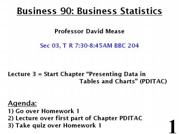
Business 90 Business Statistics Professor
David Mease Sec 03, T R 730-845AM BBC 204
Lecture 3 Start Chapter Presenting Data in
Tables and Charts (PDITAC) Agenda 1) Go
over Homework 1 2) Lecture over first part of
Chapter PDITAC 3) Take quiz over Homework 1
2
Homework Assignment
- Homework 1 Due Tuesday, February 2
1) Read the chapter entitled Introduction and
Data Collection 2) In that chapter do textbook
questions 2, 3, 8(b), 14 (skip a), 16 (skip a),
18 (Note Answers to textbook questions with even
numbers are given in the chapter. Also, you will
need to use Table 1 in the back of the book.)
3
Statistics for Managers Using Microsoft Excel
4th Edition
- Presenting Data in Tables and Charts
4
Chapter Goals
- After completing this chapter, you should be able
to - Create an ordered array
- Construct and interpret a frequency distribution,
histogram, and polygon for numerical data - Construct and interpret a cumulative percentage
distribution and ogive for numerical data - Create and interpret contingency tables, bar
charts, and pie charts for categorical data - Create and interpret a scatter diagram and a
least squares regression line (in other chapter
p. 387-398) - Describe appropriate and inappropriate ways to
display data graphically
5
Organizing and Presenting Data Graphically
- Data in raw form are usually not easy to use for
decision making - Some type of organization is needed
- Table
- Graph
6
Example
Below are Bus 90 midterm exam scores. Describe
this data.
92 60 83 36 62 65 80 88 50 63 92 64 84 89 83 80 8
8 91 90 84 71 77 25 92 49 88 54 51 59 41 71 53 69
68 68 57 60 90 66 50
7
The Ordered Array
- A sorted list of data
- Shows range (min to max)
- Provides some signals about variability
within the range - May help identify outliers (unusual
observations) - If the data set is large, the ordered array is
less useful
8
In class exercise 4 Construct the ordered array
for the exam scores. Now describe this data.
(Its easier now!)
9
Tabulating Numerical Data Frequency Distributions
- What is a Frequency Distribution?
- A frequency distribution is a list or a table
containing class groupings (categories or ranges
within which the data fall) and the corresponding
frequencies with which data fall within each
grouping or category
10
Why Use Frequency Distributions?
- A frequency distribution is a way to summarize
data - The distribution condenses the raw data into a
more useful form - and allows for a quick visual interpretation of
the data
11
Class Intervals and Class Boundaries
- Each class grouping has the same width
- Determine the width of each interval by
- Use at least 5 groupings
- Class boundaries never overlap
- Round up the interval width to get desirable
endpoints
12
In class exercise 5 Construct a frequency
distribution for the exam scores beginning at 20
and ending at 100 using 8 intervals.
13
Graphing Numerical Data The Histogram
- A graph of the data in a frequency distribution
is called a histogram - The class boundaries (or class midpoints) are
shown on the horizontal axis - the vertical axis is either frequency or
percentage - Bars of the appropriate heights are used to
represent the number of observations within each
class
14
In class exercise 6 Construct a frequency
histogram for the exam scores.
Recommended
CrystalGraphics Presentations


