
The Worst Slide Deck Ever - PowerPoint PPT Presentation
1 / 9
Title:
The Worst Slide Deck Ever
Description:
College of Information Sciences and Technology. The Pennsylvania State University ... Probably safe exceptions: Et al. Per se. Etc. or et cetera. Questions? ... – PowerPoint PPT presentation
Number of Views:80
Avg rating:3.0/5.0
Title: The Worst Slide Deck Ever
1
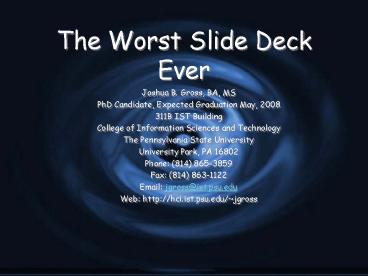
The Worst Slide Deck Ever
- Joshua B. Gross, BA, MS
- PhD Candidate, Expected Graduation May, 2008
- 311B IST Building
- College of Information Sciences and Technology
- The Pennsylvania State University
- University Park, PA 16802
- Phone (814) 865-3859
- Fax (814) 863-1122
- Email jgross_at_ist.psu.edu
- Web http//hci.ist.psu.edu/jgross
2
An Inappropriate Talk Overview
- Detailed explanation of some of my work
- Some background, but no context
- Lots and lots of data
- If you cant do a good job, you can at least
confuse people - Conclusions that do not follow from the work
3
Requisite Prior Knowledge for All CHI Attendees
- In order to understand my talk, you must know
about - Usability Engineering
- Web Design
- Ecological Psychology and Affordance Theory
- Activity Theory from Vygotsky to present
- Neurophysiology
- Geldards homunculus
- My prior work
- My advisors prior work
- Et cetera
- I will not explain any of these
4
Talk Overview
- Here Ill include my entire abstract
- Research into presentations at CHI and other
conferences indicates that some people do a much
better job of presenting their paper than others.
While the slide deck isnt the key to a great
paper, a good slide deck is often the hallmark of
a good paper. One of the most common mistakes is
to put too much information on one slide. - Now Ill say that I know you cant read this much
information, but its really crucial to the rest
of my presentation. - Or Ill read the slide to you - thats fun for
everyone!
5
A Really Bad Chart Example
6
Whats Wrong?
- Too much data
- Unreadable
- Poor chart choice
- Legend doesnt help
- Cant read the titles unless you use a white
background - Isnt this a horrible background?
7
One Point (and a Non Sequitor at That)
- Participatory design is the only correct solution!
8
Latin and Other Foreign Languages
- While the argument may seem, in this case, post
hoc ergo propter hoc, in reality res ipsa
loquitur - Latin phrases are another good way to confuse
your audience - Probably safe exceptions
- Et al.
- Per se
- Etc. or et cetera
9
Questions?
Recommended
CrystalGraphics Presentations


