
Chapter 2 Descriptive Statistics: Tabular and Graphical Methods - PowerPoint PPT Presentation
Title:
Chapter 2 Descriptive Statistics: Tabular and Graphical Methods
Description:
Ogive. 15. Slide. Example: Hudson Auto Repair. The manager of Hudson Auto would like to get a ... Ogive. An ogive is a graph of a cumulative distribution. ... Ogive ... – PowerPoint PPT presentation
Number of Views:1217
Avg rating:3.0/5.0
Title: Chapter 2 Descriptive Statistics: Tabular and Graphical Methods
1
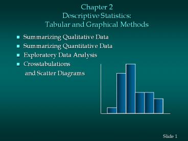
Chapter 2Descriptive StatisticsTabular and
Graphical Methods
- Summarizing Qualitative Data
- Summarizing Quantitative Data
- Exploratory Data Analysis
- Crosstabulations
- and Scatter Diagrams
2
Summarizing Qualitative Data
- Frequency Distribution
- Relative Frequency
- Percent Frequency Distribution
- Bar Graph
- Pie Chart
3
Frequency Distribution
- A frequency distribution is a tabular summary of
data showing the frequency (or number) of items
in each of several nonoverlapping classes. - The objective is to provide insights about the
data that cannot be quickly obtained by looking
only at the original data.
4
Example Marada Inn
- Guests staying at Marada Inn were asked to rate
the - quality of their accommodations as being
excellent, - above average, average, below average, or poor.
The - ratings provided by a sample of 20 quests are
shown - below.
- Below Average Average Above Average
- Above Average Above Average Above
Average Above Average Below Average Below
Average Average Poor Poor - Above Average Excellent Above Average
- Average Above Average Average
- Above Average Average
5
Example Marada Inn
- Frequency Distribution
- Rating Frequency
- Poor 2
- Below Average 3
- Average 5
- Above Average 9
- Excellent 1
- Total 20
6
Relative Frequency Distribution
- The relative frequency of a class is the fraction
or proportion of the total number of data items
belonging to the class. - A relative frequency distribution is a tabular
summary of a set of data showing the relative
frequency for each class.
7
Percent Frequency Distribution
- The percent frequency of a class is the relative
frequency multiplied by 100. - A percent frequency distribution is a tabular
summary of a set of data showing the percent
frequency for each class.
8
Example Marada Inn
- Relative Frequency and Percent Frequency
Distributions - Relative Percent
- Rating Frequency Frequency
- Poor .10 10
- Below Average .15 15
- Average .25 25
- Above Average .45 45
- Excellent .05 5
- Total 1.00 100
9
Bar Graph
- A bar graph is a graphical device for depicting
qualitative data. - On the horizontal axis we specify the labels that
are used for each of the classes. - A frequency, relative frequency, or percent
frequency scale can be used for the vertical
axis. - Using a bar of fixed width drawn above each class
label, we extend the height appropriately. - The bars are separated to emphasize the fact that
each class is a separate category.
10
Example Marada Inn
- Bar Graph
11
Pie Chart
- The pie chart is a commonly used graphical device
for presenting relative frequency distributions
for qualitative data. - First draw a circle then use the relative
frequencies to subdivide the circle into sectors
that correspond to the relative frequency for
each class. - Since there are 360 degrees in a circle, a class
with a relative frequency of .25 would consume
.25(360) - 90 degrees of the circle.
12
Example Marada Inn
- Pie Chart
13
Example Marada Inn
- Insights Gained from the Preceding Pie Chart
- One-half of the customers surveyed gave Marada a
quality rating of above average or excellent
(looking at the left side of the pie). This
might please the manager. - For each customer who gave an excellent rating,
there were two customers who gave a poor rating
(looking at the top of the pie). This should
displease the manager.
14
Summarizing Quantitative Data
- Frequency Distribution
- Relative Frequency and Percent Frequency
Distributions - Dot Plot
- Histogram
- Cumulative Distributions
- Ogive
15
Example Hudson Auto Repair
- The manager of Hudson Auto would like to get a
- better picture of the distribution of costs for
engine - tune-up parts. A sample of 50 customer invoices
has - been taken and the costs of parts, rounded to the
- nearest dollar, are listed below.
16
Frequency Distribution
- Guidelines for Selecting Number of Classes
- Use between 5 and 20 classes.
- Data sets with a larger number of elements
usually require a larger number of classes. - Smaller data sets usually require fewer classes.
17
Frequency Distribution
- Guidelines for Selecting Width of Classes
- Use classes of equal width.
- Approximate Class Width
18
Example Hudson Auto Repair
- Frequency Distribution
- If we choose six classes
- Approximate Class Width (109 - 52)/6 9.5
??10 - Cost () Frequency
- 50-59 2
- 60-69 13
- 70-79 16
- 80-89 7
- 90-99 7
- 100-109 5
- Total 50
19
Example Hudson Auto Repair
- Relative Frequency and Percent Frequency
Distributions - Relative Percent
- Cost () Frequency Frequency
- 50-59 .04 4
- 60-69 .26 26
- 70-79 .32 32
- 80-89 .14 14
- 90-99 .14 14
- 100-109 .10 10
- Total 1.00 100
20
Example Hudson Auto Repair
- Insights Gained from the Percent Frequency
Distribution - Only 4 of the parts costs are in the 50-59
class. - 30 of the parts costs are under 70.
- The greatest percentage (32 or almost one-third)
of the parts costs are in the 70-79 class. - 10 of the parts costs are 100 or more.
21
Dot Plot
- One of the simplest graphical summaries of data
is a dot plot. - A horizontal axis shows the range of data values.
- Then each data value is represented by a dot
placed above the axis.
22
Example Hudson Auto Repair
- Dot Plot
23
Histogram
- Another common graphical presentation of
quantitative data is a histogram. - The variable of interest is placed on the
horizontal axis. - A rectangle is drawn above each class interval
with its height corresponding to the intervals
frequency, relative frequency, or percent
frequency. - Unlike a bar graph, a histogram has no natural
separation between rectangles of adjacent classes.
24
Example Hudson Auto Repair
- Histogram
18
16
14
12
Frequency
10
8
6
4
2
Parts Cost ()
50 60 70 80 90 100
110
25
Cumulative Distributions
- Cumulative frequency distribution -- shows the
number of items with values less than or equal to
the upper limit of each class. - Cumulative relative frequency distribution --
shows the proportion of items with values less
than or equal to the upper limit of each class. - Cumulative percent frequency distribution --
shows the percentage of items with values less
than or equal to the upper limit of each class.
26
Example Hudson Auto Repair
- Cumulative Distributions
- Cumulative Cumulative
- Cumulative Relative
Percent - Cost () Frequency Frequency
Frequency - lt 59 2 .04 4
- lt 69 15 .30 30
- lt 79 31 .62 62
- lt 89 38 .76 76
- lt 99 45 .90 90
- lt 109 50 1.00 100
27
Ogive
- An ogive is a graph of a cumulative distribution.
- The data values are shown on the horizontal axis.
- Shown on the vertical axis are the
- cumulative frequencies, or
- cumulative relative frequencies, or
- cumulative percent frequencies
- The frequency (one of the above) of each class is
plotted as a point. - The plotted points are connected by straight
lines.
28
Example Hudson Auto Repair
- Ogive
- Because the class limits for the parts-cost data
are 50-59, 60-69, and so on, there appear to be
one-unit gaps from 59 to 60, 69 to 70, and so on. - These gaps are eliminated by plotting points
halfway between the class limits. - Thus, 59.5 is used for the 50-59 class, 69.5 is
used for the 60-69 class, and so on.
29
Example Hudson Auto Repair
- Ogive with Cumulative Percent Frequencies
100
80
60
Cumulative Percent Frequency
40
20
Parts Cost ()
50 60 70 80 90 100
110
30
Exploratory Data Analysis
- The techniques of exploratory data analysis
consist of simple arithmetic and easy-to-draw
pictures that can be used to summarize data
quickly. - One such technique is the stem-and-leaf display.
31
Stem-and-Leaf Display
- A stem-and-leaf display shows both the rank order
and shape of the distribution of the data. - It is similar to a histogram on its side, but it
has the advantage of showing the actual data
values. - The first digits of each data item are arranged
to the left of a vertical line. - To the right of the vertical line we record the
last digit for each item in rank order. - Each line in the display is referred to as a
stem. - Each digit on a stem is a leaf.
- 8 5 7
- 9 3 6 7 8
32
Stem-and-Leaf Display
- Leaf Units
- A single digit is used to define each leaf.
- In the preceding example, the leaf unit was 1.
- Leaf units may be 100, 10, 1, 0.1, and so on.
- Where the leaf unit is not shown, it is assumed
to equal 1.
33
Example Leaf Unit 0.1
- If we have data with values such as
- 8.6 11.7 9.4 9.1 10.2 11.0 8.8
- a stem-and-leaf display of these data will be
- Leaf Unit 0.1
- 8 6 8
- 9 1 4
- 10 2
- 11 0 7
34
Example Leaf Unit 10
- If we have data with values such as
- 1806 1717 1974 1791 1682 1910 1838
- a stem-and-leaf display of these data will be
- Leaf Unit 10
- 16 8
- 17 1 9
- 18 0 3
- 19 1 7
35
Example Hudson Auto Repair
- Stem-and-Leaf Display
- 5 2 7
- 6 2 2 2 2 5 6 7 8 8 8 9 9 9
- 7 1 1 2 2 3 4 4 5 5 5 6 7 8
9 9 9 - 8 0 0 2 3 5 8 9
- 9 1 3 7 7 7 8 9
- 10 1 4 5 5 9
36
Stretched Stem-and-Leaf Display
- If we believe the original stem-and-leaf display
has condensed the data too much, we can stretch
the display by using two more stems for each
leading digit(s). - Whenever a stem value is stated twice, the first
value corresponds to leaf values of 0-4, and the
second values corresponds to values of 5-9.
37
Example Hudson Auto Repair
- Stretched Stem-and-Leaf Display
- 5 2
- 5 7
- 6 2 2 2 2
- 6 5 6 7 8 8 8 9 9 9
- 7 1 1 2 2 3 4 4
- 7 5 5 5 6 7 8 9 9 9
- 8 0 0 2 3
- 8 5 8 9
- 9 1 3
- 9 7 7 7 8 9
- 10 1 4
- 10 5 5 9
38
Crosstabulations and Scatter Diagrams
- Thus far we have focused on methods that are used
to summarize the data for one variable at a time. - Often a manager is interested in tabular and
graphical methods that will help understand the
relationship between two variables. - Crosstabulation and a scatter diagram are two
methods for summarizing the data for two (or
more) variables simultaneously.
39
Crosstabulation
- Crosstabulation is a tabular method for
summarizing the data for two variables
simultaneously. - Crosstabulation can be used when
- One variable is qualitative and the other is
quantitative - Both variables are qualitative
- Both variables are quantitative
- The left and top margin labels define the classes
for the two variables.
40
Example Finger Lakes Homes
- Crosstabulation
- The number of Finger Lakes homes sold for each
style and price for the past two years is shown
below. - Price Home Style
- Range Colonial Ranch Split
A-Frame Total - lt 99,000 18 6
19 12 55 - gt 99,000 12 14
16 3 45 - Total 30 20 35
15 100
41
Example Finger Lakes Homes
- Insights Gained from the Preceding
Crosstabulation - The greatest number of homes in the sample (19)
are a split-level style and priced at less than
or equal to 99,000. - Only three homes in the sample are an A-Frame
style and priced at more than 99,000.
42
Crosstabulation Row or Column Percentages
- Converting the entries in the table into row
percentages or column percentages can provide
additional insight about the relationship between
the two variables.
43
Example Finger Lakes Homes
- Row Percentages
- Price Home Style
- Range Colonial Ranch Split
A-Frame Total - lt 99,000 32.73 10.91 34.55
21.82 100 - gt 99,000 26.67 31.11 35.56
6.67 100 - Note row totals are actually 100.01 due to
rounding.
44
Example Finger Lakes Homes
- Column Percentages
- Price Home Style
- Range Colonial Ranch Split
A-Frame - lt 99,000 60.00 30.00 54.29
80.00 - gt 99,000 40.00 70.00 45.71
20.00 - Total 100 100 100
100
45
Scatter Diagram
- A scatter diagram is a graphical presentation of
the relationship between two quantitative
variables. - One variable is shown on the horizontal axis and
the other variable is shown on the vertical axis. - The general pattern of the plotted points
suggests the overall relationship between the
variables.
46
Example Panthers Football Team
- Scatter Diagram
- The Panthers football team is interested in
investigating the relationship, if any, between
interceptions made and points scored. - x Number of y Number of
- Interceptions Points Scored
- 1 14
- 3 24
- 2 18
- 1 17
- 3 27
47
Example Panthers Football Team
- Scatter Diagram
y
30
25
20
Number of Points Scored
15
10
5
x
0
1
2
3
0
Number of Interceptions
48
Example Panthers Football Team
- The preceding scatter diagram indicates a
positive relationship between the number of
interceptions and the number of points scored. - Higher points scored are associated with a higher
number of interceptions. - The relationship is not perfect all plotted
points in the scatter diagram are not on a
straight line.
49
Scatter Diagram
- A Positive Relationship
50
Scatter Diagram
- A Negative Relationship
51
Scatter Diagram
- No Apparent Relationship
52
Tabular and Graphical Procedures
Data
Qualitative Data
Quantitative Data
Tabular Methods
Tabular Methods
Graphical Methods
Graphical Methods
- Frequency
- Distribution
- Rel. Freq. Dist.
- Freq. Dist.
- Crosstabulation
- Bar Graph
- Pie Chart
- Dot Plot
- Histogram
- Ogive
- Scatter
- Diagram
- Frequency
- Distribution
- Rel. Freq. Dist.
- Cum. Freq. Dist.
- Cum. Rel. Freq.
- Distribution
- Stem-and-Leaf
- Display
- Crosstabulation
53
End of Chapter 2
Recommended
CrystalGraphics Presentations


