
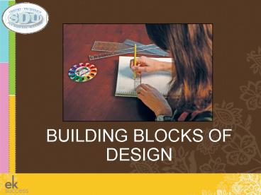
BUILDING BLOCKS OF DESIGN - PowerPoint PPT Presentation
1 / 60
Title:
BUILDING BLOCKS OF DESIGN
Description:
Color theory as it is related to designing scrapbook pages. ... Repeat elements like color, shape and texture across the pages to give the design vitality. ... – PowerPoint PPT presentation
Number of Views:180
Avg rating:3.0/5.0
Title: BUILDING BLOCKS OF DESIGN
1
- BUILDING BLOCKS OF DESIGN
2
- SUPPLIES FOR CLASS
- Class Kit
- Notebook and pencil/pen this will be used to
sketch or take notes - 5-7 printed photos
- Pick, Point and Match Rainbow Color Selector
- Alphabet Sticker Sheet
- One pack of stickers
- 3 colors of cardstock (2 sheets of each color)
- Embellishments this is optional, but nice to
have.
3
OBJECTIVES FOR CLASS
- In this class you will learn
- Color theory as it is related to designing
scrapbook pages. - To create color combinations effortlessly.
- That photographs, journaling, titles,
enhancements, color, line, lettering and shape
are the building blocks of scrapbook design. - How and when to use each of these elements to
create great layout designs. - Learn principles of design structure that will
help you create strong designs.
4
COLOR THEORY
- Color is the scrapbookers richest resource.
- Choosing and using color correctly is among the
most difficult choices in designing a layout. - Most of us stick to tried and tested options, yet
a more imaginative approach can transform any
page into a work of art. - Use your photographs for inspiration.
- Stray from your comfort zone and be willing to
play with color. - Look for what appeals to you.
- Allow yourself to be drawn to unique colors and
combinations.
5
COLOR THEORY
- Introduce color through the use of paper.
- Play with a variety of color schemes.
- Create key cards with your favorite color
schemes. - You do not have to be an artist to use color
principles in your scrapbooking. - You simply need to be aware of color vocabulary
and how to apply it to the most amazing color
tool the patented Rainbow Color Selector.
6
COLOR VOCABULARY
- The three primary colors are
- Pure red
- Pure yellow
- Pure blue
- They are known as the primaries because you
cannot create them from other colors. - When the three primary colors are mixed, they
create all of the other colors on the Color
Selector.
7
COLOR VOCABULARY
- Orange (red and yellow)
Secondary colors are made by mixing equal
amounts of two primary colors.
- Green (blue and yellow)
- Violet (blue and red)
8
COLOR VOCABULARY
- Pure colors are the most intense version of
themselves. - The pure colors - red, orange, yellow, green,
blue, violet - are the most powerful colors
because they cause the greatest visual impact.
9
COLOR VOCABULARY
- COLOR VALUE
- A Shade is created when black is added to a pure
color. - A Tint of a color is created when white is added
to the pure color.
10
COLOR VOCABULARY
- COLOR INTENSITY
- Gray can be added to pure colors to dull or
weaken the appearance of the color. - A tone is a grayed version of a pure color.
11
COLOR VOCABULARY
- Neutrals
- Neutrals provide a resting place for the eye.
- Black, white, and gray are true neutrals.
12
COLOR COMBINATIONS
- MONOCHROMATIC
- One-color scheme
- Select a pure color, and then select tints and
shades of the color to create a monochromatic
layout.
13
COLOR COMBINATIONS
- ANALAGOUS
- Colors that are next to one another on the Color
Selector are analogous colors.
14
COLOR COMBINATIONS
- COMPLIMENTARY
- Complementary colors complement one another.
- Complementary colors are found directly across
from one another on the Color Selector.
15
COLOR COMBINATIONS
- TRIADIC AND QUADRATIC
- Triadic color combinations are on the Color
Selector in the form of a triangle. - Quadratic color combinations are on the Color
Selector in the form of a square or rectangle. - The equilateral triangle and square color
combinations are strong, traditional
combinations. - The unequal isosceles triangle and rectangle will
produce more fashion forward, trendy color
combinations.
16
COLOR AND EMOTIONS
- MOOD - There has been a great deal written
concerning color psychology and the power of
color on emotions. - Warm Colors - Red, orange, and yellow
- Warm colors stimulate the senses.
- Cool Colors -Purple, green, and blue
- Cool colors are soothing and tranquil.
- Combine warm and cool colors for excitement and
movement.
17
COLOR AND EMOTIONS
- THEME
- As you plan your scrapbook page, your color
scheme and theme should coordinate. - Now that you know how colors affect mood, you can
plan a page that will fulfill its purpose. Warm
Colors - Red, orange, and yellow
18
COLOR DOMINANCE
- A dominant color is the color that stands out,
comes forward, and catches the eye. - Warm colors and light, bright colors tend to
dominate. - Cool and dark colors tend to recede.
19
COLOR DOMINANCE
- Cool and dark colors make good backgrounds.
- Light, bright colors make good accents.
20
COLOR DOMINANCE
- Light, Bright colors will dominate.
- With three cool colors, lightest tint or shade
will dominate.
21
COLOR DOMINANCE
- In a monochromatic layout, the proportions of the
color determine color dominance.
22
COLOR DOMINANCE
- CREATE FOCUS WITH COLOR
- A focal point is the main attraction of a
scrapbook page.
23
COLOR DOMINANCE
- Select a three-color scheme.
- Dominant
- Supporting
- Accent
- Cool or Dark Color Good Background
- Warm or Lightest Color Good Accent
- Medium Color Good Supporting Color
24
BUILDING BLOCKS OF DESIGN
- Now that you have a good working knowledge of
color - all you need is knowledge about how to
position all of the elements of a scrapbook page
onto the paper! - Designing a layout is the act of arranging parts,
details, form and color in order to produce a
harmonious scrapbook page. - The success of a page is due to the sum of its
parts - Proportions
- Number and shapes of photographs
- The written story
- Colors
- Enhancements
25
BUILDING BLOCKS OF DESIGN
- Transforming a plain piece of paper and
photographs into a visually appealing
story-telling device is the specialty of a
scrapbook designer. - Each part of the page is considered and added
thoughtfully in order to achieve a sense of
harmony.
26
SCRAPBOOK PAGE ELEMENTS
- PHOTOGRAPHS
- Select the photographs for the page.
- Pick photos that match the theme of the page.
- Choose the best shots and store the remaining
photos for future. - Identify the Focus Photo.
27
SCRAPBOOK PAGE ELEMENTS
- JOURNALING
- The written word is the complement to the
photographs. - Prepare tidbit journaling.
28
SCRAPBOOK PAGE ELEMENTS
- TITLE
- The title states the theme of the page.
- Compose the title.
- Think of several title options.
- Consider the style of the title
- Single Headline
- Mini-Headline
- Title and Subtitle
29
SCRAPBOOK PAGE ELEMENTS
- PAPER
- Paper selection is very important.
- Select a color scheme that reflects the mood and
theme of the page. - Assign dominant, supporting, and accent roles to
the colors selected.
30
SCRAPBOOK PAGE ELEMENTS
- ENHANCEMENTS
- Make enhancement selections.
- Be sure to keep the enhancements in the same
color scheme as the paper. - The enhancements should reflect the theme of the
page. - Less is more.
31
DESIGN ELEMENTS
- LINE
- The simplest design element, Line.
- Organize with Line.
- Strengthen your layout with Line.
- Create movement with Line
32
DESIGN ELEMENTS
- ORGANIZE WITH LINE
- Divide your scrapbook page in thirds.
- Use the invisible grid to distribute
- Pictures
- Journaling
- Titles
- Page Enhancements
- Visible lines offer structure and unity to a
layout.
33
DESIGN ELEMENTS
- STRENGTHEN YOUR LAYOUT WITH LINE
- Select lines to add strength to a layout.
- Line comes in all shapes and sizes and mediums.
- Use line in
- Titles
- Borders
- Enhancements
- Object placement
- Use line to balance and unify a layout.
34
DESIGN ELEMENTS
- CREATE MOVEMENT WITH LINE
- Use line to guide a reader through a layout.
- Connect and divide elements with line.
35
DESIGN ELEMENTS
- LETTERING
- Letters are perceived by the reader in several
ways - As text to read
- As shape
- As a visual element
- The form of letters conveys a feeling and
meaning. - Lettering is prominent and has a strong impact.
36
DESIGN ELEMENTS
- SHAPE
- Shape is obtained through cropping photos.
- Cropping is the act of cutting away parts of a
photograph to reframe the subject. - Framing focuses the viewers attention on the
picture. - The most common shapes are
- Circle
- Square
- Rectangle
- Oval
37
DESIGN ELEMENTS
- CROPPING
- When do I crop?
- What is the right shape?
38
DESIGN ELEMENTS
- IMPORTANCE OF SCALE
- Remember the importance of scale.
- If you have enlarged your focus photos to 5 x 7,
your other photos should remain large so that
they balance complement the focus. Likewise,
if the majority of your photographs have been
cropped small, do not make the focus twice as big
as the supporting photos. - All of the photos on the page should be cropped
in proportion to one another
39
DESIGN STRUCTURE
- Now the fun begins!
- Once you understand the elements of design
line, lettering, and shape you are prepared to
use these raw materials within a structure. - Not every layout uses all the design elements.
40
DESIGN STRUCTURE
- BALANCE
- In design, you balance Visual Interest.
- Different colors, shapes and sizes create various
degrees of interest. - It is the distribution of this interest that a
scrapbooker attempts to control.
41
DESIGN STRUCTURE
- BALANCE AND WEIGHT
- Weight, in scrapbook design, is determined by the
amount of attention an element draws. - Single vs. Group
- Inanimate vs. Animated
- Light Bright Colors vs. Cool Dark Colors
42
DESIGN STRUCTURE
- BALANCE AND EQUILIBRIUM
- Scrapbookers rarely want things to be equal.
- Balance Unity without sacrificing variety.
- Sometimes it is desirable to throw off the
balance to draw attention to one item.
43
DESIGN STRUCTURE
- SYMMETRY
- Formal Balance
- Mirror Image
- Similarity on either side of the central axis.
- Symmetry has great appeal.
- Symmetry reflects good shape relationships.
44
DESIGN STRUCTURE
- ASYMMETRY
- Informal Balance
- Without symmetry
- Asymmetry defies order and repetition.
- Variety is desired over order.
- Asymmetry generates interest.
- Asymmetry gives the artist more freedom.
45
DESIGN STRUCTURE
- RULE OF THREES
- Asymmetry thrives on the balance of threes.
- Red, Blue, and Yellow three primary colors
- Hue, Value, and Intensity three characteristics
of color - The Rule of Threes creates balanced variety in
- Color Selection
- Page Distribution
- Object Placement
46
DESIGN STRUCTURE
- BALANCE THROUGH DISTRIBUTION
- Break your page into threes
- Vertically
- Horizontally
- Use the three segments to create an asymmetrical
layout that maintains balance. - Place objects on the page in design triangles.
47
DESIGN STRUCTURE
- COLOR TRIANGLE
- The accent color is used in three places on the
page.
48
DESIGN STRUCTURE
- SHAPE TRIANGLE
- Place a shape in three places on the page that
together form a triangle.
49
DESIGN STRUCTURE
- ENHANCEMENT TRIANGLE
- Place enhancements in three places to achieve an
Enhancement Triangle.
50
OBJECT PLACEMENT
- Final Step
- Organize the elements on the page.
- Text and Imagery Positive Aspects of Design
- Empty Space Negative Aspects of Design
51
OBJECT PLACEMENT
- FOCAL POINT
- Create a focal point that guides the reader to
the heart of your design.
52
OBJECT PLACEMENT
- RHYTHM
- Repeat elements like color, shape and texture
across the pages to give the design vitality.
53
OBJECT PLACEMENT
- MOVEMENT
- Use overlapping elements and line to create
movement on the page. - Create relationships between elements on a page
that give the illusion of moving in and around
the page space.
54
OBJECT PLACEMENT
- CONTRAST
- Contrast shapes and color for increased visual
interest and dynamic scrapbook pages.
55
OBJECT PLACEMENT
- UNITY
- Unity is the coordination of the design elements
in one harmonious scrapbook page. - Relate all of the design elements to create a
connected scrapbook page.
56
OBJECT PLACEMENT
- VARIETY
- Variety creates interest.
- Place photos and journal entries straight and on
edge. - Vary the size and shape of photos and mats.
- Create titles in a variety of fonts, shapes, and
sizes. - Use a variety of line lengths, shapes, and widths.
57
READY TO BEGIN
- Sketching and Pre-planning Layouts
- A sketch is a small, scaled-down version of an
actual layout. - This is a good way to plan out a layout prior to
cutting your paper or photos.
58
READY TO BEGIN
- All of the black, white and red examples show how
each lesson of layout design acts as a building
block to our final design - Pre-planned layout
- Line
- Lettering
- Shape
- Balance
- Rule of threes
- Object Placement
59
READY TO BEGIN
- Plan your color scheme!
- Inspiration
- Consult the Pick, Point, and Match Rainbow
Color Selector - Select a background color The background color
will constitute the greatest part of your design,
choose a color that states the mood of the page,
keep in mind that cool colors are tranquil and
warm colors are exciting. - Select a supporting color this will be used in
matting borders and titles - Select the accent color this is best used
around your focal point and journaling.
60
READY TO BEGIN
- This is the best part of class!
- Now you are ready to begin.
- Use one of the sketches, or create your own.
- Create your first layout!